
The sweet spot for website photos is a delicate balance. You need images wide enough for big, beautiful screens—think 1500 to 2500 pixels—but you also need them to be lightweight, ideally under 200KB. Getting this right means your photos will look sharp without killing your site's speed, which is a massive win for both your visitors and your SEO.
Why the Right Photo Size Is Critical for Your Website
We’ve all been there: staring at a blank screen, waiting for a website to load. It's a universal frustration, and more often than not, huge, clunky images are the culprits behind the delay. The "best photo size" isn't a single magic number; it’s a careful negotiation between stunning visuals and snappy performance.
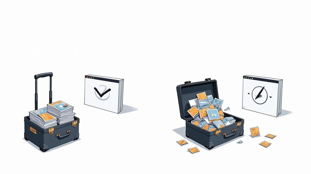
Think of it like packing a suitcase for a trip. You need all your essentials, but overpacking just weighs you down and makes the journey a drag. When an image is too large, it forces a visitor's browser to work overtime, and those precious seconds of delay are often enough to send them clicking away for good.
The High Cost of Heavy Images
Unoptimized images act like anchors on your website, dragging down its performance and sinking your key business metrics. The consequences are real and can completely undermine all your other marketing efforts.
Here’s exactly what’s at stake:
- User Experience Suffers: A slow site feels unprofessional and clunky. It creates a terrible first impression and can seriously erode trust in your brand before a visitor even sees what you have to offer.
- Bounce Rates Increase: People have zero patience online. If a page takes too long to appear, a huge chunk of your audience will simply give up and leave, never to return.
- SEO Rankings Drop: Search engines like Google are obsessed with user experience, and speed is a massive part of that. A slow site gets penalized with lower rankings, making it that much harder for new customers to even find you.
The core principle is simple: every single kilobyte you can shave off an image makes your website faster and more effective. This isn’t a minor tweak; it's a fundamental part of modern web design.
Finding the Performance Sweet Spot
Image optimization is all about finding that perfect middle ground where your photos look fantastic but are lean enough to load in a flash. It’s a staggering fact, but images contribute to an average of 21% of a total webpage's weight. They're often the heaviest single element on the page.
And the stakes are high. Pages that take longer than three seconds to load can see their bounce rates jump by 32%. This is why keeping most of your images under 200KB is so critical—it has a direct impact on your speed and your ability to keep visitors engaged.
To really nail this, it helps to know your image types and their typical use cases.
Quick Guide to Common Image Sizes and File Weights
Here's a handy little cheat sheet for the most common types of images you'll be working with. Think of these as reliable starting points for balancing quality and performance.
| Image Type | Recommended Width (Pixels) | Ideal File Size |
|---|---|---|
| Full-Width Hero/Banner | 1500 – 2500 px | Under 200KB |
| Blog Post Image | 800 – 1200 px | Under 150KB |
| Product Image (e-commerce) | 600 – 1000 px | Under 100KB |
| Thumbnail/Preview | 150 – 300 px | Under 30KB |
| Logo | 200 – 400 px | Under 25KB |
This table isn't about rigid rules but about providing a framework. Your specific needs might vary, but sticking close to these guidelines will put you way ahead of the game.
To truly grasp how all these pieces fit together, understanding how to improve website loading speed fast is a game-changer. Mastering your image dimensions and file sizes is the first, most important step toward building a site that is both beautiful and blazing fast.
Getting to Grips with Image Dimensions and Aspect Ratios
Before we can find the perfect photo size for your website, we need to talk about what makes up a digital image. Imagine a grand mosaic, made up of thousands of tiny, colorful tiles. A single pixel is just like one of those tiles. When you see image dimensions, like 1920×1080 pixels, it’s just a simple count of how many tiles make up the width and height of your picture.
Think of getting the dimensions right as choosing the right size canvas before you start painting. It just makes sense. If your website's content area is only 800 pixels wide, there's no point in uploading a massive 3000-pixel-wide image. The browser has to waste time and energy shrinking it down, which slows your page load for zero visual gain.
Why Aspect Ratio is a Big Deal
But dimensions are only half the story. The other piece of the puzzle is the aspect ratio, which is just a fancy way of describing an image's shape. It’s the relationship between the width and height, usually written as a ratio like 16:9 (widescreen) or 1:1 (a perfect square).
Sticking to a consistent aspect ratio is absolutely crucial if you want your site to look professional. Have you ever seen a photo that’s been weirdly stretched or squished? That’s what happens when you try to force a wide 16:9 image into a square 1:1 box. It looks awful and immediately makes your site feel sloppy.
Aspect ratio is all about creating visual harmony. When you use the same proportional shape for similar images—like all your blog post thumbnails—you give your visitors a clean, organized, and polished experience.
Different parts of a website are built for specific shapes. A big, dramatic hero banner at the top of a page usually looks best in a panoramic 16:9 ratio. On the other hand, an Instagram post is designed for a 1:1 square. Knowing these common ratios ahead of time lets you prep your images correctly from the get-go.
Here are a few common ratios you'll see all over the web:
- 16:9: The go-to for widescreen displays. It's perfect for hero images and video thumbnails.
- 4:3: A more traditional, slightly boxier shape you'll often find in photo galleries.
- 3:2: A super common ratio for blog post images, stemming from classic photography.
- 1:1: The perfect square. Think profile pictures, logos, and e-commerce product shots.
Putting It All Together in the Real World
So, what does this look like in practice? Let's say you're running a blog. A good size for your featured image might be 1200×800 pixels, which fits neatly into that 3:2 aspect ratio. If you're selling products online, you might want your photos to be 1000×1000 pixels (a 1:1 ratio) to keep your shop grid looking uniform and tidy.
If you need a quick way to get your images to the right size and shape, an online image resizer can be a real lifesaver.
Don't forget that different platforms have their own rules, too. What works for your blog might not look right on social media. For specific guides, like finding the ultimate guide to LinkedIn graphic sizes, it’s always best to check resources dedicated to that platform. Mastering both dimensions and aspect ratio is the first real step to a website that not only looks fantastic but also runs smoothly.
Choosing the Right Image Format for the Job
https://www.youtube.com/embed/WblPwVq9KnU
Let's get one thing straight: not all image files are created equal.
Picking the right format is a bit like choosing the right tool for a DIY project. You wouldn't use a sledgehammer to hang a picture frame, right? Using the wrong image format can bloat your file sizes and drag your site's loading speed to a crawl for no good reason.
To build a fast, beautiful website, you need to know the main players. We'll break down the four most common formats you’ll run into: JPEG, PNG, WebP, and SVG. Each one has a specific job where it absolutely shines.
H3: JPEG: Your Go-To for Photographs
Think of JPEG (or JPG) as the trusty, all-purpose workhorse for web images. It's hands-down the best choice for any complex photograph with millions of colors and smooth gradients. We're talking about your product shots, hero images, and team portraits.
Its secret weapon is lossy compression. This is a clever trick that dramatically shrinks the file size by shaving off tiny bits of data your eyes are unlikely to ever notice. This makes it perfect for balancing rich visuals with the critical need for speed.
The one catch? JPEG doesn't do transparency. If you need a logo or icon with a see-through background, you'll have to look elsewhere.
H3: PNG: When Transparency Is a Must
This is where PNG comes in. It's the specialist you call when you absolutely, positively need a transparent background. PNG is the ideal format for logos, icons, and any graphic where you don't want a clunky white box messing up your design.
This format uses lossless compression, which means it reduces file size without sacrificing a single pixel of quality. The trade-off, however, is that file sizes are often much larger than JPEGs, especially for detailed photos. It's best to stick with PNGs for simpler graphics to keep things light.
The infographic below breaks down how pixels, dimensions, and aspect ratio all work together to form the foundation of a well-structured image.
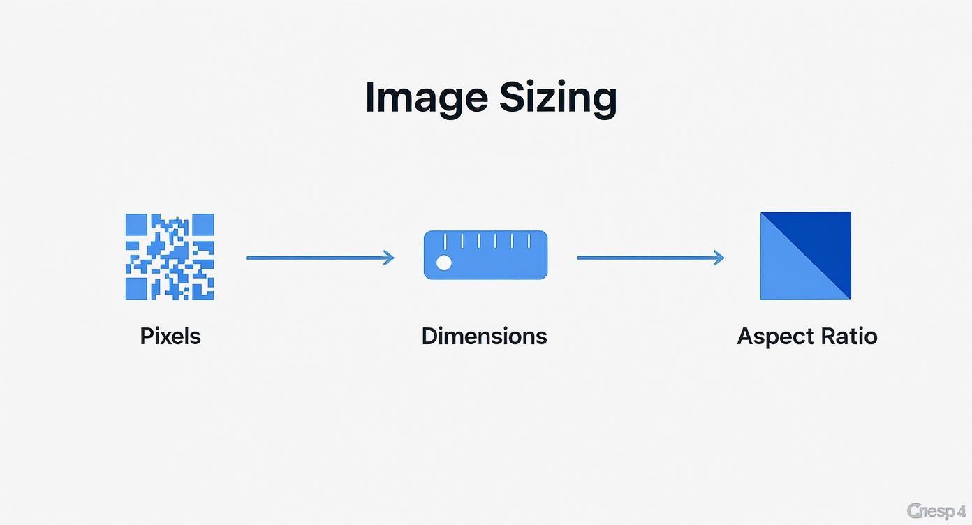
This visual guide shows how these core concepts build on each other, giving you a solid starting point before you even start thinking about file formats.
H3: WebP: The Modern High-Performer
WebP is the new kid on the block, built by Google specifically for the modern web. It truly offers the best of both worlds: it has superior compression that beats both JPEG and PNG, and it supports transparency.
How much better is it? A WebP file can be 25-34% smaller than an equivalent JPEG image with no visible loss in quality.
Because it’s so efficient, WebP is quickly becoming the go-to recommendation for almost any image on your site. The vast majority of modern browsers now fully support it, making it a safe and incredibly smart choice for speeding things up.
Switching to a modern format like WebP is one of the single most effective things you can do to slash your page weight, improve loading speed, and boost your SEO rankings—all without sacrificing an ounce of visual quality.
H3: SVG: for Crisp, Scalable Graphics
Finally, we have SVG (Scalable Vector Graphic). Unlike the other formats we've discussed, which are made of pixels, SVGs are built from mathematical code.
What does that mean? It means you can scale them up or down to any size imaginable—from a tiny icon on a phone to a massive billboard—and they will stay perfectly sharp and crisp. No blurriness, ever.
This makes SVG the undisputed champion for logos, icons, and simple illustrations. They also have incredibly tiny file sizes, which is fantastic for performance. If you're dealing with anything that isn't a photograph, SVG is almost always your best bet.
Image Format Comparison: JPEG vs PNG vs WebP vs SVG
Choosing the right format can feel overwhelming, but it's really about matching the format's strengths to your specific needs. This table breaks down the key differences to help you make the right call every time.
| Feature | JPEG | PNG | WebP | SVG |
|---|---|---|---|---|
| Best For | Photographs, complex images | Logos, icons, simple graphics | All raster images (photos & graphics) | Logos, icons, simple illustrations |
| Compression | Lossy | Lossless | Lossy & Lossless | Vector-based (code) |
| Transparency | No | Yes | Yes | Yes |
| File Size | Small | Medium to Large | Smallest | Tiny |
| Scalability | No (pixelates when enlarged) | No (pixelates when enlarged) | No (pixelates when enlarged) | Yes (infinitely scalable) |
| Browser Support | Universal | Universal | Very good (most modern browsers) | Universal |
Ultimately, JPEG is your workhorse for photos, PNG is for graphics needing transparency, WebP is the modern, high-performance upgrade for both, and SVG is the undisputed king for any scalable vector graphic. Use this as your guide, and you'll have a site that's both beautiful and blazingly fast.
Mastering Compression to Reduce File Size
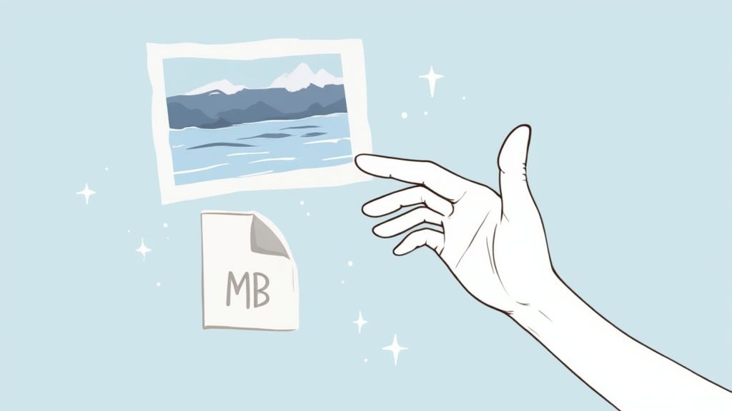
This is where the real magic happens for site speed. That gorgeous photo straight from your camera might be a massive 5MB file, which is an absolute disaster for web loading times. The secret weapon here is compression, a process that intelligently shrinks file size to make your images web-friendly.
Think of it this way: an image's dimensions are like the physical size of a book, but its file size is the page count. Compression is the editor who makes the story just as compelling but with far fewer pages. The result? Your website loads in a flash.
There are two main ways to go about this, each with its own approach to making images smaller.
Lossy Compression: The Smart Reducer
Lossy compression is your go-to method for dramatically shrinking image files. It works by cleverly removing tiny bits of data that the human eye is unlikely to even notice.
Imagine a photo of a clear blue sky. A lossy algorithm might take thousands of slightly different shades of blue and simplify them into a few hundred. This move slashes the data needed to display the image, but the sky still looks perfectly blue to your visitors. Formats like JPEG and WebP are masters of this technique, making them ideal for most website photos where you need a great balance between quality and speed.
Lossless Compression: The Perfect Preservationist
On the other hand, lossless compression is like vacuum-sealing your clothes for a trip. It shrinks the space the file takes up without losing a single thread of the original data. When you "unzip" the file by loading it in a browser, every single pixel is restored to its original state.
This method, used by formats like PNG, is perfect for graphics where absolute precision is critical—think logos, icons, or technical diagrams with sharp, clean lines. The trade-off is that it generally creates larger files than lossy compression.
Websites that get compression right see an average 35-50% reduction in page load times compared to sites using raw, unoptimized photos. Tools like TinyPNG can often shrink file sizes by an incredible 60-80% with almost no visible loss in quality. Discover more insights on high-performance images.
The goal is to get your images well under 200KB whenever possible. For an e-commerce store, hitting this sweet spot is crucial, but editing every single photo can eat up a lot of time. Streamlining this with professional product photo editing services ensures your images are perfectly optimized without all the manual effort.
When you master compression, you can serve up high-quality visuals that load almost instantly for every single visitor.
How Responsive Images Improve User Experience
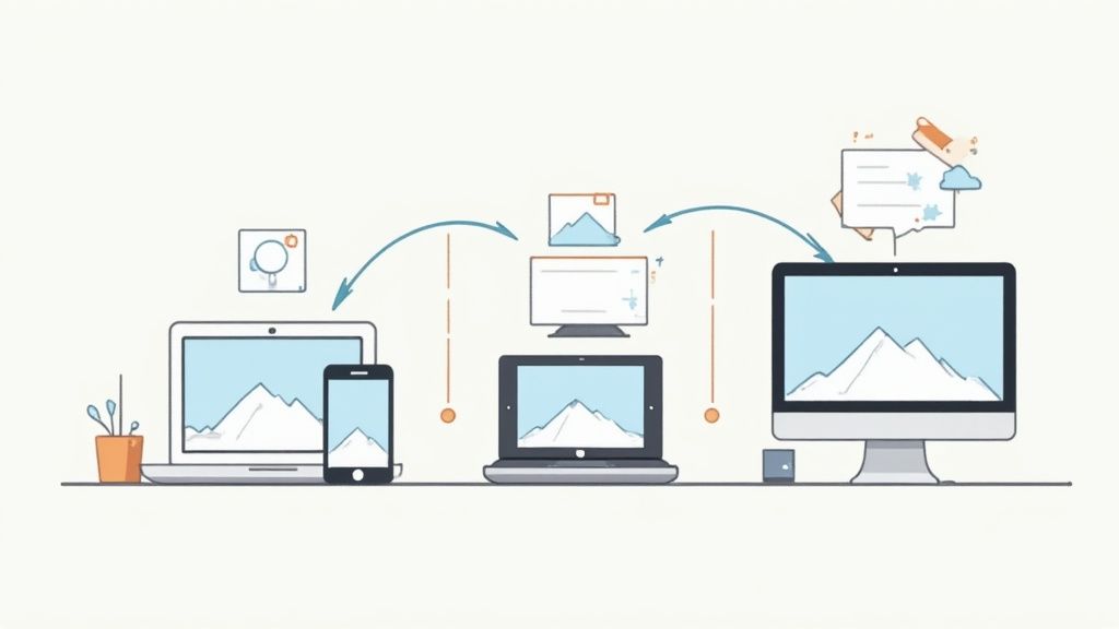
In a world where your customers jump between tiny phones and massive desktop monitors, a one-size-fits-all image is a recipe for a terrible experience. This is where responsive images save the day, creating a faster, smarter, and far more pleasant journey for everyone who visits your site.
Think of your website as a clever traffic controller for images. It intelligently sends a small, lightweight version to someone on their smartphone, while delivering a beautiful, high-resolution version to a visitor on a desktop. This simple act prevents a phone from wasting precious data and time downloading a huge file it simply doesn't need.
Why One Size Fails Everyone
Modern web design has a clever trick up its sleeve called srcset. It’s an attribute that essentially gives the browser a menu of image options to choose from. The browser then automatically picks the best size based on the user's screen dimensions and resolution, ensuring every image looks tack-sharp without dragging the page down.
If you're using a platform like Shopify, a lot of this heavy lifting happens behind the scenes. But here’s the catch: you still have to start with properly sized source images. It's a non-negotiable first step. Without a good source file, even the best automation can't conjure up a crisp, fast-loading visual. Using a dedicated Shopify photo editor is a great way to prep perfectly optimized source images for your store.
Adapting to a Multi-Device World
Ever since mobile web usage officially overtook desktop traffic, the game has changed. Web standards have shifted to serve all kinds of screen sizes efficiently. For example, leading platforms now recommend specific dimensions for different devices to lock in that perfect balance of quality and speed.
A sprawling desktop background image might be 2560×1400 pixels, but its mobile counterpart could be just 360×640 pixels. This adaptive approach is at the heart of modern web performance.
Likewise, a hero image is often a cinematic 1280×720 pixels on a desktop but scales down to a punchy 360×200 pixels on mobile, all while keeping that consistent 16:9 aspect ratio. This strategy makes sure your website is lightning-fast and looks fantastic for every single visitor, no matter what device they're holding.
Your Questions About Website Photo Sizes Answered
Diving into image optimization can feel like a maze of technical questions. But getting a few key concepts right is all it takes to build a fast, beautiful website. Let's tackle the most common questions head-on so you can move forward with confidence.
What Is the Best Overall Image Size?
If only there was one magic number! But a great rule of thumb is to aim for a width between 1500 and 2500 pixels for those big, impressive full-screen images like hero banners.
For smaller images that sit inside your content, like a blog post photo, a width of around 1200 pixels usually hits the sweet spot.
The most important takeaway is this: match your image's dimensions to the largest possible space it will fill on your site. Uploading a massive 5000-pixel-wide photo for a little 800-pixel-wide spot is a classic performance killer. The browser has to work overtime to shrink it down every single time someone visits the page.
The real art of finding the best photo size for a website is striking that perfect balance between sharp visuals and speedy performance. The goal is always to use the smallest dimensions possible that still look crisp and professional on every device.
What File Size Should My Images Be?
This is just as crucial as the pixel dimensions. For a zippy website, try to keep most of your images under 200KB. For those giant hero images, you might have to push that a little, but smaller is always, always better.
Here’s a quick guide to keep in your back pocket:
- Large Hero Images: Under 200KB
- Blog Post Images: Under 150KB
- E-commerce Product Photos: Under 100KB
- Thumbnails and Logos: Under 30KB
Getting down to these tiny file sizes without turning your images into a pixelated mess is where compression tools become your best friend.
How Do I Know the Right Dimensions for My Specific Theme?
This is a fantastic question because every website layout is unique. The most foolproof way to find out is to use your browser's own developer tools.
It sounds super technical, but it’s surprisingly easy. Seriously.
- Go to a page on your website.
- Right-click on the image (or the empty space where it will go).
- Choose "Inspect" or "Inspect Element" from the pop-up menu.
- As you hover your mouse over the image's code, the browser will highlight it on the page and show you the exact dimensions it's being displayed at.
This little trick reveals the image's "rendered size," giving you the perfect target to aim for in your image editor. No more guessing, and no more uploading files that are way too big for the space they live in.
Should I Use JPEG, PNG, or WebP?
Choosing the right file format is one of the easiest optimization wins you can get. The decision really just comes down to what kind of image you're working with.
WebP is the modern champion and should be your go-to for pretty much everything. It delivers incredible compression for both photos and graphics, supports transparency, and keeps file sizes shockingly small. All modern browsers love it.
If you need to support older browsers or have specific needs, you can fall back on these trusted classics:
- JPEG: Your workhorse for all photographs and complex images with millions of colors. It provides amazing compression for these kinds of detailed visuals.
- PNG: Use this only when you absolutely need a transparent background, like for a logo or an icon. For photos, PNG files are often much larger than JPEGs.
Nailing these core concepts—dimensions, file size, and format—puts you in complete control. You’ll be able to build a site that not only looks stunning but also loads in a flash.
Ready to transform your product photos from simple snapshots into stunning, sales-driving assets? ProdShot uses AI to create professional-grade images in seconds, no studio required. See how easy it is to elevate your brand.