
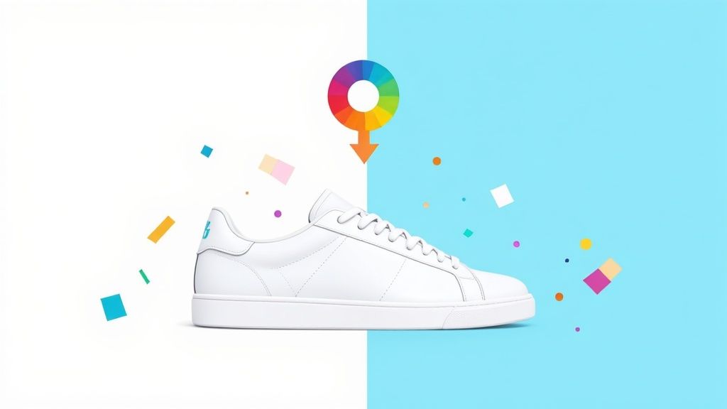
To really nail your product photos, you need to think about the background color. The quickest way to do this is with an AI tool that strips away the original background instantly. After that, you can drop in a clean, neutral color like white or light gray, or even pop in your specific brand color using its hex code. This simple step is what gives your product images that professional, consistent look that sells.
Why Background Color Matters in E-commerce
When someone lands on your product page, their first impression is almost entirely visual. It happens in a flash. Before they even think about reading your carefully written description, they've already made a subconscious call on your product based on the photo. This is where something as simple as choosing the right background color becomes a surprisingly powerful sales tool.
A clean, consistent background isn't just about looking nice; it's about building instant trust. It sends a clear signal to the shopper: you're a professional who cares about the details. On the flip side, messy or distracting backgrounds can plant a seed of doubt, making a product feel cheaper or less valuable. A uniform backdrop across all your listings creates that cohesive, high-end brand experience everyone's chasing.
The Psychology of a Clean Slate
Think of your product's background as its stage. A cluttered stage pulls focus away from the star of the show, right? The exact same thing happens with your product photos.
A neutral background, like a crisp white or a soft gray, basically hits the reset button visually. It strips away all the noise, forcing the shopper's eye right where you want it: on your product. This lets them see the little details, the texture, and the quality without any other elements in the frame competing for attention. This isn't just a designer's preference; it's a strategic move to make the path from "looking" to "buying" as short as possible.
By minimizing visual noise, you aren’t just cleaning up a photo—you're making the value of your product crystal clear. A simple background sends one direct message: this product is the only thing that matters right now.
The data backs this up. Different background colors can have a noticeable effect on how customers perceive your products and how they behave on your site.
Impact of Background Color on E-commerce KPIs
| Background Color Type | Primary Benefit | Best For | Potential Drawback |
|---|---|---|---|
| Pure White (#FFFFFF) | Maximizes clarity and meets marketplace requirements. | Amazon, eBay, and multi-brand retailers. | Can feel sterile if not styled well; may wash out light-colored products. |
| Light Gray/Neutrals | Adds subtle depth and sophistication. | Lifestyle brands, premium goods, apparel, and home decor. | Less "pop" than pure white; requires careful color balancing. |
| Brand Colors | Reinforces brand identity and recognition. | Direct-to-consumer (DTC) websites, social media marketing. | Can distract from the product if too bold or clashing. |
| Bold/Vibrant Colors | Creates high energy and grabs attention in feeds. | Youth-focused brands, cosmetics, and promotional campaigns. | Can cheapen the look if overused; may not appeal to all demographics. |
Ultimately, the goal is to choose a background that makes your product the hero, whether that's through the quiet support of a neutral or the confident statement of a brand color.
Building Brand Identity Beyond White
While pure white is the undisputed king for getting your products listed on marketplaces like Amazon, it’s not your only move, especially for building a memorable brand.
Using a consistent, on-brand color across your own website and social media feeds can create incredibly powerful brand recognition. Think of a signature pastel pink for a beauty brand or a deep, moody navy for a luxury leather goods store. These colors help customers spot your products instantly in a crowded, scrolling feed.
The real key here is consistency. Whether you stick with stark white for ultimate clarity or go bold with a color that defines your identity, applying it across your entire product line is what builds that professional, unforgettable brand image. This isn't just fluff—studies show that for over 60% of online shoppers, high-quality images are the most critical factor in their decision to buy.
The demand for tools that make this possible is exploding. The AI image editor market is expected to jump from USD 88.7 billion in 2025 to a massive USD 229.6 billion by 2035. If you want to dive deeper, you can explore more data on AI image statistics.
Your Instant Workflow with AI Background Editors
Forget spending hours tracing pixels in complicated software. These days, the smartest way to change a photo's background color is with AI. Tools built specifically for e-commerce sellers now do all the heavy lifting, transforming what used to be a tedious chore into a quick, almost satisfying, workflow.
You no longer need to be a design guru to get professional-looking shots. The focus shifts from wrestling with technical settings to just getting the job done, letting you churn out a high volume of consistent, on-brand images in minutes.
Being able to quickly swap out a background is a huge deal for modern digital marketing. It's no surprise the global photo editing software market was valued at $449.2 million in 2023 and is projected to hit $886.2 million by 2032. This explosion is fueled by the demand for tools that make tasks like this one dead simple for online sellers.
Getting Started with an AI Editor
The whole process is refreshingly simple. Most AI-powered platforms, like ProdShot, are built around a simple drag-and-drop interface. All you have to do is upload your raw product photo. For the best results, start with an image that’s well-lit and where your product stands out clearly from its original surroundings.
Once your image is uploaded, the AI gets to work. Within seconds, it scans the photo, zeroes in on the main subject, and cleanly removes the background. That single click replaces the painstaking manual process of tracing around your product with lasso or pen tools. It's a game-changer.
This quick visual shows exactly how a clean, professional product image guides a customer from just looking to actually buying.
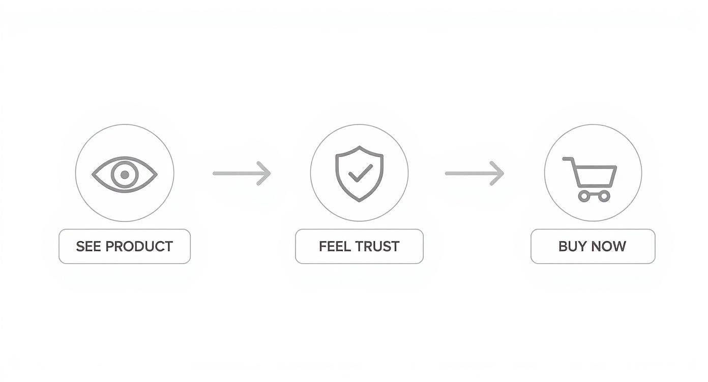
It’s clear that a high-quality visual isn't just nice to have; it's the first step toward building the trust you need to make a sale.
Choosing and Applying Your New Background
With the old background gone, you have a clean slate. This is where you bring in your new color. You’ve got a few ways to do this:
- Select from a Preset Palette: Most tools offer a curated selection of popular e-commerce background colors, like pure white, light grays, and other soft neutrals that just work.
- Use a Color Picker: This lets you visually select any shade you want from a full-spectrum color wheel.
- Enter a Hex Code: For perfect brand consistency, you can punch in the exact hex code of your brand’s color (like #F5F5F5 for a specific off-white).
Pro Tip: Keep your brand's hex codes in a note or document you can easily access. This simple habit makes sure every single product photo is perfectly on-brand, strengthening your visual identity across all your sales channels.
After applying the new color, the tool gives you a final, polished image. As AI makes background editing a breeze, it's worth exploring the broader applications of AI for ads to see how you can automate even more of your marketing creative.
From here, you can download the image in whatever format your marketplace requires. If you want to see just how stunning the results from these automated workflows can be, check out our deep dive on using an AI product photo generator.
Polishing Your Edits for a Professional Finish
An AI tool can get your product photo about 90% of the way there. But that last 10%? That’s where the magic happens. The small, manual refinements are what separate a good-enough image from a great one that actually sells. It’s all in the details—this is how you create that seamless, professional look that builds trust and makes your brand look legit.
Once you’ve swapped out the background color, it's time to zoom in and play detective. You're looking for the subtle giveaways of an edit, making sure your product looks like it was shot in a high-end studio, not just dropped onto a colored square. Trust me, these tiny tweaks make all the difference.

Nail Your Brand Colors with Precision
Brand consistency is everything. If your website uses a very specific shade of off-white, your product photos need to match it perfectly. Just eyeballing the color isn't going to cut it.
The best way to guarantee a perfect match is by using a hex code. This is a six-character code that represents an exact color, like #F7F5F2 for a warm, creamy white. Using the hex code ensures every single image aligns with your brand's visual identity, no questions asked. Most editing tools, even the AI-powered ones, have a simple input field where you can paste it right in.
Add Realistic Shadows to Ground Your Product
One of the most common rookie mistakes is a product that looks like it's floating in space. That "pasted-on" look is a dead giveaway, and it happens when you forget to add shadows to give the object a sense of place and depth.
Adding a subtle, soft drop shadow is a non-negotiable step for realism. It grounds the product, making it look like it's actually sitting on a surface. Here’s what you should be aiming for:
- Softness: Ditch the hard, dark lines. A realistic shadow is a little blurry and diffused around the edges.
- Direction: Make sure the shadow is cast away from your main light source. This simple detail keeps things looking natural.
- Opacity: Less is more. Keep the shadow’s transparency low—somewhere between 15-30% is usually plenty to add depth without being a distraction.
A well-executed shadow is one you don't even notice. Its job is to add realism so subtly that the viewer just accepts the image as real, without ever questioning the edit.
This small step has a massive impact on how people perceive the quality of your photo. If you want to dive deeper into professional finishing touches, exploring a guide on product photo retouching can give you even more advanced techniques to play with.
Hunt Down and Eliminate Edge Halos
When an AI removes a background, it can sometimes leave behind a faint, bright outline around the product. This is often called a "halo" or "fringing," and it screams "this background was edited."
To fix this, get in close and inspect the edges of your product, especially around curves or any tricky details. Most editing software has edge refinement tools. Look for settings like "feathering" or "edge blur" that can soften the transition between your product and the new background. Applying a tiny, one- or two-pixel feather is often all it takes to make the edge blend flawlessly and complete that professional look.
Getting Your Images Ready for Amazon, Shopify, and Etsy
https://www.youtube.com/embed/FaD5MOsibrs
So you’ve perfected your product shot and changed the background color to match your brand. Awesome. But before you rush to upload, there's a final, crucial step that can make or break your efforts. A stunning image is useless if it gets rejected by a marketplace or slows your website to a crawl.
Each platform—be it Amazon, Shopify, or Etsy—plays by its own rules. Ignoring them can lead to blurry photos, frustrating upload errors, and, worst of all, lost sales. Think of this next part as your technical pre-flight check. Getting these settings right ensures your images aren't just compliant but are actually optimized to give customers the best possible experience.
Meeting Marketplace Technical Requirements
Every major e-commerce platform has specific guidelines for a reason: to create a consistent, high-quality shopping environment. Amazon, for instance, is notoriously strict. For any main product image, they demand a pure white background and a minimum size of 1000 pixels on the longest side.
Why are they so picky? That 1000-pixel rule enables their zoom feature, which is a game-changer for conversions. It lets shoppers get up close and personal with your product, inspecting details just like they would in a physical store. Etsy and Shopify are a bit more relaxed about background colors, but they still have best practices for dimensions and file size that you’ll want to follow.
Nailing the Right Format and Size
Choosing the right file format is all about balancing image quality with loading speed. It's a trade-off, but one that's easy to manage. Here’s the lowdown:
- JPEG (or JPG): This is your workhorse for almost all product photos. It delivers fantastic quality in a small, web-friendly file size, which is absolutely critical for keeping your page load times snappy. I always recommend exporting at a high-quality setting, somewhere between 80-90%, to keep things crisp without visible compression marks.
- PNG: Save this one for when you absolutely need a transparent background. For a product on a solid color background, a well-saved JPEG is almost always the smaller, faster, and better choice.
A slow-loading product page is a conversion killer. Your goal should be to keep image file sizes under 500 KB whenever possible without sacrificing visual clarity. A well-optimized JPEG can easily achieve this.
There’s one more technical detail that’s easy to miss: the color profile. Always, always export your images using the sRGB color profile. It’s the universal standard for the web. This simple setting ensures the vibrant colors you see on your monitor are the same ones your customers see, no matter what browser or device they're using.
E-commerce Image Export Cheat Sheet
Navigating the different specs for each platform can feel like a chore. To make it easier, I've put together this quick cheat sheet. Keep it handy, and you'll never have to second-guess your export settings again.
| Marketplace | Recommended Dimensions | File Format | Max File Size | Color Profile |
|---|---|---|---|---|
| Amazon | 1000px on longest side (2560px ideal) | JPEG, PNG, GIF, TIFF | < 10 MB | sRGB |
| Shopify | 2048 x 2048 px (for square images) | JPEG, PNG | < 20 MB | sRGB |
| Etsy | 2000px on shortest side (3000px ideal) | JPEG, PNG, GIF | < 1 MB | sRGB |
| eBay | 1600px on longest side | JPEG, PNG, GIF, TIFF | < 12 MB | sRGB |
Getting these technical details right from the start saves a massive amount of headache down the road. It ensures your hard work pays off with images that look fantastic and perform perfectly on every platform.
To take your visuals even further without blowing your budget, check out these affordable product photography tips. And if you're on Shopify and want to make this whole process even faster, learning how to remove backgrounds for Shopify can be a huge time-saver.
Solving Common Background Editing Challenges
Even the smartest AI tools can stumble and need a bit of human guidance. When you change a photo background color, you're bound to hit a few snags, especially with more complex products. But don't sweat it—most of these common hiccups are surprisingly easy to fix once you know what to look for.
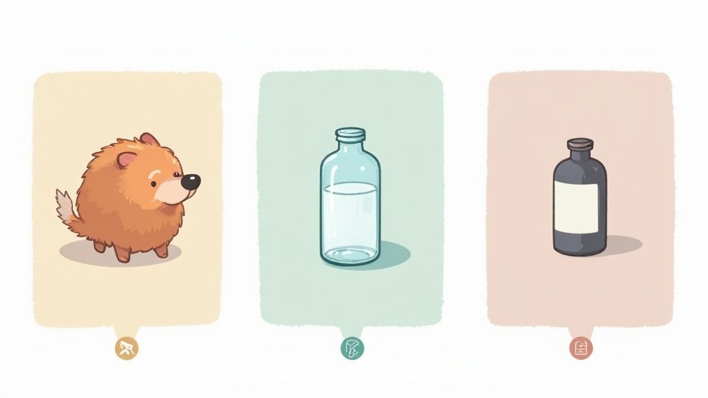
Think about products with tricky edges, like a fuzzy sweater, a pet toy covered in fur, or even just a person's hair in a lifestyle shot. These fine details can sometimes trip up an automated tool and leave you with a less-than-perfect cutout. The same goes for anything transparent or reflective, like glassware or shiny jewelry, where the old background might still show through.
Handling Complex Edges Like Hair and Fur
When you’re dealing with intricate edges, the secret usually lies in the tool’s edge refinement settings. After the AI has done its initial work, zoom right in on the problem spots. You’re looking for features called "Refine Edge" or "Feather" that help soften the transition.
- For fur or hair: A tiny bit of feathering—think just 1-2 pixels—can make all the difference. It creates a much more natural blend and gets rid of that harsh, "cut-out" look.
- For transparent items: This might require a quick manual touch-up. You'll need to adjust the selection to tell the tool that certain areas are semi-transparent, allowing the new background color to peek through realistically.
Creating Consistency Across Your Entire Catalog
Editing a single photo is one thing, but what about 50 of them? Keeping your colors consistent is absolutely key for a professional-looking storefront. The last thing you want is a product grid showing ten different shades of "white."
The easiest way to handle this is by creating and saving presets. Once you nail the perfect background color, shadow effect, and lighting for one product, save those settings as a template. Now you can apply that exact same style to every other photo with just a click, guaranteeing a uniform and polished brand image.
Pro Tip: Don't just save the color. Build a complete template that includes your preferred shadow opacity, angle, and any go-to brightness or contrast tweaks. This becomes your brand's unique visual formula.
Salvaging Photos with Poor Lighting
Let's be real—sometimes you just have to work with the photos you have. If a source image is poorly lit, with harsh shadows or a weird yellow tint, just changing the background won't fix the underlying problem. The product itself will still look off.
Before you even think about the background, use some basic adjustment tools to fix the lighting on the product. Try bumping up the brightness slightly, boosting the contrast to make details pop, and correcting the white balance to get rid of any unnatural color casts. A few small tweaks can make a mediocre photo look surprisingly professional, giving you a much stronger foundation for the background swap.
It's a common need; by 2025, it's estimated that over 70% of social media users will have edited a photo by changing its background. A separate survey found 36% of consumers expect branding in 2025 to be dominated by earthy, organic tones and futuristic AI-generated colors—a trend you can easily tap into. You can learn more about how color psychology influences branding to stay ahead of the curve.
Still Have Questions About Background Colors?
Even with the best tools, you're bound to have a few questions pop up. When you're tweaking something as important as your product photos, you want to be sure you're making the right calls for your brand and, most importantly, for your customers. I've pulled together some of the most common questions I hear to give you clear, straight-to-the-point answers.
What’s the Best Background Color for Product Photos?
For most e-commerce, especially on platforms like Amazon, pure white (#FFFFFF) is the undisputed champion. It's often a strict requirement, and for good reason—it creates a clean, distraction-free stage that puts your product in the spotlight. This approach maximizes clarity and keeps you compliant with marketplace rules.
But what if you're selling something that's white or a very light color? It can easily get washed out against a pure white backdrop.
In that scenario, a light gray or a soft off-white is your best friend. It provides just enough contrast to make the product pop while still feeling neutral and professional. If you're selling on your own website or posting on social media, using a consistent brand color can be a game-changer for building recognition.
Can I Change the Background Without Wrecking the Quality?
Absolutely. You can definitely change the background color of a photo without losing quality, but it all comes down to the tools and the process you use. Modern AI editors are built specifically to create incredibly precise cutouts that keep the integrity of your product's edges intact.
To make sure you don't degrade the image quality, just stick to two golden rules:
- Start with a high-resolution image. The better the photo you start with, the better the final result will look. Garbage in, garbage out, as they say.
- Export correctly. Save your final image as a high-quality JPEG or a PNG. Be careful not to over-compress it, which can create ugly artifacts and blur your hard-earned details.
How Do I Make a New Background Actually Look Realistic?
The secret to an edit that doesn't scream "I was photoshopped!" is all in the details. Just dropping your product onto a new color will look flat and fake every single time. There are two things that are absolutely critical for making it believable: shadows and refined edges.
The most convincing edits are the ones nobody notices. Realism comes from recreating the subtle interplay of light and shadow that our eyes expect to see.
First, always add a soft, subtle drop shadow. This is what grounds your product, giving it weight and making it feel like it's actually sitting on a surface instead of just floating in space.
Second, zoom way in and check the edges. Look for any pixelated, sharp lines or weird "halos" left over from the original background. Use edge refinement or feathering tools to soften that transition for a seamless, natural blend. It’s these tiny tweaks that make all the difference between an amateur edit and a professional shot.
Ready to stop fussing with manual edits and transform your product photos in seconds? With ProdShot, you can automatically swap backgrounds, add realistic shadows, and generate professional, on-brand images with just a few clicks.