
Knowing how to change a photo's background color is one of those fundamental skills that can instantly level up your visuals. It’s usually about lifting your main subject out of its original setting and dropping it onto a clean, solid-colored canvas—a go-to technique in product photography and marketing. This one simple edit can dramatically improve an image's impact and make it a whole lot more versatile.
Why Changing a Photo's Background Color Matters

Swapping out a photo’s background isn’t just a cosmetic tweak. It's a strategic move that directly shapes how people see your product. A clean, consistent background gets rid of all the noise, forcing the viewer's eye right where you want it: on what you're selling. For anyone in e-commerce, this is pretty much non-negotiable.
Elevate Brand Consistency
Think about your Instagram feed or your online store. When every single product shot shares a background that fits your brand’s color palette, it just feels right. It looks cohesive and professional. This kind of consistency is what builds brand recognition and, more importantly, trust.
Instead of a chaotic jumble of different locations and lighting, you’re presenting a polished, unified storefront that looks deliberate and high-quality. A skincare brand, for instance, might use a soft pastel pink for all its product shots to bring out a feeling of gentle care. That’s branding in action.
Meet Marketplace Requirements
Big online marketplaces have rules, and they’re not messing around. Amazon, for example, demands that most primary product photos sit on a pure white background (#FFFFFF). Being able to change the background color of a photo means your listings stay compliant, avoiding rejections and getting the visibility you need.
But it's not just about following rules. A clean background makes your product pop, especially on a crowded search results page. That visual punch can be the difference between a scroll-past and a click-through.
This kind of skill is no longer just for professional graphic designers. The global photo editing software market is expected to grow by USD 606.1 million between 2025 and 2029, all because more people need accessible, powerful tools.
Key Takeaway: A smart background color change is one of the quickest ways to turn an average photo into a conversion-driving machine. It's not just about looking good—it's about getting results.
Once you’ve nailed the look, don’t forget to optimize images for web performance to keep your site fast and your users happy. Whether you tackle this yourself or lean on specialized product photo editing services, getting this process right is a huge step forward.
Get Instant Results with AI Background Changers
If you need to change a photo's background color quickly without things looking cheap, AI-powered tools are your new best friend. In the old days, this meant painstakingly tracing around your product with a mouse, battling with complex software. Now, modern AI editors do all the heavy lifting for you, giving you a professional result in just a few seconds.
The magic is in the algorithms. You just upload your picture, and the AI instantly figures out what the main subject is and separates it from the background. A task that might take a skilled designer a good chunk of time in Photoshop happens almost instantly.
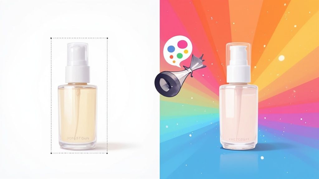
Here's a look at the kind of clean, no-fuss interface you can expect from an AI tool like ProdShot.
The whole process is incredibly simple. Upload the image, and the AI handles the tricky part of isolating your product, getting it ready for a new background.
Your AI Workflow from Start to Finish
Once your product is neatly cut out, you get to the fun part. Most AI editors will show you a simple color palette. You can click a preset color, use a dropper to pick a shade you like, or—and this is key for branding—type in a specific HEX code.
For example, let's say your brand's core blue is #0A4B8B. You can plug that code straight into the editor. This guarantees that every single product photo is perfectly on-brand, building a consistent, professional look across your entire store.
These tools have completely changed the game for sellers and marketers. It's no surprise the global AI image editor market, valued at USD 88.7 billion in 2025, is expected to jump to USD 229.6 billion by 2035. That's a massive indicator of just how much businesses rely on this kind of automation.
Fine-Tuning Your AI-Generated Image
After you’ve picked your new background color, the last step is a quick quality check. Zoom in and look closely at the edges of your subject. The best AI tools are shockingly accurate, but it never hurts to double-check for any little mistakes, especially around tricky areas like fuzzy fabrics or intricate details.
A great example of this is the workflow offered by an AI product photo generator, which is built to make this entire process seamless. And these AI tools aren't just for changing colors; you can also explore various image-to-image AI transformations for all sorts of powerful photo edits.
Here’s a quick mental checklist before you hit download:
- Check for Clean Edges: Did the AI create a smooth, believable cutout around your product?
- Verify Color Accuracy: Is the HEX code you typed in showing up exactly as you expected?
- Consider Shadows: Some of the better AI editors can add realistic drop shadows, which really helps make your product look like it's sitting on the new background instead of just floating.
This automated approach puts professional-grade photo editing into anyone's hands. You get the incredible speed of AI without sacrificing the quality you need for a polished final image—an absolute must-have for modern e-commerce.
Achieve Perfect Edits with Photoshop
When an automated tool just won't cut it and you need absolute, pixel-perfect control, you turn to Adobe Photoshop. It’s the industry standard for a reason. Manually selecting your subject gives you the power to tackle complex images, fine-tune every last edge, and walk away with a flawless, professional result. This method is all about precision.
It definitely takes more time than a one-click AI solution, but the payoff is huge: a clean, believable composite that stands up to close inspection. This is the workflow you pull out for a high-stakes campaign or your flagship product shots.
Mastering Subject Selection
First things first, you have to isolate your subject from its original background. This is the most crucial part of the whole process. Photoshop has a fantastic suite of tools for this, and the one you choose really depends on the subject you're working with.
For images where the subject is clear and well-defined against a simple background, the Object Selection Tool is an amazing starting point. You just draw a rough box around your object, and Photoshop’s AI, Sensei, does a surprisingly good job of finding the edges.
But when you're dealing with products that have sharp, geometric lines—think electronics or furniture—nothing beats the Pen Tool. It lets you create a super precise vector path around your subject, guaranteeing perfectly clean lines. It takes some practice, but the crisp results are more than worth the effort.
Refining Your Edges with Select and Mask
Once you've got that initial selection, the real magic happens in the Select and Mask workspace. This is where you take a good selection and make it great. It's especially important for those tricky subjects with soft or intricate edges, like a model's hair, a fuzzy sweater, or the delicate fur on a pet product.
Inside this workspace, you have a few powerhouse tools:
- Refine Edge Brush: This is your best friend for hair and fur. Just gently paint over those complex areas, and Photoshop will intelligently separate the fine strands from the background.
- Feathering: This softens the selection edge just a tiny bit, helping the subject blend more naturally with its new background. A small value, like 0.5 to 1 pixel, is often all you need.
- Contrast: This slider sharpens the selection edge back up, which is useful after feathering to bring back some definition without it looking harsh.
Getting these details right is what separates an amateur edit from something truly professional. I recommend spending quality time in this workspace, toggling the view modes to see your selection against different backdrops (like black, white, or a transparent grid) to catch any imperfections.
Creating a Non-Destructive Background
With your subject perfectly isolated, it’s time to bring in the new background. The best way to do this is with a non-destructive method, which lets you change your mind later without having to redo all that hard work. Instead of just filling a new layer with color, you’ll want to create a Solid Color Fill Layer.
Just go to Layer > New Fill Layer > Solid Color. This drops a new layer beneath your masked subject. The beauty of this technique is that you can double-click that fill layer's thumbnail anytime to pop open the color picker and choose a new shade. You can test out dozens of colors in seconds.
This whole process—whether manual or AI-driven—boils down to a few core steps.
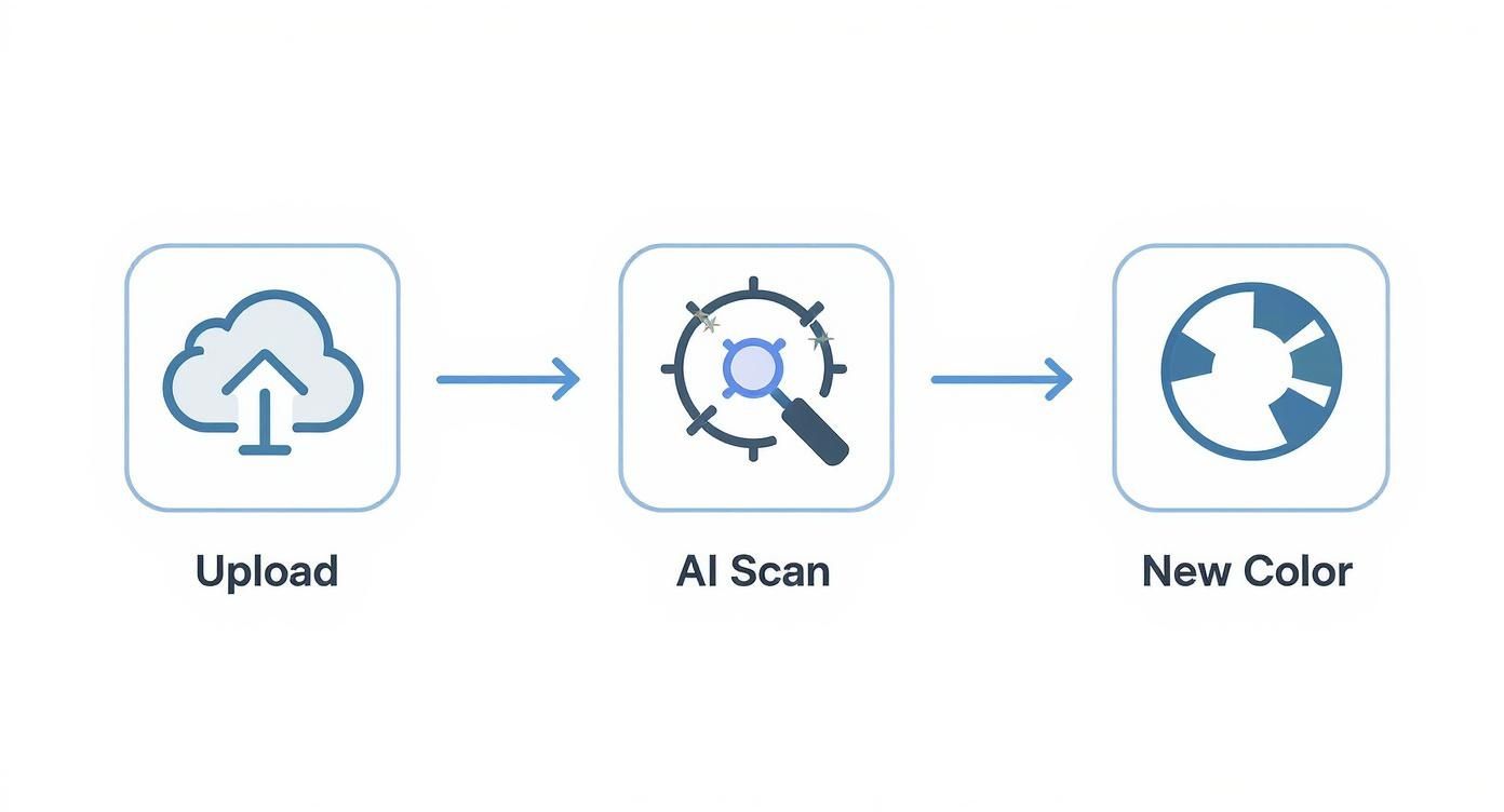
This visual shows the fundamental workflow: upload an image, process it to isolate the subject, and then apply a new background color. It's the foundation of any background change.
Pro Tip: Always, always save your work as a PSD file with all layers intact. This preserves your selection masks and fill layers, so you can easily come back later to make adjustments or export versions with different background colors for various campaigns or platforms.
This manual process requires a bit more patience, no doubt. But the level of control you get is simply unmatched. For a deeper dive into these kinds of professional techniques, it's worth exploring expert product photo retouching services that live and breathe these precise methods every day. Mastering this workflow ensures your images aren't just edited—they're truly polished.
How to Choose the Right Background Color
Picking a new background color isn't as simple as choosing your favorite shade from the rainbow. Get it right, and your product jumps off the screen, stirs up the right emotions, and can even nudge a customer toward the “buy” button.
But a bad choice? It can clash with your subject, make your whole setup look amateurish, and completely chip away at your brand’s credibility.
Think of it this way: a fiery, high-energy orange might be the perfect backdrop for a sports drink, but it would feel jarring and out of place for a luxury timepiece. Your background sets the stage and starts telling a story before anyone even focuses on the product itself. The goal is to find a color that supports the subject, not one that steals the show.
Aligning Color with Your Brand and Audience
Before you go any further, your first stop should always be your brand identity. If your brand already has a specific color palette, sticking to it is a no-brainer. It creates that cohesive, recognizable look across your website, social media, and ads. Consistency is what builds trust.
Once you’ve got your brand guide in mind, think about who you're trying to reach. This is where a little color psychology comes in handy, as different colors can spark very different feelings.
- Blues and Greens: These colors are often tied to feelings of trust, calm, and the natural world. They’re a great fit for products in the health, finance, or eco-friendly spaces.
- Reds and Oranges: Talk about high energy. These shades create a sense of excitement and urgency, making them perfect for grabbing attention during sales, promoting special offers, or showcasing food.
- Blacks and Grays: Want to communicate sophistication, luxury, or modern tech? These are your go-to colors. They work beautifully for high-end fashion, electronics, or automotive products.
The technical side offers a ton of flexibility. The standard RGB color model used in photo editing and web design gives you over 16 million possible combinations. Even the simple hex codes used for websites provide thousands of options, so you’re guaranteed to find the perfect hue. You can dive deeper into the technical standards of web colors on Wikipedia.
To help you get started, here’s a quick-reference table for matching colors to their common psychological associations and use cases.
Background Color Selection Guide
| Color | Psychological Association | Best For |
|---|---|---|
| White | Purity, simplicity, cleanliness | E-commerce (Amazon standard), minimalist brands, highlighting product details |
| Black | Luxury, power, sophistication | High-end electronics, luxury goods, bold fashion statements |
| Gray | Neutrality, balance, professionalism | Corporate branding, tech products, when a softer alternative to white is needed |
| Blue | Trust, security, calm | Financial services, healthcare, technology, corporate branding |
| Green | Nature, health, growth, wealth | Eco-friendly products, wellness brands, organic food, financial apps |
| Red | Excitement, urgency, passion | Sales promotions, food and beverage, clearance items, grabbing attention |
| Orange | Fun, energy, friendliness | Youth brands, creative services, call-to-action buttons |
| Yellow | Optimism, warmth, happiness | Children's products, creative brands, highlighting key features |
| Pink | Femininity, romance, playfulness | Beauty products, children's toys, brands targeting a female demographic |
| Purple | Royalty, creativity, wisdom | Luxury goods, beauty products, innovative or artistic brands |
This table is a great starting point, but always test what resonates best with your specific audience and product.
Practical Rules for E-Commerce
Sometimes, the decision is already made for you. If you’re selling on a major online marketplace, you absolutely have to know their rules. Amazon, for one, is famous for its strict requirement that all primary product photos must have a pure white (#FFFFFF) background.
This rule isn’t just for looks; a white background strips away all distractions, creates a consistent look across millions of listings, and makes your product’s details pop on any screen. It’s a clean, uniform shopping experience that has become the gold standard for a reason.
Even if you aren’t locked into a platform’s rules, a neutral background—like a clean white, a soft gray, or even a warm beige—is almost always a safe and effective bet. It puts the entire focus right where it belongs: on your product.
When you change the background color of a photo, remember that your one and only goal is to make the subject look its best. Often, the simplest choice is the most powerful one. This strategy guarantees your product remains the hero of the image, every single time.
Avoiding Common Background Editing Mistakes
Knowing how to change the background color of a photo is one thing, but making it look believable is a whole different ball game. Even with the best tools, a few common slip-ups can instantly scream "this has been edited!" Learning to spot and fix these tells is what separates a quick, amateur job from a truly professional image.
The Dreaded Halo Effect
One of the most frequent offenders is the dreaded halo effect. This happens when a faint outline of the old background stubbornly clings to the edges of your subject, creating a fuzzy, glowing border. It’s a dead giveaway that the background was swapped out and looks especially bad on high-contrast images.
This almost always comes from a selection that isn't quite tight enough. If you’re in a tool like Photoshop, the fix is to refine your selection mask. I've found that using a tiny bit of feathering (think 0.5 pixels) can soften the edge just enough to blend, while a slight contrast bump helps sharpen it back up for a clean finish.
Fixing Jagged Edges and Color Bleed
Another classic amateur mistake is leaving behind jagged, pixelated edges. This pops up when you use automated tools on low-resolution images or make a rough, freehand selection. The result is a subject that looks like it was cut out with a pair of craft scissors. If you spot this, your best bet is to go back and smooth out your selection path or lean on a refinement tool to create a more natural-looking curve.
Color bleed is a more subtle but equally damaging issue. This is when the color of the original background reflects onto the edges of your subject. For example, a product shot on a bright green screen might leave a faint green tint along its sides. It just looks off.
Key Insight: To get rid of color bleed, my go-to trick is to create a new layer clipped to the subject. Set its blending mode to 'Color,' then simply paint over the affected edges with a neutral or complementary color. This technique neutralizes the unwanted color spill without messing with the subject's texture or lighting.
Mismatched Lighting and Shadows
This is probably the biggest hurdle: making your subject look like it actually belongs in the new environment. If the lighting on your object doesn't match the new background, the whole image will feel disconnected and fake. A subject lit from the left just looks bizarre against a background where the implied light source is on the right.
The solution? You need to add realistic shadows to ground the object. Even a simple drop shadow can create a sense of depth and make things click.
- Create a Subtle Ground Shadow: On a new layer underneath your subject, make a soft, dark oval shape where it would touch the "ground."
- Lower the Opacity: Drop the shadow layer's opacity to somewhere between 15-30%. You want it to be felt, not seen.
- Apply a Blur: Use a Gaussian blur to soften the shadow’s edges, making it look much more natural and less like a sticker.
By paying attention to these small details—clean edges, correct colors, and believable lighting—you can ensure your final image looks polished and professional, not like a rushed cut-and-paste job. These little adjustments make all the difference.
Got Questions? We’ve Got Answers.
When you're deep in the editing process, a few common questions always seem to pop up. Let's tackle some of the most frequent ones to make sure your final images are pixel-perfect and ready to perform, no matter where you post them.
What’s the Best Format to Save My Photo In?
This is a classic question, and the answer really comes down to where your image is going to live. There isn't one single "best" format, but there are definitely right and wrong choices for specific situations.
For almost any online use—think e-commerce product pages, social media posts, or your website's hero banner—JPEG is your best friend. It gives you a fantastic balance between solid image quality and a small file size. A smaller file means your website loads faster, and that's a huge deal for user experience and SEO.
But what if you need a transparent background? Maybe you want to place your product on different colored sections of your website without a clunky white box around it. In that case, you absolutely must use PNG-24. It’s the standard for web images that need transparency. If you're prepping images for professional printing or you know you’ll be doing more heavy-duty editing later, TIFF is the industry go-to. It's a "lossless" format, meaning it doesn't lose a single bit of quality no matter how many times you save it.
Can I Use a Gradient Instead of a Solid Color?
Absolutely, and you should consider it! A subtle gradient can add a layer of depth and polish that makes your product photo look more dynamic and professional. It’s a simple trick to elevate your images without being distracting.
Most modern editors, including ProdShot, have a built-in 'gradient' option right next to the solid color selector. This lets you pick your colors, play with the angle, and see how it looks in real-time.
If you’re a Photoshop user, the workflow is just as straightforward. Instead of making a 'Solid Color' fill layer, just choose 'Gradient' from the exact same menu (Layer > New Fill Layer > Gradient). You'll get total control to mix and match colors and create a custom background that makes your product pop.
My Take: Gradients are one of the easiest ways to add a sophisticated, high-end feel to your product shots. They're just as simple to create as a solid color, so it's definitely worth experimenting with.
How Can I Make Sure the Background Color Matches My Brand Exactly?
When it comes to branding, "close enough" is never good enough. Your brand colors need to be spot-on every single time to maintain a strong, cohesive look.
The only way to nail this is by using the specific color codes from your brand's style guide. Don't just eyeball it or use a color picker to sample it from another image—that's a recipe for inconsistency. Every decent photo editor lets you input a HEX code (like #1A2B3C) or RGB values directly. Punch in that code, and you've guaranteed your background color is a perfect match across every single piece of marketing material.
How Do I Fix the Lighting to Match the New Background?
This is what separates a good edit from a great one. You need to make your subject look like it actually belongs in its new environment. A clashing light source is a dead giveaway of a sloppy edit.
In a tool like Photoshop, my go-to technique is using adjustment layers like 'Curves' or 'Levels' and "clipping" them directly to the subject's layer. This is a game-changer because it lets you tweak the brightness, shadows, and contrast of just your subject, leaving the new background untouched.
Another pro tip is to add a very subtle drop shadow using layer styles. This small touch creates a sense of depth, "grounding" the object so it doesn't look like it's just floating in space. It's these little details that make the whole image feel realistic and cohesive.
Ready to skip the manual work and create stunning, marketplace-ready product photos in just a few clicks? With ProdShot, you can automatically remove backgrounds, add any color you want, and generate professional-quality images without any design skills. Try ProdShot for free today and see just how easy it is to make your products stand out from the crowd.