
That 'cinematic' look you see in movies isn't just for Hollywood. In fact, some of the smartest e-commerce brands are borrowing these visual secrets to stop the scroll, make their products feel more desirable, and build a brand that people remember.
It’s about moving beyond basic photo editing and into the realm of visual marketing. A cinematic color grade uses specific color palettes and contrast to tell a story and create a mood. This isn't just slapping on a filter; it's a strategic process that can make your products feel more premium and, ultimately, drive more sales.

From Product Shot to Brand Story
Think about it. When a customer lands on your product page, the color and mood are the first things their brain processes. A dark, moody grade can instantly make a watch or a bottle of whiskey feel sophisticated and luxurious. On the other hand, a bright, airy look can make home goods feel clean and aspirational.
The whole goal is to shift your mindset. You're not just selling an item; you're selling an experience, a lifestyle, or a feeling. Cinematic color grading is your most powerful tool for communicating that without saying a word.
- Evoke Emotion: Colors have a real psychological impact. Warm tones can feel comforting and nostalgic, while cool tones often come across as sleek and futuristic.
- Create Perceived Value: A professional, consistent visual style makes your entire brand look more polished and trustworthy. This alone can help justify a higher price point.
- Enhance Product Features: You can use strategic contrast and color to pull the viewer's eye toward the most important details of your product, highlighting its quality and design.
The difference between a simple product photo and a cinematic one is storytelling. A basic photo says, "Here is a product." A cinematic photo says, "Imagine this product in your life."
To really get this right, you need to see how even a simple item can be turned into a captivating visual, much like a stunning photorealistic cinematic scene featuring a premium product. By deliberately controlling the tones in your shadows, midtones, and highlights, you're guiding the viewer's emotional response. This is how you turn a simple online shop into a memorable brand experience.
Shooting Your Products with the Grade in Mind

A truly magnetic cinematic grade isn't something you just slap on in an editing app. The real work—the secret, really—begins the second you pick up your camera. When you learn to shoot with your final grade in mind, you turn a potentially frustrating editing session into a fluid, creative process.
The goal here is simple: capture as much visual information as humanly possible. This gives you the wiggle room you need later to push and pull colors without the image breaking down into a pixelated mess. Think of it like cooking—the better your raw ingredients, the more incredible your final dish will be.
Maximizing Your Camera's Data
For product photos, this means one thing: shoot in RAW format. A standard JPEG might seem convenient, but it compresses your image and tosses out a huge amount of color data to keep file sizes small. A RAW file, on the other hand, is the digital equivalent of a film negative, holding every last bit of unprocessed data from your camera's sensor.
The same principle applies to video. You'll want to use a LOG picture profile, like S-Log3 on Sony cameras or C-Log on Canons. LOG footage looks flat, gray, and lifeless straight out of the camera, but don't let that fool you. That's by design. It preserves an enormous dynamic range, clinging to details in the brightest highlights and deepest shadows that would otherwise be lost.
This whole approach has its roots in Hollywood. Back in the 2000s, filmmaking took a giant leap when it embraced digital color grading. The movie 'O Brother, Where Art Thou?' famously became the first feature film to be entirely graded digitally, creating its iconic sepia-toned, Dust Bowl aesthetic. This "digital intermediate" process gave filmmakers unprecedented control, a philosophy that now extends to product sellers through tools like ProdShot, which apply that same level of control to achieve color grading cinematic looks without the Hollywood budget. You can explore more about the history of color in film and see how these techniques evolved.
Control Your Lighting and Environment
The light you use on set is your primary tool for building mood and depth. You don’t need a truck full of expensive gear, either. Often, a single, strong key light is all it takes to carve out dramatic shadows and shapes, mimicking that high-contrast look you see in so many films.
Pro Tip: Never mix light sources with different color temperatures. That cool blue light from a window clashing with a warm yellow lamp in the room will create a post-production nightmare. Kill the overhead lights and stick to one consistent light source for a clean, professional foundation.
Here are a few habits to get into during every shoot:
- Set a Custom White Balance: Grab a simple gray card and take a picture of it. This tells your camera exactly what "neutral gray" looks like under your specific lighting, giving you a perfect, consistent starting point for every shot.
- Expose Consistently: When shooting in LOG for video, it’s often best to slightly overexpose your footage, a technique known as "exposing to the right." This simple trick dramatically reduces noise in the shadows, giving you a much cleaner image to grade.
- Keep Your Background Simple: A neutral or dark background does more than just look clean. It prevents distracting colors from bouncing onto your product and makes it far easier to isolate your subject if you decide to grade the background and foreground separately.
By folding these practices into your shooting routine, you're setting yourself up for success. You’ll spend less time fixing problems in post-production and more time having fun and getting creative with your colors.
A Practical Guide to Color Theory for Sellers
Let's be honest, you don't need a degree in art history to sell products online. Forget the dense textbooks. For you, color theory isn't an academic chore—it's one of the most powerful sales tools you have. When you learn the basics of a color grading cinematic style, you're not just making pretty pictures. You’re tapping directly into your customer’s emotions to build a mood that makes your products feel essential.
Think of it this way: a high-end watch brand often uses a cool, desaturated look with soft grays and blues. That’s no accident. It’s a deliberate choice to create a feeling of timeless luxury. On the other hand, a shop selling rugged hiking boots would do better with warm, earthy tones like deep greens and rich browns to evoke adventure and the great outdoors. Your colors tell a story.
This idea of using color to set a mood is as old as movies themselves. It all started back in the 1890s, with filmmakers painstakingly hand-tinting individual frames to guide the audience’s feelings. This eventually led to the vibrant Technicolor of films like The Wizard of Oz, where color was a character in itself. Today, modern tools give you that same storytelling power for your product photos. If you're curious, you can see just how film color evolved into a storytelling powerhouse over the last century.
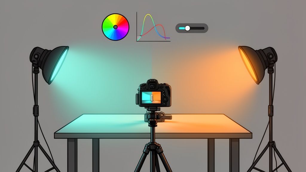
Choosing Your Cinematic Palette
So, where do you begin? The easiest and most famous cinematic palette is teal and orange. There's a reason it's everywhere. This complementary color scheme works because it naturally makes warm tones (like skin) pop against cooler backgrounds (like the sky or a neutral wall). For your products, this is a fantastic way to draw your customer's eye exactly where you want it.
Another great approach is an analogous color scheme. This just means picking colors that sit side-by-side on the color wheel—think blue, green, and a hint of yellow. This creates a really harmonious and cohesive look that feels natural, making it perfect for brands centered on wellness, nature, or organic products.
Key Takeaway: Your color palette shouldn't just look good; it should mean something. Ask yourself: "What emotion am I trying to sell?" The answer will guide your color choices far more effectively than any trend.
The Impact of Saturation and Contrast
Beyond just picking your colors, how you present them is what seals the deal. Saturation and contrast are your two main controls for dialing in the intensity and mood of your visuals.
Let's break that down:
- High Saturation: Think bright, vivid, energetic colors. This is perfect for grabbing attention and creating a sense of fun. It works great for kids' toys or any brand with a bold, youthful vibe. Just be careful not to push it too far, as over-saturated images can start to look cheap.
- Low Saturation (Desaturation): Muted, almost washed-out colors feel more serious, nostalgic, or sophisticated. A desaturated look can make a product feel premium and understated. It’s a go-to for luxury goods and minimalist brands.
- High Contrast: This creates strong, dramatic differences between the light and dark parts of your image. You get a bold, graphic look that has a lot of depth and makes your product pop right off the screen.
- Low Contrast: A soft, flatter image with gentle shadows feels dreamy, airy, and light. This is an ideal match for beauty products, baby items, or any brand going for a soft, ethereal aesthetic.
When you intentionally combine a specific color palette with the right levels of saturation and contrast, you're no longer just editing a photo. You’re becoming a visual storyteller, crafting an experience that connects with your customers and pushes them to click "add to cart."
Your Cinematic Grading Workflow in Action
So you’ve shot your footage with grading in mind. Now for the fun part: bringing that cinematic vision to life. The key to getting consistent, professional results is having a repeatable workflow. I like to think of it as a simple but powerful sequence: Correct, Create, and Refine.
This approach stops you from chasing your tail with random slider adjustments. By building a solid technical foundation first, your creative choices will have a much bigger impact.
First, Nail the Basics: Primary Correction
Every stunning color grade starts from a clean, neutral canvas. This first step, often called primary correction, isn’t about style—it’s all about accuracy. Your only job here is to make the image look as true-to-life as possible.
Start by fixing your white balance. You want whites to be pure white and grays to be perfectly neutral, with no weird color cast. From there, tweak the exposure and contrast until the shot is balanced, with no crushed blacks or blown-out highlights. Think of it as a quick technical cleanup pass. You’re simply fixing any issues from the shoot to give yourself the perfect starting point.
From Technical to Creative
With your image balanced and neutral, you can finally start painting with color and light. This is where you inject the mood and emotion that will make your product visuals stand out. We’ll focus on a few essential tools you can find in almost any editor, from powerful desktop software like DaVinci Resolve and Adobe Lightroom to capable mobile apps.
A great place to start is with the Curves tool. By creating a gentle 'S-curve'—lifting the highlights and pulling down the shadows—you can instantly add that punchy, cinematic contrast that gives images a sense of depth. It's one of the fastest ways to make a flat shot feel dynamic and rich.
Next, turn your attention to the Color Wheels or Color Balance sliders. These are your heavy hitters for creating a specific mood. Want that classic teal-and-orange Hollywood look? Try pushing a touch of teal or blue into your shadows and a bit of warm orange or yellow into the highlights. This one simple move can completely transform the feeling of a scene.
This chart breaks down how you move from a basic understanding of color to intentionally building a palette that evokes a specific mood.

It’s a reminder that great grading is a deliberate process, not just a happy accident from moving sliders around.
To get a better handle on these core adjustments, let's look at what each tool does and how it contributes to that cinematic feel.
Core Cinematic Color Grading Adjustments
| Adjustment Tool | Purpose (Primary Correction) | Creative Use (Cinematic Look) |
|---|---|---|
| Exposure/Contrast | Set a balanced starting point; avoid clipped whites/blacks. | Create a high-contrast "S-curve" for depth and punch. |
| White Balance | Remove unnatural color casts; ensure whites are pure white. | Introduce a subtle, overall color tint (e.g., warm or cool) for mood. |
| Color Wheels | Correct color balance in shadows, midtones, and highlights. | Push complementary colors (e.g., teal & orange) into shadows and highlights. |
| HSL Panel | Tweak specific colors to restore accuracy or fix issues. | Isolate and shift a specific color (e.g., make greens more desaturated). |
| Saturation/Vibrance | Restore natural color levels after LOG/RAW correction. | Use Vibrance to boost muted tones without oversaturating skin or products. |
| Sharpening/Clarity | Add crispness and detail to a soft image. | Add a subtle "glow" or "bloom" by reducing midtone contrast (negative clarity). |
These are the fundamental building blocks you'll use in nearly every grade. Mastering them gives you the creative control to build any look you can imagine.
Refining the Final Look
The last stage is all about precision and dialing everything in. Here, you’ll lean on tools like the HSL (Hue, Saturation, Luminance) panel for surgical adjustments.
For example, let's say that teal you added to the shadows made your product's red logo look a little muddy. Using the HSL panel, you can select just that red hue and bring back its proper saturation and brightness without messing up the beautiful mood you’ve created everywhere else. It’s all about control.
The goal of a cinematic grade is to enhance the story, not to distract from it. A successful grade feels intentional and supports the product without overpowering it.
Managing saturation is another critical final step. A rookie mistake is to just crank up the global saturation, which makes everything look garish and fake. A much better approach is to use the Vibrance slider. It intelligently boosts the less-saturated colors more than the already vibrant ones, adding life to your image without making product colors or skin tones look radioactive.
By following this simple yet effective workflow, you can consistently produce professional, evocative product visuals. For those looking to streamline the editing process even further, understanding the techniques used in professional product photo retouching can offer valuable insights.
Using LUTs and Presets Without Looking Cheap
Look-Up Tables (LUTs) and presets can be incredible shortcuts for getting that specific color grading cinematic style. But let's be honest, they come with a huge catch. Just slapping a trendy LUT on your product shot and calling it a day is the quickest route to looking generic and, frankly, a little cheap. The real art is using them as a starting point, not a one-click fix.
Think of a LUT as a complex color recipe. It’s a tiny file that remaps every color in your image to a new one, creating an instant mood. When you use one well, it saves you from the painstaking process of building a look from scratch. But just like any recipe, you almost always have to tweak it for your specific ingredients—in this case, your unique product photo.
Making Presets and LUTs Work for You
The single biggest mistake I see sellers make is applying a LUT at full strength. More often than not, this crushes all the important details in your shadows or makes skin tones look unnatural and waxy. Instead of cranking it to 100% intensity, dial it way back.
Try applying your chosen cinematic LUT at around 50-70% opacity to start. This gives you the emotional heart of the look—the intended color relationships and vibe—without completely bulldozing your original photo. From there, you have a professional-looking base that still feels authentic, and you can jump back into your basic adjustment tools to refine it.
- Tweak Exposure and Contrast: After the LUT is applied, your image might look a bit too dark or flat. Tiny adjustments to the exposure and contrast sliders can bring back the brightness and punch you need.
- Correct White Balance: LUTs can throw a strong color cast over your whole image. A slight nudge on the Temperature and Tint sliders can bring your whites and grays back to neutral, making the grade feel much more intentional.
- Fine-Tune Saturation: Reach for the Vibrance slider instead of the main Saturation slider. Vibrance is smarter—it boosts the more muted tones without making your product's most important colors look garish or cartoonish.
A professional grade is a conversation between the LUT and your image. The LUT makes a suggestion, and you refine it until it perfectly fits your product and brand.
Building Your Own Custom Presets
Once you’ve nailed a look by blending a LUT with your own specific tweaks, don't let that effort disappear. Save that entire chain of adjustments as your own custom preset. This is, without a doubt, one of the most powerful ways to lock in brand consistency across all your product listings and marketing channels.
This process creates your brand’s visual signature. Every new photo gets the same foundational treatment, which builds a cohesive, recognizable look that customers begin to trust. It's an incredibly efficient workflow, especially if you're using a dedicated Shopify photo editor designed to apply consistent styles quickly.
Building a small library of just 2-3 of your own custom presets—maybe one for bright lighting, one for moodier shots—can save you countless hours and guarantee your store always has that polished, professional feel.
Balancing Cinematic Style with Product Accuracy

It’s easy to fall in love with a moody, atmospheric color grade. It's beautiful. But if that artistic choice misrepresents your product, it quickly becomes a business problem. When a customer orders what they think is a cherry-red dress and a burgundy one shows up, you’re dealing with more than just a return—you're dealing with broken trust.
This is the tightrope every professional brand has to walk. You want that killer aesthetic, but not at the cost of accuracy. The goal isn’t to abandon your creative vision, but to be smart about where you apply it.
Thankfully, modern editing tools give you incredible control. The secret weapon here is masking. This technique lets you digitally "fence off" your product from the background. You can drench the scene in that cinematic vibe while leaving the product itself completely untouched and true-to-life.
Protecting Your Product's True Colors
When it comes to surgically protecting color, the HSL (Hue, Saturation, Luminance) panel is your best friend. Let’s go back to that red dress. Say you’ve applied a cool, blue-toned preset that looks amazing on the background but turns the dress slightly purple. With the HSL panel, you can specifically target just the reds and shield them from the global color shift. You can dial their hue, saturation, and brightness back to perfection.
This kind of selective control is everything. As you start creating more sophisticated product visuals, mastering ecommerce image editing becomes less of a skill and more of a necessity. It’s what lets your color grading cinematic style set a powerful mood without ever lying about what you're selling.
This tension between art and commerce isn’t new. Many people think cinematic color started with The Wizard of Oz, but filmmakers were tinting film long before that to guide audience emotions. The game really changed between 1929 and 1932 when Technicolor made vibrant color films possible on a mass scale, solidifying color grading as a core part of storytelling.
The rule is simple: the background tells the story, but the product tells the truth. Never let your artistic grade compromise the color accuracy of the item for sale.
Before you hit publish on any photo or video, do one last check. Pull up your final, graded image right next to a simple, color-corrected shot of the product. Ask yourself, "Does this still look like the exact same item a customer will receive?" This one simple step gives you the confidence to get creative without risking your reputation.
Common Questions About Cinematic Color Grading
As you start exploring cinematic grading, a few common questions always seem to pop up. This is especially true when you're an e-commerce seller and your primary goal isn't just art—it's driving sales.
Let's dig into some of the most frequent hurdles and clear them up.
Can I Really Do This on My Smartphone?
You bet. Modern smartphones are packing some serious camera power these days. If your phone has a Pro or RAW shooting mode, it's capturing a ton of image data that's perfect for grading.
You don't need a fancy desktop setup to get started. Mobile apps like the free versions of Lightroom Mobile or VN Video Editor give you access to the same powerful tools we've been talking about, like curves and HSL adjustments. You can follow this entire guide right from the palm of your hand.
Is This Going to Hurt My Conversion Rates?
When done right, a cinematic grade should actually boost your conversion rates. The whole point is to make your products feel more aspirational and premium, telling a story that increases their perceived value in the customer's mind.
But—and this is a big one—you have to protect your product's color accuracy at all costs. If your grade makes a blue sweater look teal, you're setting yourself up for a wave of customer complaints and returns. Always make the product itself the hero.
What’s the Difference Between Color Correction and Color Grading?
This is probably the most important distinction to understand. They sound similar, but they are two completely different steps.
- Color Correction is the technical part. It’s about fixing problems and making the image look neutral and true-to-life. You’re adjusting white balance, fixing exposure, and tweaking contrast. Think of it as building a solid foundation.
- Color Grading is the creative part. This comes after correction. It’s where you apply a specific style or mood—like our cinematic look—to create an emotional response. This is where you paint the picture.
Correction is science; grading is art. Many brands find that using dedicated photo editing services for ecommerce helps them nail the technical correction so they can focus on the creative grading.
Ready to transform your own product photos in seconds? With ProdShot, you can turn simple smartphone pictures into stunning, conversion-focused visuals with the power of AI. Get your free trial and see the difference at https://prodshot.net.