In the hyper-competitive digital marketplace, driving traffic to your website is only half the battle. The real challenge lies in converting those visitors into loyal customers, and this is where Conversion Rate Optimization (CRO) transforms from a marketing buzzword into a critical business discipline. Effective CRO is about understanding user psychology, eliminating friction, and creating an experience so seamless that conversion becomes the natural next step. It's the science and art of getting a higher percentage of your visitors to take a desired action, whether that's making a purchase, filling out a form, or subscribing to a newsletter.
This article moves beyond generic advice to provide a curated list of the most impactful conversion rate optimization best practices. These aren't just theories; they are actionable strategies backed by data and proven through real-world application. For e-commerce entrepreneurs, it's essential to understand the nuances of your specific platform. To lay a strong foundation for boosting your online sales, delve into the top conversion rate optimization best practices for Shopify.
This guide will equip you with a comprehensive blueprint covering everything from A/B testing and landing page optimization to enhancing user experience and building trust. Prepare to arm your business with the tools needed to not just compete, but to thrive and significantly boost your bottom line.
1. A/B Testing and Multivariate Testing
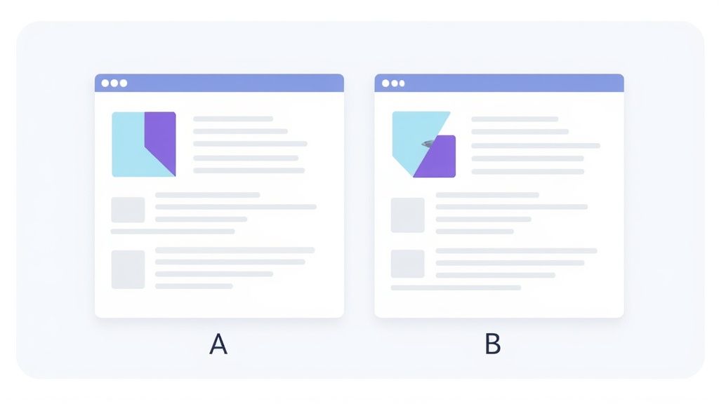
At the heart of any successful conversion rate optimization best practices program lies a commitment to data-driven decision-making, which is precisely what A/B and multivariate testing provide. This systematic method involves comparing two or more versions of a webpage or marketing asset to see which one performs better. A/B testing (or split testing) compares a control version ("A") against a single variant ("B"), while multivariate testing assesses multiple element combinations at once to identify the most effective combination.

Why It's a Foundational Practice
By eliminating guesswork, you can make incremental improvements that lead to significant gains over time. Companies like Amazon and Booking.com have built empires on this principle, constantly testing everything from button colors to urgency messaging. For example, HubSpot famously increased its conversion rate by 24% simply by testing different headlines on its homepage, proving that even seemingly small changes can yield powerful results. This approach allows you to understand your audience’s behavior on a deep, empirical level.
How to Implement Testing Effectively
To get started, identify a high-impact page, like a product or landing page, and form a hypothesis. For instance, "Changing the call-to-action button text from 'Buy Now' to 'Add to Cart' will increase conversions because it feels like a lower-commitment action." Then, use a testing tool like Google Optimize (now part of Google Analytics 4), Optimizely, or VWO to set up your experiment.
Here are some key tips for successful testing:
- Test One Variable at a Time: In A/B testing, isolate a single element (e.g., headline, image, or CTA) to ensure you can attribute any change in performance directly to that variable.
- Ensure Statistical Significance: Don’t end a test prematurely. Run it long enough to gather a sufficient sample size, ensuring your results are reliable and not due to random chance.
- Run for Full Business Cycles: Let your test run for at least one to two full weeks to account for daily and weekly fluctuations in user behavior.
- Document Everything: Keep a detailed log of your hypotheses, variations, results, and key learnings to inform future optimization efforts.
Beyond optimizing your website, extending A/B testing to your marketing campaigns, such as through effective Facebook Ads optimization strategies, can ensure you're driving the most relevant traffic to your optimized landing pages.
2. Landing Page Optimization
A dedicated landing page is a focused, standalone webpage designed to capture leads or drive a specific action. Unlike a homepage with multiple navigation options, a landing page removes distractions to guide visitors toward a single conversion goal. Effective landing page optimization is one of the most critical conversion rate optimization best practices because it ensures the traffic you’ve worked so hard to acquire from ads, emails, or search results has the highest possible chance of converting.

Why It's a Foundational Practice
By creating a seamless journey from ad to conversion, you can dramatically improve your ROI. For instance, Dropbox famously achieved a 60% increase in sign-ups by using a simple, hyper-focused landing page that clearly communicated its value proposition. Similarly, industry leader Unbounce showcases the power of this practice, often improving their own conversion rates by 90% or more through iterative page optimization. This targeted approach works because it meets user expectations and minimizes friction, making it easy for them to say "yes."
How to Implement Landing Page Optimization Effectively
Start by ensuring your landing page directly reflects the promise made in the ad or link that brought the visitor there. This concept, known as "message match," is crucial for building trust and reducing bounce rates. Then, apply a user-centric design that guides them toward the call-to-action.
Here are some key tips for successful optimization:
- Maintain Message Match: The headline and offer on your landing page must align perfectly with the source ad or link. Any disconnect will cause confusion and lead to abandonment.
- Use a Compelling, Clear Headline: Your headline should instantly communicate the primary benefit and answer the visitor's question: "What's in it for me?"
- Leverage Social Proof: Include testimonials, case studies, customer logos, or trust badges (like security seals) to build credibility and overcome skepticism.
- Minimize Friction: Only ask for essential information in your forms. Every additional field you require is another reason for a potential lead to drop off.
- Design for Action: Use a high-contrast, attention-grabbing color for your call-to-action (CTA) button and write clear, action-oriented text like "Get Your Free Quote" instead of a generic "Submit."
Platforms pioneered by experts like Tim Ash and Oli Gardner have institutionalized these principles, proving that a well-optimized landing page is a non-negotiable asset for any serious marketing campaign.
3. User Experience (UX) and User Interface (UI) Optimization
A seamless user experience (UX) and an intuitive user interface (UI) are critical components of conversion rate optimization best practices. This discipline focuses on designing digital platforms that are not only aesthetically pleasing but also easy, efficient, and enjoyable to navigate. The core principle, championed by experts like Steve Krug in "Don't Make Me Think," is to remove friction and cognitive load, guiding visitors effortlessly toward conversion goals.

Why It's a Foundational Practice
A poor user experience directly translates to lost revenue. If users can't find what they need or find the checkout process confusing, they will leave. In contrast, a strong UX/UI builds trust and satisfaction, encouraging both initial conversions and long-term loyalty. For instance, Apple’s streamlined checkout process famously has up to 70% fewer steps than the industry average, drastically reducing cart abandonment. Similarly, Airbnb’s relentless focus on simplifying the user journey led to a reported 30% increase in bookings.
How to Implement UX/UI Optimization Effectively
Begin by understanding your users' behavior through research and data analysis. Tools like heatmaps (e.g., Hotjar) and session recordings reveal where users click, scroll, and encounter issues. Combine these quantitative insights with qualitative feedback from usability testing to form a complete picture of your user experience. From there, you can prioritize improvements that will have the biggest impact.
Here are some key tips for successful optimization:
- Prioritize a Mobile-First Experience: Design for the smallest screen first, as mobile traffic often accounts for the majority of visitors. This ensures a seamless experience across all devices.
- Create a Clear Visual Hierarchy: Use whitespace, typography, and color to guide the user's eye to the most important elements, like your value proposition and call-to-action buttons.
- Maintain Design Consistency: Ensure that design patterns, colors, and branding are consistent across all pages and touchpoints. This familiarity builds user confidence and reduces confusion.
- Minimize Cognitive Load: Simplify forms, break down complex information into digestible chunks, and use clear, concise language. The easier your site is to use, the higher your conversions will be.
4. Compelling Call-to-Action (CTA) Optimization
A call-to-action (CTA) is the gateway to your conversion. It's the button or link that guides users toward your desired outcome, whether that's making a purchase, signing up for a newsletter, or downloading a resource. Optimizing your CTAs involves a strategic blend of persuasive copywriting, visual design, and psychological triggers to create an unmissable prompt that users are eager to click.

Why It's a Foundational Practice
Your CTA is the final instruction you give a user before they convert, making it one of the most critical elements on any page. A weak, generic, or poorly placed CTA can cause friction and lead to abandonment, even if the rest of your page is perfectly optimized. For instance, Performable famously increased its conversion rate by 21% simply by changing its button color from green to red. Likewise, ContentVerve saw a 90% increase in click-through rate by changing "Order Information" to the more benefit-driven "Get Course Information." These examples prove that targeted CTA adjustments are a cornerstone of any effective conversion rate optimization best practices.
How to Implement CTA Optimization Effectively
Start by auditing your most important CTAs on key landing pages, product pages, and your homepage. Form a hypothesis based on user psychology or a specific benefit. For example, "Changing the CTA from 'Submit' to 'Get My Free Quote' will increase form submissions because it frames the action around the user's gain." To truly make your CTAs compelling and action-oriented, delve deeper into understanding powerful persuasive writing techniques.
Here are some key tips for successful CTA optimization:
- Use Action Verbs: Start your CTA with a strong command verb like "Get," "Start," "Join," or "Discover" to clearly state what happens next.
- Create Urgency: Incorporate time-sensitive language such as "Shop Now, Sale Ends Tonight" or "Claim Your Spot Before It's Gone" to encourage immediate action.
- Test Colors and Contrast: Use a color that stands out from the rest of the page design. High-contrast colors naturally draw the eye and prompt clicks.
- Prioritize Placement: Position your primary CTA above the fold where it’s immediately visible. Also, place CTAs at natural reading breaks throughout your content.
- Leverage First-Person Language: Test phrases like "Get My Free Trial" instead of "Get Your Free Trial." This first-person perspective can make the offer feel more personal and increase ownership.
- Ensure Mobile-Friendliness: Make sure your CTAs are large enough to be easily tapped on smaller screens without accidental clicks on other elements.
5. Social Proof and Trust Building
One of the most powerful psychological drivers in marketing is the principle of social proof. This practice involves using customer testimonials, reviews, case studies, and trust signals to show potential customers that others have had positive experiences with your brand. By showcasing this evidence, you reduce visitor anxiety and build the confidence needed to drive conversions, leveraging the innate human tendency to follow the actions of others.
Why It's a Foundational Practice
In an anonymous digital world, trust is a valuable currency. Social proof acts as a bridge, transforming a skeptical visitor into a confident buyer. It validates their decision-making process by showing that peers have already made the same choice and were satisfied. For instance, Basecamp famously boosted its conversion rate by 102.5% after redesigning its homepage to feature a long-form customer testimonial. This demonstrates that authentic customer stories are far more persuasive than a company’s own marketing claims and are a cornerstone of modern conversion rate optimization best practices.
How to Implement Social Proof Effectively
Integrating social proof requires more than just adding a generic quote to your site. It’s about strategically placing authentic, relevant, and compelling evidence at key decision points. Start by gathering genuine feedback from your customers through post-purchase emails, surveys, or review platforms like Yotpo or Trustpilot.
Here are some key tips for successful implementation:
- Be Specific and Authentic: Instead of vague praise like "Great product!", use detailed testimonials that highlight specific benefits or solve a particular problem. Including customer photos, names, and company info adds a powerful layer of authenticity.
- Showcase Real-Time Activity: Use tools to display notifications like “25 people have bought this in the last 24 hours” to create a sense of urgency and popularity.
- Use Trust Badges Strategically: Display security seals (e.g., McAfee, Norton), payment logos (e.g., Visa, PayPal), and industry awards near checkout forms or call-to-action buttons to alleviate security concerns.
- Leverage Case Studies: For B2B or high-ticket items, create in-depth case studies that detail the customer's problem, your solution, and the measurable results (e.g., "Increased revenue by 40%").
- Respond to All Reviews: Engaging with both positive and negative feedback shows that you are an attentive and customer-centric brand, further building trust.
6. Form Optimization and Friction Reduction
Forms are the final gateway between a visitor and a conversion, yet they are often the source of the most friction. Form optimization is the process of methodically redesigning and streamlining your forms to make them as easy and intuitive as possible for users to complete. This involves removing unnecessary fields, clarifying instructions, and improving the overall user experience to minimize effort and abandonments.
Why It's a Foundational Practice
Every field you add to a form creates a small barrier. Cumulatively, these barriers can feel insurmountable, causing users to drop off just inches from the finish line. As research from conversion experts like Luke Wroblewski has shown, simpler forms consistently lead to higher completion rates. For instance, Expedia famously discovered that removing a single, optional 'Company' field from their checkout form increased annual profits by $12 million. Similarly, Marketo boosted its lead generation by 50% just by reducing its form fields from nine to five. These examples highlight how minimizing user effort is a core principle of conversion rate optimization best practices.
How to Implement Form Optimization Effectively
Begin by auditing your existing forms. Question the necessity of every single field: is this information absolutely critical for this specific conversion step, or can it be collected later? Use analytics and session recording tools to identify where users are struggling or dropping off.
Here are some key tips for successful form optimization:
- Ask Only What's Essential: Be ruthless in culling unnecessary fields. If you don't need their phone number to deliver an ebook, don't ask for it. Every field must justify its existence.
- Use a Single-Column Layout: Single-column forms are easier to scan and complete, especially on mobile devices. They provide a clear, linear path for the user to follow.
- Implement Inline Validation: Provide real-time feedback as users fill out the form. A green checkmark for a valid email or a red error message for an incorrect format prevents frustration and rework at the end.
- Group Related Fields: Use logical groupings and clear section headers (e.g., "Shipping Information," "Payment Details") to make longer forms feel less intimidating.
- Use Progress Indicators: For multi-step forms, show users where they are in the process and how much is left. This manages expectations and encourages completion.
- Optimize Button Text: Make your call-to-action button specific. Instead of "Submit," use compelling, action-oriented text like "Get Your Free Quote" or "Create My Account."
7. Page Speed and Technical Performance Optimization
In today's fast-paced digital environment, users expect instant access to information. Page speed and technical performance optimization is the practice of enhancing your website’s loading times and overall functionality to meet these expectations. A slow, clunky site creates friction and frustration, causing potential customers to abandon your page before your message even has a chance to load, making this a critical component of conversion rate optimization best practices.
Why It's a Foundational Practice
Technical performance directly impacts user experience and, consequently, conversion rates. Google has made it clear that page speed is a ranking factor for both desktop and mobile searches, but the user-facing benefits are even more compelling. For instance, Amazon calculated that every 100ms of latency cost them 1% in sales, while Walmart saw a 2% increase in conversions for every one-second improvement in load time. Similarly, AliExpress reduced their load time by 36% and saw a 10.5% increase in orders. These figures prove that speed isn't just a technical metric; it’s a business imperative.
How to Implement Testing Effectively
Your goal should be to get your pages loading in under three seconds, with under two seconds being ideal. Start by measuring your current performance using free tools like Google's PageSpeed Insights or GTmetrix, which provide detailed reports and actionable recommendations based on metrics like Core Web Vitals.
Here are some key tips for successful optimization:
- Optimize Your Images: Compress images to reduce file size without sacrificing quality. Use modern formats like WebP, which offer superior compression compared to traditional JPEGs and PNGs.
- Implement Lazy Loading: Configure images and videos located "below the fold" (off-screen) to load only as the user scrolls down. This prioritizes the loading of visible content first.
- Minimize Code and HTTP Requests: Reduce the number of CSS, JavaScript, and HTML files by minifying them (removing unnecessary characters) and combining them where possible to limit server requests.
- Leverage Browser Caching: Instruct browsers to store static assets like logos, CSS, and JavaScript locally. This allows returning visitors to load your site much faster on subsequent visits.
- Choose a High-Quality Host: Your hosting provider plays a significant role in server response time. Invest in a reliable hosting solution that can handle your traffic and deliver content quickly.
7 Best Practices Comparison Guide
| Technique | Implementation Complexity 🔄 | Resource Requirements ⚡ | Expected Outcomes 📊 | Ideal Use Cases 💡 | Key Advantages ⭐ |
|---|---|---|---|---|---|
| A/B Testing and Multivariate Testing | Medium to High – requires setup of tests and statistical analysis | High – needs significant traffic and analytics tools | Reliable data-driven decisions, measurable conversion lifts | Validating design/marketing changes, optimizing multiple elements | Data-driven insights, risk mitigation, continuous optimization |
| Landing Page Optimization | Medium – focused design and maintenance effort required | Medium – design, copywriting, and testing resources | Higher conversion rates, improved ROI | Dedicated campaign funnels, pay-per-click traffic | Focused messaging, better UX, clear performance attribution |
| UX/UI Optimization | High – involves research, design, and iterative development | High – specialized design and usability expertise | Improved engagement, higher conversions, brand trust | Comprehensive website/app redesigns, user retention improvements | Enhanced user satisfaction, competitive advantage |
| CTA Optimization | Low to Medium – relatively simple changes with testing | Low – mainly copywriting and design tweaks | Increased click-through and conversion rates | Buttons, forms, promotions, sign-ups | Direct conversion impact, easy to test, cost-effective |
| Social Proof and Trust Building | Low to Medium – content gathering and integration | Low to Medium – content management, some design | Increased trust, reduced anxiety, higher conversions | E-commerce, SaaS sales pages, lead generation | Builds credibility, authentic content, broad funnel impact |
| Form Optimization and Friction Reduction | Medium – design and technical balancing of fields and UX | Medium – requires testing and some development | Higher form completions, better lead quality | Lead capture, sign-up flows, mobile forms | Reduced abandonment, improved mobile UX, better data quality |
| Page Speed and Technical Performance Optimization | High – technical expertise, ongoing monitoring | High – developer and infrastructure resources | Faster load times, higher engagement and conversions | Sites with heavy traffic, e-commerce, content-heavy platforms | Direct conversion impact, better SEO, improved UX |
From Clicks to Customers: Putting Your CRO Plan into Action
We’ve journeyed through the most impactful conversion rate optimization best practices, exploring everything from the scientific rigor of A/B testing to the psychological power of social proof. The strategies detailed in this guide are not isolated tactics; they are interconnected components of a comprehensive system designed to enhance user experience and drive revenue. Mastering these concepts is the key to transforming your digital storefront from a passive online presence into an active, high-performance conversion engine.
The core principle that unites every best practice, from landing page design to form optimization, is a relentless focus on the user. By understanding your audience's needs, pain points, and motivations, you can systematically remove friction and build a clearer path to purchase. Remember, a successful CRO strategy is never truly finished. It is a continuous cycle of listening, testing, learning, and iterating.
Your Path Forward: A Step-by-Step Implementation Plan
Embarking on your CRO journey can feel overwhelming, but a structured approach makes it manageable and effective. Instead of trying to implement everything at once, focus on strategic, incremental improvements.
Here are your actionable next steps:
- Establish Your Baseline: Before you change anything, you need to know where you stand. Use analytics tools to identify your current conversion rates, key drop-off points in your funnel, and underperforming pages. This data is your foundation.
- Prioritize with the PIE Framework: Assess potential optimization areas using the PIE (Potential, Importance, and Ease) framework. Identify changes that have high potential for improvement, are important to your bottom line, and are relatively easy to implement. Often, optimizing your highest-traffic landing pages or streamlining a complex checkout form offers the quickest wins.
- Formulate a Hypothesis: For your first test, create a clear, data-driven hypothesis. For example, "Changing the primary CTA button color from grey to orange and using the text 'Get Your Free Quote Now' will increase form submissions by 15% because it will stand out more and create a sense of urgency."
- Execute and Measure: Run your test for a statistically significant period. Whether it's an A/B test on your CTA, a multivariate test on your landing page, or a technical fix to improve page speed, let the data guide your conclusions. Avoid ending tests prematurely or acting on gut feelings.
- Analyze, Iterate, and Repeat: Once the test concludes, analyze the results. Did your change lead to a win, a loss, or an inconclusive result? Every outcome is a learning opportunity. Implement the winning variation, learn from the losing one, and use these insights to formulate your next hypothesis. This iterative process is the engine of sustainable growth.
By embracing these conversion rate optimization best practices, you are not just tweaking buttons and text. You are building a stronger, more resilient business that truly serves its customers. The result is more than just a higher conversion rate; it's increased customer loyalty, a stronger brand reputation, and a significant, measurable return on your investment.
Ready to supercharge your landing pages and product displays? High-quality, compelling visuals are a cornerstone of CRO, and ProdShot makes it effortless to create stunning, studio-grade product photos in seconds using AI. Elevate your brand and boost your conversions by transforming simple images into professional shots that capture attention and drive sales. Get started with ProdShot today and see the difference professional visuals can make.
Article created using Outrank

