

Getting people to your Shopify store is just the first step. The real trick is convincing them to actually buy something. That's where conversion rate optimization for Shopify comes in. It's not about guesswork; it's a systematic process of refining your store to turn a higher percentage of your visitors into paying customers. Think of it as paving a smoother path from the moment someone lands on your site to the final "thank you" page.
Why Your Shopify Traffic Isn't Converting
It’s a story I hear all the time: "My traffic is great, but my sales are flat." This gap between visitors and buyers almost always comes down to friction. A series of small, seemingly minor roadblocks in the shopping experience can add up to a dead end.
Maybe your navigation is a bit confusing, your pages take an extra second to load, or your product descriptions don't quite answer a key question. It could even be a clunky checkout process that asks for too much information. Each one of these is an open door for a potential customer to walk right out.
Good CRO is about finding and fixing these friction points methodically. For a broader look at the core ideas, this guide on website conversion rate optimization strategies is a fantastic starting point.
Defining a Good Shopify Conversion Rate
Okay, so what number should you be shooting for? It's easy to get lost in averages, but Shopify-specific data gives us a much clearer target.
While the general ecommerce world hovers around a 2.5% to 3% conversion rate, the benchmarks for Shopify stores are a bit more ambitious. If you can get your conversion rate above 3.2%, you’re already in the top 20% of all Shopify stores. Pushing that to 4.7% or higher? That puts you in the elite top 10%.

To put these numbers in context, here's a quick cheat sheet for what different conversion rates mean for your store's performance.
Shopify Conversion Rate Benchmarks
| Conversion Rate | Performance Tier | What This Means |
|---|---|---|
| Below 1.2% | Needs Improvement | Your store likely has significant friction points that are turning customers away. Time to audit. |
| 1.2% – 3.2% | Average Performer | You're on the right track, but there are clear opportunities to improve and capture more sales. |
| 3.2% – 4.7% | Top 20% | You're doing better than most. Small, targeted optimizations can yield big results here. |
| Above 4.7% | Top 10% (Elite) | You're a leader in your space. The focus shifts to continuous, data-driven A/B testing to stay ahead. |
Ultimately, comparing yourself to others is less important than improving on your own performance.
The real goal isn't just to hit an industry average. It's to establish your own baseline and consistently beat it. Even a tiny 0.5% increase can mean thousands in new revenue if you have the traffic.
This guide is your roadmap to making that happen. We're going to skip the fluff and get straight to a practical, step-by-step framework. You’ll learn how to audit your store, run smart tests, and make changes that directly boost your bottom line.
Building Your CRO Foundation With Smart Analytics
Before you touch a single button or rewrite a headline, let's get one thing straight: real conversion rate optimization for your Shopify store starts with data. Guessing is a fast track to wasted time and money. It’s like trying to navigate a ship in a thick fog—you might get lucky, but you're far more likely to run aground. Good analytics are your map and compass, showing you exactly where you are and where you need to go.
Your basic Shopify dashboard is fine for a quick pulse check, but it barely scratches the surface. It won't tell you why people are leaving your site. To get that, you need to combine the "what" (quantitative data) with the "why" (qualitative data).
Getting Your Numbers Straight with Quantitative Data
Your go-to tool here is going to be Google Analytics 4 (GA4). It’s powerful, free, and plays nicely with Shopify. The goal isn't just to watch your traffic numbers go up and down; it’s about tracking the entire customer journey from the moment they land on your site to the second they buy.
Make sure these key e-commerce events are firing correctly in GA4:
- view_item: Someone looks at a product page.
- add_to_cart: They pop an item into their cart.
- begin_checkout: They actually start the checkout process.
- purchase: They complete the sale.
Once you're tracking these, you can build a sales funnel right inside GA4. This is where the magic happens. You’ll see exactly where people are dropping off. Maybe you discover that 90% of users who add an item to their cart never even start the checkout. That’s a huge red flag, and it tells you the problem isn’t your product—it's something happening on the cart page itself.
This kind of specific data makes broad benchmarks, like the average Shopify conversion rate of 1.4%, feel a lot less important. Your own numbers are what really count.
Adding the Human Element with Qualitative Tools
Numbers tell you what is happening. Qualitative tools tell you why. This is where you bring in tools like Hotjar or Microsoft Clarity to see the real human behavior behind the clicks.
Heatmaps are fantastic for this. They visually show you where people are clicking, moving their mouse, and how far down the page they scroll. You might spot dozens of people clicking on a lifestyle image, thinking it's a product link. That’s a clear signal that your design is creating false expectations.
Session recordings take it even further. You get to watch anonymized videos of real people using your site. It’s like looking over their shoulder. You can see them hesitate, "rage click" on a broken button, or get stuck and leave. These insights are pure gold for figuring out what to test first.
Turning Data into Actionable Insights
Now that you have all this data, it's time to connect the dots. Don't just admire the graphs—ask them questions.
Start segmenting your audience. How do first-time visitors behave compared to returning customers? Returning visitors should be converting at a much higher rate. If they aren't, you might have a problem with your post-purchase experience or brand loyalty.
Dig into your landing page reports. Find the pages with tons of traffic but sky-high exit rates. If your best-selling product page has an 80% exit rate, something is seriously wrong. Are the photos blurry? Is the description confusing? Visuals are everything in e-commerce, and it's worth understanding the cost of professional product photography because it's an investment that pays for itself.
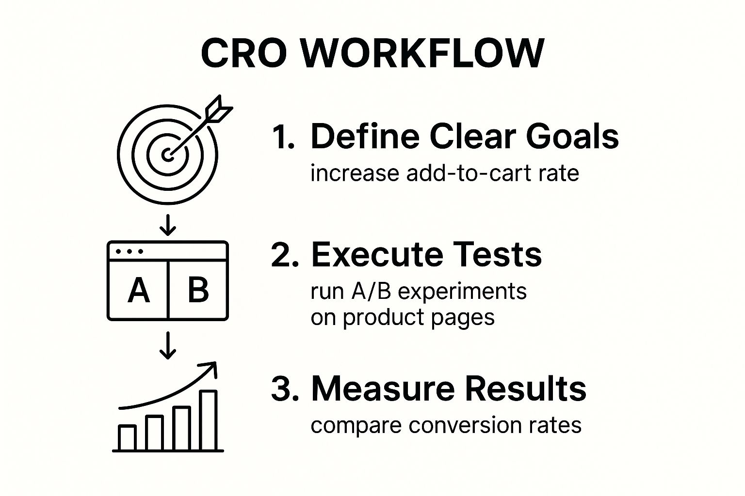
Ultimately, you want to get into a rhythm: use your data to find a problem, form a hypothesis about how to fix it, run a controlled test, and measure the results. This disciplined cycle stops you from making random changes and ensures every optimization effort is a calculated step toward growth. This is how you build a CRO machine that delivers predictable results.
Turning Product Pages Into Conversion Engines
Think of your product page as the final, most crucial step before a customer heads to the checkout. It's the digital equivalent of them picking an item off a shelf, feeling its weight, and deciding if it’s worth buying. A weak page sends them packing, but a great one makes that "Add to Cart" click feel like the most natural next step.
This is where so many Shopify stores leave money on the table. They treat the product page like a simple catalog entry—a picture, a price, a button. But a high-converting product page is a finely-tuned sales pitch. It needs to build desire, answer questions before they're even asked, and completely erase any lingering doubt.
Go Beyond Basic Product Photography
Nothing kills conversions faster than grainy, low-effort photos. In e-commerce, your images are the product until the package arrives. Since customers can't touch or hold your item, your visuals have to do all the heavy lifting and create a tangible experience.
Having one or two clear photos isn’t going to cut it anymore. You need a full suite of visuals that tells a complete story.
- High-Resolution Studio Shots: These are your non-negotiables. Clean, crisp images on a neutral background that show the product from every conceivable angle. This is all about clarity.
- Lifestyle & In-Context Photos: This is where you help the customer connect. Show your backpack on a hiker's back, or your coffee mugs on a cozy kitchen counter. It helps people visualize the product in their own lives.
- 360-Degree Views & Video: Let them explore. Interactive elements like 360-degree spinners or short, well-produced product videos can skyrocket engagement. They answer questions that static images just can't.
Pulling this off requires a specific skill set. For store owners serious about presentation, investing in professional Shopify product photography often delivers a fantastic return by building immediate confidence and driving sales.
Write Descriptions That Sell, Not Just Describe
Stop listing specs. Your product description needs to get inside the customer’s head, anticipate their questions, and translate every feature into a real-world benefit. Think less like an engineer writing a manual and more like a top salesperson guiding a customer to the perfect solution.
And please, make it scannable. Nobody reads a wall of text online.
A great product description doesn't just describe what the product is. It describes what the product does for the customer. It solves their problem, fulfills their desire, or improves their life in some small way.
Try starting with a compelling paragraph that hooks them, then break down the key details with bullet points. For example, don't just say, "Made with 100% merino wool." Instead, frame it as a benefit: "Stay warm without the bulk. Our 100% merino wool is naturally breathable and incredibly soft, perfect for layering on cold days." See the difference?
Build Unshakeable Trust and Social Proof
First-time visitors arrive with a healthy dose of skepticism. They're silently asking, "Can I trust this store? Is this product actually any good?" Your product page is ground zero for shutting down that inner critic with undeniable trust signals.
- Customer Reviews: Don't hide them. Showcase genuine customer reviews prominently. A mix of glowing praise and even some constructive criticism can actually be more believable. A perfect 5.0-star rating can feel fake, while a 4.8-star rating with detailed feedback feels authentic.
- User-Generated Content (UGC): There's nothing more powerful than seeing real people using and loving your products. Encourage customers to share their photos and feature them in a gallery. It’s infinitely more compelling than another staged model shot.
- Clear Trust Badges: Make your guarantees impossible to miss. Display familiar icons for secure payments, highlight your money-back guarantee, and make sure your shipping and return policies are easy to find.
When these elements—visuals, copy, and trust—work in harmony, you transform a static product listing into a true conversion engine. You’re making it easy for the customer to feel confident, secure, and excited to click "buy."
Making Your Checkout Effortless to Stop Abandoned Carts
You’ve done all the hard work. You got a visitor to your site, showed them a product they love, and they finally hit "Add to Cart." The finish line is so close. But this is where things often fall apart—a staggering 18% of shoppers will bail right here because the checkout process is too complicated or just plain long.
A clunky, confusing checkout can single-handedly kill a sale, making all your marketing efforts worthless. Every unnecessary field, every surprise fee, every confusing step gives the customer a reason to stop and wonder if they really need this. If you're serious about conversion rate optimization for your Shopify store, you have to make this final step as smooth and painless as possible.
Guest Checkout Isn't Optional Anymore
Forcing someone to create an account before they can give you their money is one of the oldest and most effective conversion killers in the book. A first-time shopper isn't looking for a long-term relationship; they just want to buy their thing and get on with their day. Making them dream up a password and fill out a bunch of extra fields adds a massive wall of friction at the worst possible moment.
The fix is simple: always offer a guest checkout option, and make it obvious. You can always ask them to create an account after the sale is complete. A simple "Want to save your info for next time?" is a much better approach. It respects their time and can make a huge difference in your abandonment rate.
Cut the Fat and Speed Things Up
Your checkout page needs to be a masterclass in efficiency. Look at every single form field and ask yourself, "Do I really need this?" Does the phone number actually matter? Can you get by with a single "Full Name" field instead of two separate ones? The entire goal is to get it down to the bare essentials.
This is also where express payment options become your best friend. Services like Shop Pay, Apple Pay, Google Pay, and PayPal are no longer nice-to-haves; they're expected. They let people buy with a single click, which is a game-changer.
Think about it: enabling one-click checkouts directly addresses the modern shopper's need for speed. It lets them skip the tedious process of typing in their address and credit card details, which is a major headache for the mobile users who likely make up most of your traffic.
Here are a few other quick wins to make your checkout faster:
- Use address auto-fill: Tools that suggest addresses as the customer types save time and reduce errors.
- Have clear error messages: If something is wrong, highlight the exact field and tell them precisely what needs to be fixed. No vague "Invalid input" messages.
- Design for thumbs: On mobile, buttons need to be big, fields easy to tap, and the whole layout has to be clean and simple on a small screen.
No More Last-Minute Surprises
There's almost nothing worse as a shopper than getting to the final screen, ready to pay, and suddenly seeing a massive, unexpected shipping fee. That "sticker shock" is a leading cause of abandoned carts.
You have to be upfront about all costs, as early as you possibly can. Put shipping estimates right on the product page or in the cart summary. If you offer free shipping, shout it from the rooftops. When you set clear expectations from the start, you build trust and avoid that gut-punch feeling that sends customers clicking away.
Even the little things matter, like the product images in the checkout summary. Those tiny thumbnails are a final visual confirmation that reassures the buyer they're getting what they wanted. If those images are blurry or low-quality, it can plant a seed of doubt. This is why having sharp, professional visuals is critical from the first click to the last, and why many stores rely on professional photo editing services for ecommerce to keep every image looking perfect.
In the end, a great checkout experience is all about removing friction and doubt. Make it feel secure, fast, and transparent, and you'll ensure that a customer's initial excitement follows them all the way through to a completed order.
Using A/B Testing and Personalization to Drive Growth
Alright, you've shored up your site’s foundation. Now it's time to get surgical. We're moving away from broad-stroke improvements and into the world of precise, data-backed experiments. This is where A/B testing and personalization come in, turning your store from a static website into a dynamic system that's always learning and improving.
Instead of making changes based on a gut feeling, you'll be able to scientifically prove which version of a page, headline, or button actually puts more money in your pocket.
The name of the game is small, incremental improvements that compound over time. This is what a mature conversion rate optimization Shopify strategy looks like—it’s not about one-off fixes, but about building a sustainable engine for growth.
Forming a Strong A/B Testing Hypothesis
Every great A/B test starts with a solid hypothesis, not just a random idea someone threw out in a meeting. A good hypothesis is a clear, testable statement that predicts a specific outcome. It needs three key ingredients: the proposed change, the expected result, and the reasoning behind it.
For instance, a weak idea is, "Let's test a green button." A much stronger hypothesis sounds like this: "Changing the 'Add to Cart' button from our standard blue to a high-contrast green will increase add-to-cart clicks by 10% because the new color will stand out more against our product page’s neutral color palette."
See the difference? This structure forces you to think critically about why a change might work. From there, you can use tools like VWO, Optimizely, or the now-retired Google Optimize's spirit in other platforms to run the experiment, splitting your traffic between the original version (your control) and the new one (the variation).
Here's a crucial mindset shift: the goal isn't just to be right. It’s to learn. A "failed" test—one where your new version doesn't win—is still incredibly valuable. It tells you what your audience doesn't respond to, saving you from rolling out a change that would have actually hurt your sales.
What to Test on Your Shopify Store
You can test almost anything, but you'll get the best bang for your buck by starting with changes that can have the biggest impact on your bottom line. I always tell clients to focus their initial energy on high-traffic pages—the homepage, top-selling product pages, and the checkout flow are prime real estate for testing.
Here are a few high-impact ideas to get the ball rolling:
- Headlines and Value Propositions: How are you communicating your brand's promise? Test "Handmade Leather Goods" against "Leather Goods That Last a Lifetime" to see which one resonates more.
- Call-to-Action (CTA) Text: The words on your buttons matter. Does "Buy Now" create more urgency than "Add to Cart"? Maybe something more inviting like "Shop The Collection" works better for your brand. You won't know until you test.
- Promotional Offers: Pit your deals against each other. Will a 20% Off discount outperform a "Free Shipping on All Orders" offer? The answer often isn't what you'd expect.
- Product Page Layout: Try shuffling key elements around. What happens if you move customer reviews and testimonials higher up the page? Does that build trust faster and lead to more conversions?
Personalizing the Experience with Smart Pop-Ups
Going beyond simple A/B testing, personalization is about delivering the right message to the right person at the right time. One of the most effective ways to do this is with pop-ups, but they have to be used intelligently. Nobody likes an annoying, in-your-face pop-up the second they land on a site.
Exit-intent pop-ups are the perfect example of doing it right. They only appear when a user’s mouse moves toward the browser's back or close button, giving you one last chance to grab their attention without disrupting their flow. This is your moment to offer a first-time purchase discount, a free resource, or an invite to your newsletter.
What’s wild is that data from top Shopify stores shows only 39.4% are currently using pop-ups, even though they're proven to work. A well-timed pop-up, like one triggered on exit-intent, can hit an average conversion rate of 11.09%. It’s a powerful and seriously underused tool. If you want to dig into the numbers, you can learn more about pop-up conversion rates and other CRO statistics.
Answering Your Shopify CRO Questions
Once you start digging into conversion rate optimization for Shopify, the questions start piling up. You've got the theory down, but what about the real-world stuff? Let's clear the air and tackle the most common questions I hear from store owners just like you.
This is your practical guide for getting past the theory and into the day-to-day work of CRO. We'll cover everything from benchmarks and timelines to the must-have tools for doing the job right.
What Is a Good Conversion Rate for a Shopify Store?
This is the big one, but the truth is, there's no single magic number. The average Shopify store pulls in about a 1.4% conversion rate, but "good" completely depends on your niche, price point, and audience. Context is king.
Think about it: a brand selling high-ticket, custom furniture might be thrilled with a 1% conversion rate. Each sale is massive. But a store selling cheap phone cases would need to be hitting 5% or more just to stay afloat.
The only benchmark that truly matters is your own. Your goal is to consistently improve upon last month's numbers. If you're looking for a North Star, a rate over 3.2% puts you in the top 20% of Shopify stores, while hitting 4.7% or more lands you in the elite top 10%.
Stop chasing industry averages and start competing with yourself. That's the real win.
How Long Does It Take to See CRO Results?
Patience is a virtue in CRO. Some changes can deliver results almost overnight, while others are a slow burn. It all comes down to the scale of the change and how much traffic your store gets.
You can definitely score some quick wins. For instance, making your shipping costs crystal clear on the product page or slashing your site's load time could give you a conversion bump in less than a week. You're removing obvious roadblocks, so the impact is fast and direct.
Proper A/B testing, on the other hand, is more of a marathon. You have to wait for enough data to roll in to be sure your results are statistically significant—meaning they weren't just a lucky guess.
- A simple button color test on a high-traffic homepage might only need two weeks.
- An experiment on a low-traffic checkout page could easily take a month or more to get a clear answer.
Ultimately, you should view conversion rate optimization for your Shopify store as an ongoing process, not a one-and-done project. After about three to six months of consistent effort, you should start to see a real, lasting lift in your overall conversion rate.
Which Tools Are Essential for Shopify CRO?
You can't fix what you can't see. A solid tech stack is non-negotiable for making smart, data-driven decisions. While the app store is endless, you really only need a few core tools to get started.
Here’s the essential toolkit:
- Quantitative Analytics (The "What"): This is your foundation. Google Analytics 4 is the standard for a reason. It shows you what people are doing—tracking traffic, bounce rates, and every step they take down your sales funnel.
- Qualitative Analytics (The "Why"): To understand the human behavior behind the numbers, you need tools like Hotjar or Microsoft Clarity. Their heatmaps and session recordings let you see exactly why users are getting stuck or leaving your site.
- A/B Testing Platform: To prove your hypotheses, you need a dedicated testing tool. Platforms like VWO or Optimizely let you run controlled experiments to see which version of a page actually performs better.
- Lead Capture & Personalization: This is where apps like Klaviyo or OptiMonk shine. They help you build smart pop-ups and forms to capture emails, offer targeted discounts, and fight cart abandonment.
To get a wider view of strategies that work across the board, digging into some general conversion rate optimization best practices can offer some fantastic insights you can apply to your store.
Ready to transform your product photos from simple snapshots into conversion-driving assets? ProdShot uses AI to create stunning, professional-grade images in seconds, helping you build trust and sell more. Try it for free and see the difference at https://prodshot.net.
Article created using Outrank