

Ever heard of a flat lay photo? It's that classic, super clean shot taken from directly above—think of it as a bird's-eye view of your products, styled perfectly on a flat surface. You've seen it everywhere, and for good reason. It’s a go-to style in both product and lifestyle photography for telling a story in a crisp, compelling way.
Why Flat Lays Are a Game Changer for E-Commerce

Before you start clearing off your dining table, let's talk about why this photography style is such a powerhouse for online brands. The flat lay isn't just some passing social media trend; it's a potent visual marketing tool that taps into some simple psychology.
That top-down perspective is unique. It feels both artsy and incredibly organized, cutting out all the distracting backgrounds and letting the products be the undeniable heroes of the shot. For customers scrolling online, that clarity is gold. It builds instant trust because they can see all the details—the color, the texture, the quality—without any visual noise getting in the way.
The Art of Visual Storytelling
A really great flat lay does more than just show off a product; it weaves a narrative. When you surround your main item with a few thoughtfully chosen props, you’re not just selling a sweater. You’re selling the feeling of a cozy weekend morning. That's the magic. This helps customers imagine the product in their own lives, turning a simple object into something they truly desire.
This storytelling superpower is what makes flat lays so effective on crowded platforms. Whether it's an Amazon listing or your Instagram feed, a captivating flat lay can stop the scroll and instantly communicate what your brand is all about. It's your chance to show off your aesthetic, your values, and your personality, all in one quick glance.
I've seen it work wonders for all sorts of brands:
- Fashion brands use them to style entire outfits, showing how one killer piece can pull a whole look together.
- Food bloggers arrange fresh ingredients around a finished dish, telling the delicious story of a recipe from start to finish.
- Tech companies place their gadgets next to sleek, minimalist accessories, sending a clear message of modern efficiency.
The real strength of a flat lay photo is its ability to create context. It answers the customer's unspoken questions: "How would I use this?" or "Does this fit my personal style?"
A Proven Strategy for Growth
The impact here isn't just a gut feeling; the numbers back it up. The flat lay photo is a cornerstone technique in product photography, a niche that makes up about 45% of the entire commercial photography market. This isn't a small corner of the industry. According to the photography experts at Ocus, this market was valued at US$163.91 million in 2025 and is on track to hit US$275.4 million by 2030. That kind of growth shows just how vital this skill is for anyone selling online.
Mastering the flat lay is more than just learning a new photography trick. It's a strategic move. It's about creating high-impact visuals that connect with customers and drive sales—all without breaking the bank.
Planning Your Shot Before You Press the Shutter
A killer flat lay photo almost never happens by accident. In fact, you’ll find that about 90% of the work is done before you even dream of hitting that shutter button. This is the prep work, the foundation for an image that doesn't just look pretty but actually tells a story and makes someone want to click "buy."
Think of yourself as a film director setting up a scene. What’s the vibe? What’s the plot? If you just throw things together, you’ll get a chaotic photo. But if you walk in with a clear vision, the whole process becomes incredibly smooth and, honestly, a lot more fun.
Define Your Story and Mood
Every single flat lay needs a purpose. Before you grab a single prop, stop and ask yourself: what story am I telling here? This one question will guide every other decision, from your color choices to the textures you use. And don't worry, the story doesn't have to be some epic novel; it can be a simple feeling or a moment in time.
Let's say you're selling a new handmade ceramic mug. You could go in a couple of different directions:
- Story Idea 1: The Cozy Morning. You could surround the mug with a half-finished crossword puzzle, a pair of reading glasses, and maybe the corner of a chunky knit blanket. The mood is all about warmth, relaxation, and comfort.
- Story Idea 2: The Productive Workspace. Or, you could place that same mug next to a sleek laptop, a minimalist notebook, and a nice pen. Suddenly, the mood is modern, focused, and professional.
See? It’s the same product, but those two concepts will attract totally different customers. Nailing down your narrative from the get-go is the most important thing you can do.
Choose a Cohesive Color Palette
Once you have your story, picking a color palette is the next logical step. Colors are a massive shortcut to setting the mood you just defined. A great rule of thumb is to stick with a simple scheme of two to three complementary colors and toss in a neutral like white, gray, or beige to tie it all together.
A tight, cohesive palette makes sure your actual product stays the star of the show. If your product is a vibrant blue, think about pairing it with props in softer, similar shades. Or, if you want to make a statement, contrast it with a pop of warm, complementary orange. The goal here is harmony, not a color competition.
Select Props That Add Context
Your props are the supporting cast. Their job is to make the main product look even better, not to steal the spotlight. Every single item in your flat lay should feel like it belongs there and serves a purpose in the scene you're building.
A huge mistake I see all the time is people adding props just to fill empty space. Don't do it. Instead, pick items that bring in texture, give context, or help show the product's scale. Less is almost always more.
When you're hunting for props, think about these things:
- Relevance: Does this actually make sense with my product and story? For a new face cream, some fresh botanicals or a soft towel works beautifully. For a tech gadget, maybe some clean cables or a notebook are a better fit.
- Texture: You want to add depth and make the photo more interesting to look at. Try mixing different textures—think about the contrast between a smooth ceramic dish, a rough linen napkin, and a glossy green leaf.
- Scale: Use a mix of bigger and smaller props to create a nice sense of balance. If all your props are the same size, the whole composition can feel really flat and boring.
Pick the Perfect Background
Last but not least, think about your background. The surface you're shooting on is the canvas for your entire story. A busy or distracting background can totally sink an otherwise gorgeous photo.
Most of the time, simple is best. A clean, neutral background—like a sheet of white foam board, a light-colored wooden table, or even a piece of colored cardstock—makes sure your product pops. But don't be afraid to use a textured background if it fits your story. A slab of marble can feel luxurious and high-end, while a rustic wooden plank might feel more organic and down-to-earth.
The key is that the background needs to support your story, not become the story. Once you have all these elements planned out, you're finally ready to start building your scene.
Arranging Your Scene and Finding the Best Light
This is where the real fun begins. You've got your story, your props are picked out, and your background is ready. Now it's time to build the scene and play with the most important tool in any photographer's kit: light. The way you arrange your items and shape the light is what separates an amateur-looking flat lay from a polished, professional shot.
A lot of this comes down to understanding the basic principles for taking good product shots. These aren't complicated rules, just the invisible framework that makes a great photo click.
This simple workflow shows how to get from a rough idea to a scene that's ready for its close-up.
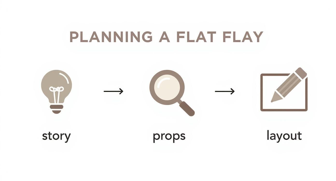
Think of each step building on the last. It’s all about creating a final shot that feels intentional, cohesive, and tells the right story for your brand.
Mastering Composition for a Balanced Scene
Composition is really just the art of placing things in your frame to guide your viewer's eye where you want it to go. Your product is the star of the show—the "hero"—and it needs to grab attention immediately. Everything else is just the supporting cast.
Always place your main product first. But don't just plop it dead center. A great starting point is the rule of thirds. Picture a tic-tac-toe grid over your scene. Placing your product along one of those lines or at an intersection often creates a much more dynamic and interesting photo.
Once your hero is set, start building the scene around it with your props. Think about visual weight—a big, dark object feels "heavier" than a small, light-colored one. You want to balance these elements across the frame so it feels harmonious, not like one side is about to tip over.
My personal tip: Don’t be afraid of empty space! We call this negative space, and it’s crucial for letting your composition breathe. If you cram too many things into the shot, it just feels chaotic and overwhelming.
This quick table breaks down some classic techniques you can use.
Key Composition Techniques for Flat Lays
| Technique | Description | Best For |
|---|---|---|
| Rule of Thirds | Placing key elements on intersecting grid lines. | Creating natural balance and a dynamic feel. |
| Negative Space | Intentionally leaving empty areas in the frame. | Highlighting a single product; creating a minimalist, high-end look. |
| Leading Lines | Using props to create lines that draw the eye to the product. | Guiding the viewer's focus directly to your hero item. |
| Framing | Using props to form a frame around the main subject. | Adding depth and drawing extra attention to the product. |
Experiment with these—you'll quickly get a feel for which ones work best for your product and style.
Arranging Props with Intention
Think about how your props relate to each other. A neat, grid-like layout can feel very modern and organized, while a more organic, scattered arrangement gives off a casual and authentic vibe. It all depends on the story you're telling.
Here are a few layout ideas to try:
- The "S" Curve: Arrange your props in a gentle, flowing 'S' shape. It's a classic trick to lead the eye smoothly through the whole picture.
- The Diagonal: Placing items along a strong diagonal line injects a ton of energy and movement into what could be a static shot.
- The Frame: Use smaller props to create a subtle border around your main product, which helps pull the focus right where you want it.
For instance, if you're shooting home decor, you could frame a candle with a few delicate botanical stems or a soft, cozy fabric. You can see more great examples of this in our guide to home decor product photos. And here's a secret weapon: a tiny piece of white tac is perfect for stopping small, round items from rolling out of position.
Finding and Shaping Natural Light
Good news: you don't need a bunch of expensive studio lights. The best light is often free—the soft, natural light coming from a window. The trick is to avoid harsh, direct sunlight, which creates ugly, distracting shadows that kill the vibe.
Your ideal setup is right next to a large window on a slightly overcast day. The clouds act like a giant, natural softbox, diffusing the light and spreading it evenly across your scene. Position your setup so the light comes from the side (left or right) or from the top of your frame. Light coming from the bottom tends to look unnatural and a little spooky.
To control this light, all you need is one cheap tool: a piece of white foam board or even a big sheet of white paper.
- Set up your scene next to your window.
- Take a look at the shadows. You'll see the side opposite the window is darker.
- Now, place your white foam board on that darker side, propping it up so it faces your scene.
This board acts as a reflector. It will bounce that beautiful, soft window light back into the shadows, brightening them up instantly. This single, simple trick makes your photo look more professional and evenly lit. It’s the most effective, low-cost thing you can do to dramatically improve your lighting.
Getting Your Smartphone Ready for the Perfect Shot
Your smartphone camera is an incredible tool, but its default settings are built for casual, everyday snapshots. We're not after casual. We're aiming for polished, professional-grade flat lay photos, and that means we need to take manual control.
Let's walk through a few simple tweaks that will make a massive difference. These settings aren't complicated, but they are the key to moving from a basic picture to a high-quality product image. Think of it as telling your camera exactly what you want it to see, rather than letting it make all the decisions for you. This control is what creates consistency and clarity.
Enable the Grid for Perfect Alignment
First things first: turn on your camera's grid. This is non-negotiable. This simple overlay of lines is your secret weapon for nailing the composition. Trust me, it's nearly impossible to judge a perfect top-down angle by eye alone, and the grid gives you an instant visual reference point.
It helps you make sure your product and props are perfectly aligned, keeping all your horizontal and vertical lines straight. For a professional-looking flat lay where symmetry and balance are everything, this is a must.
- On iPhone: Just go to
Settings > Camera, and toggle on "Grid." - On Android: Open your camera app, head into
Settings, and look for "Grid lines" or a similar option.
It's a tiny change that will immediately level up your ability to frame a balanced shot.
Lock in Your Focus and Exposure
Ever set up the perfect shot, only to have the lighting or focus suddenly jump around right as you go to press the button? That's your phone's camera constantly trying to re-evaluate the scene. We need to stop that.
The trick is using AE/AF Lock (Auto Exposure/Auto Focus Lock). To activate it, just tap and hold on your main product—your focal point—right on the screen. A yellow box or an "AE/AF Lock" indicator will pop up, confirming that the settings are now locked in place.
By locking the focus, you guarantee your main product stays tack-sharp. Locking the exposure ensures the brightness remains consistent across all your photos, which is absolutely critical for creating a cohesive set of product images.
This means you can nudge a prop or make a small adjustment without your camera's brain going haywire and changing the whole vibe of your photo. It’s a simple move that puts all the creative control back in your hands.
Tweak Your Camera Settings Manually
Beyond those two big ones, there are a few other settings to get right. Our goal is to capture an image that’s as clean and true-to-life as possible, giving us the best possible canvas for editing later.
-
Turn Off HDR: High Dynamic Range (HDR) can be great for dramatic landscapes, but for product shots, it often looks unnatural. It works by blending multiple exposures together, which can mess with your colors and create a weird, overly processed look. For flat lays, we want clean, accurate colors, so just turn it off.
-
Avoid the Flash. Always. The built-in flash on your phone is harsh and direct. It creates ugly bright spots and deep, sharp shadows that will completely sabotage the soft, even lighting you worked so hard to set up. Keep it off.
-
Use the Self-Timer: Here’s a pro tip. Even the slightest movement from tapping the shutter button can introduce a tiny bit of blur. Use the 2 or 3-second self-timer. This gives the phone a moment to stabilize after you tap the screen, leading to a much sharper final image.
Achieving the Perfect Top-Down Angle
The biggest physical challenge in shooting a flat lay is getting your phone perfectly parallel to your setup. If the angle is even slightly off, you’ll get distorted lines and a skewed perspective that just screams "amateur." Holding your phone by hand is a recipe for shaky, inconsistent shots.
You don't need a bunch of expensive gear to fix this. The best tool for the job is a tripod with an overhead arm, which will hold your phone securely in that perfect top-down position. This also frees up your hands so you can style the scene while watching the composition on your screen in real time.
No tripod? No problem. You can get creative with a DIY setup. I’ve seen people use stacks of books on a chair or even secure a selfie stick to something overhead to get the right angle. The goal is simple: keep the phone stable, level, and aimed directly down at the center of your arrangement. That stability is what transforms a simple snapshot into a professional product photo.
Bringing Your Photo to Life with Editing
The click of the shutter isn't the finish line—it's just the start of the next phase. A good photo becomes a truly great one in post-production, where you can correct, refine, and really make your flat lay pop. The best part? You don’t need a fancy desktop setup. All the power you need is right on your phone.
With free, pro-level apps like Adobe Lightroom Mobile or Snapseed, you can turn a decent shot into a polished, commercial-ready image. These tools give you granular control over the fundamental elements that give a photo its clarity and impact.
The Essential First Adjustments
Before you get into any fancy effects, every photo benefits from a few foundational tweaks. This isn't about adding filters; it's about correcting the image so it accurately reflects what you saw with your own eyes, ensuring your product looks exactly as it should.
Start with the absolute basics. These three adjustments are the bedrock of any solid edit:
- Brightness (Exposure): Was the shot a little too dark or blown out? A slight exposure bump can bring back details hiding in the shadows or pull back highlights that are too bright. The goal is a perfectly balanced, well-lit image.
- Contrast: This is all about the distance between your darkest blacks and brightest whites. Upping the contrast can add a satisfying "pop" and energy, but be gentle. Pushing it too far will crush the details in your shadows and highlights.
- White Balance: Does your crisp white background look a little yellow or blue? This is where you fix the color temperature. Nailing the white balance is non-negotiable for making sure your product colors are true-to-life, which is critical for building customer trust.
Getting these fundamentals right is the most important part of the entire editing process. A well-balanced photo with accurate colors will always look more professional than one with trendy filters slapped over poor core adjustments.
After just these initial steps, your flat lay should already look significantly cleaner and more vibrant. Now, we can get into the more detailed enhancements that really sell it.
Refining the Details for a Professional Finish
With a solid foundation in place, it’s time to zoom in and fix the little things that separate an amateur shot from a professional one. This is where you can fix tiny imperfections and guide the viewer's eye exactly where you want it to go.
This is where selective adjustments become a game-changer. Both Lightroom Mobile and Snapseed let you edit specific parts of your photo instead of applying changes globally. For instance, if one of your props is a bit too dark, you can brighten just that object without overexposing the rest of the scene.
From there, look at these finer points:
- Sharpening: A touch of sharpening can make the textures in your product—like the weave of a fabric or the grain on a wooden prop—really stand out. Just apply it sparingly. Zoom in to make sure you aren't creating an unnatural, "crunchy" look.
- Healing Tool: Notice a tiny speck of dust or a small scuff on your background after the fact? The healing or spot removal tool is your magic eraser. It lets you paint over those little distractions, leaving you with a perfectly clean shot.
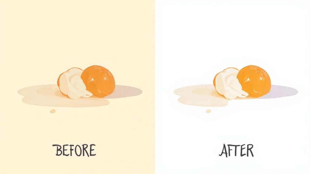
Automating Backgrounds for E-Commerce Excellence
For anyone selling online, a clean, consistent background isn't just nice to have—it's essential. Marketplaces like Amazon and Shopify have strict requirements, and a uniform look across all your listings builds a powerful, professional brand identity. But manually cutting out backgrounds is tedious, time-consuming work.
This is where AI-powered tools make a massive difference. A solution like ProdShot can instantly remove the background from your flat lay, replacing it with pure white or any other color in seconds. This doesn't just save you hours of mind-numbing work; it guarantees every image in your catalog is perfectly consistent. If you want to see how these systems operate, our overview of photo editing services for ecommerce takes a deeper dive.
By automating this final, critical step, you get a polished, marketplace-ready photo without ever breaking your workflow. It lets you focus on the creative parts—the planning and the shooting—knowing the technical finishing touches are completely handled.
You’ve created a fantastic flat lay photo, but the work isn't quite done. Now it's time to make sure that image actually works for you, driving sales and grabbing attention wherever you post it.
Think of it this way: your photo is the raw material. How you prep and share it is what turns it into a real marketing asset. A one-size-fits-all approach just won’t cut it. The technical specs for your Shopify store are worlds apart from what grabs eyeballs on Instagram. Getting this right means your images will look sharp, load in a flash, and ultimately, convert.
Prepping Your Photo for E-Commerce Platforms
When you're selling on a platform like Shopify, Amazon, or Etsy, the details matter. A lot. Your main goal here is a crystal-clear image that loads almost instantly. Why? Because page speed is directly tied to sales, and a slow-loading product page is a surefire way to lose a customer before they've even seen what you're selling.
First up, resizing. Most platforms have their own guidelines, but a solid rule of thumb is to keep your image width between 1000 and 1600 pixels. That’s the sweet spot—big enough for customers to use the zoom feature, but not so massive that it bogs down your site.
Next, you'll want to dial in the file format and compression.
- JPEG is your go-to for photos. It hits that perfect balance of high quality and small file size.
- PNG should only be on your radar if you absolutely need a transparent background.
Before you upload anything, run your image through a compression tool. Try to get the file size under 100 KB if you can. It’s a simple step that makes a world of difference for your page load times. For Shopify sellers, this is especially critical. If you’re trying to meet that clean, white-background standard, knowing how to properly remove the background for Shopify is a game-changer.
Don’t just stop at file size. If you really want your products to get noticed, learning how to optimize images for SEO by using smart file names and alt text can give your flat lays a huge boost in search results.
Adapting Your Flat Lay for Social Media
Social media is a totally different ballgame. It’s all about stopping the scroll and fitting your content to the unique quirks of each platform. That one perfect square image you shot? It’s not going to work everywhere.
Your master flat lay should be treated like a source file—something you can crop and repurpose. Keep these common aspect ratios in mind:
- Instagram Feed (1:1 or 4:5): The classic square is fine, but a taller 4:5 vertical post eats up more screen space, making it much more engaging as people scroll.
- Instagram Stories & Reels (9:16): This is the king of vertical content. You'll have to crop your flat lay quite a bit, so remember to shoot with a central focus that still looks great when the sides are trimmed off.
- Pinterest (2:3): This is the magic ratio for Pins. Vertical images with these dimensions perform way better on the platform, leading to more saves and clicks.
Once you’ve got your crops, it’s all about context. Your caption is where you expand on the story you started with your styling. Don't just list product features; tap into the feeling your flat lay is meant to create. Round it out with a smart mix of relevant hashtags—blend some popular, broad terms with niche-specific ones to cast the widest net. This is the final layer that transforms a pretty picture into a powerful piece of marketing.
Even with the best-laid plans, things can go sideways when you're in the middle of a shoot. It happens to everyone. Here are some quick answers to the common hiccups you might run into when shooting flat lays with your smartphone.
How Do I Avoid Ugly Shadows in My Photos?
Shadows are the number one giveaway of an amateur shot. The secret to avoiding them is soft, diffused light. Always, always try to set up next to a large window. If you can, shoot on a slightly overcast day—the clouds act like a giant, natural softbox, giving you beautiful, even light without harsh glares.
Position your scene so the light is coming from the top or the side of your frame. This looks the most natural to the human eye. To really take it to the next level, grab a simple piece of white foam board (or even just a sheet of printer paper) and place it opposite the window. This little trick acts as a reflector, bouncing light back into the dark spots and softening up any remaining shadows for that clean, professional look.
What Kind of Props Should I Use for My Flat Lay?
Think of your props as the supporting cast—they should help tell the story of your main product, not steal the show. Every single item in your frame needs to feel intentional and align with your brand's colors and vibe. It’s all about adding a bit of texture and context.
Here are a few go-to options that rarely fail:
- Natural Elements: Fresh flowers, a small succulent, or a few dried leaves can bring an organic, lively feel to the shot.
- Relevant Tools: Think about what someone would use with your product. A coffee scoop next to coffee beans, or paintbrushes next to art supplies, for instance. It just makes sense.
- Simple Textures: A linen napkin, a piece of high-quality textured paper, or a bit of chunky knit fabric can add depth and visual interest without being distracting.
My rule of thumb? Start with just three to five props. You can always add more, but it's much harder to untangle a shot that's become too cluttered and chaotic.
The most common mistake I see is people choosing props that are louder than their hero product. Remember, your product is the star. Everything else is just there to make it shine.
Why Do the Edges of My Photo Look Distorted?
Ah, the dreaded "barrel distortion." This usually happens for one of two reasons: your phone's camera is either too close to your setup, or it isn't perfectly parallel to the surface.
The fix is pretty simple: just move your phone further away. If your phone has a 2x zoom option, give that a try. This often switches to a different lens that has less of that weird, rounded distortion. Most importantly, you have to get your phone completely level. A tripod with an overhead arm is your best friend here. It’s the surest way to guarantee that perfectly flat, distortion-free perspective every single time.
Ready to turn those smartphone shots into stunning, marketplace-ready product images? ProdShot uses AI to instantly remove backgrounds, clean up your photos, and create conversion-optimized visuals in seconds. Get your free, professional product shots today at ProdShot.