
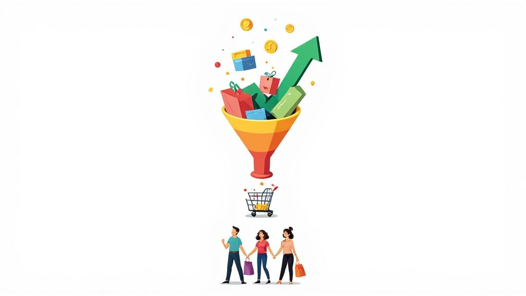
If you want to start seeing more sales, you have to get a handle on your conversion rate. But that doesn't just mean chasing some arbitrary number. It’s about creating a clear baseline, understanding what’s actually possible for your store, and then methodically improving the things that matter—your product pages, site navigation, and especially that all-important checkout process.
The real wins come from a smart mix of improving the user experience, building trust, and testing everything you change to see what truly connects with your customers.
What Is a Good Ecommerce Conversion Rate?
Before you can make anything better, you need to know where you're starting from. In simple terms, your conversion rate is just the percentage of website visitors who end up buying something.
But here's the thing: chasing a "good" conversion rate without any context is a fast track to frustration. There’s no universal magic number. A good rate is a moving target that shifts based on your industry, the price of your products, where your traffic comes from, and even what device people are shopping on.
A store selling high-end, custom furniture is naturally going to have a much lower conversion rate than one selling $15 phone cases. The goal is to stop guessing and start building your strategy on solid data.
Setting Realistic Benchmarks
Knowing how you stack up against the broader market is the first step in setting goals you can actually hit.
Globally, the average e-commerce conversion rate tends to hover between 2.5% and 3%. But for many Shopify merchants, that average is closer to a more modest 1.4%, which really highlights the unique hurdles smaller businesses have to clear.
So, what should you aim for? Stores that push their conversion rate above 3.2% are officially in the top 20% of all e-commerce sites. And if you can break past 4.7%, you’re performing better than the vast majority of your competition.
This graphic really helps put things into perspective, showing not just the global average but also how much of a difference checkout optimization and device type can make.
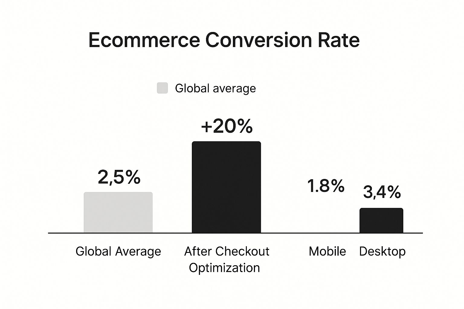
It’s pretty clear that desktop users are still more likely to complete a purchase, which is a crucial reminder to give every device its own tailored experience.
To help you get a sense of where you stand, here’s a quick look at some key benchmarks.
Ecommerce Conversion Rate Benchmarks
This table summarizes key performance benchmarks to help you gauge your store's performance against industry and device averages.
| Metric | Average Rate |
|---|---|
| Global Ecommerce Average | 2.5% – 3.0% |
| Typical Shopify Store | 1.4% |
| Top 20% of Stores | 3.2% or higher |
| Industry Leaders (Top 10%) | 4.7% or higher |
| Mobile Conversion Rate | 2.0% |
| Desktop Conversion Rate | 4.7% |
These numbers aren't rules, but they are incredibly useful guideposts. They help you understand what's normal, what's good, and what's truly exceptional in the world of e-commerce.
Tracking Conversions Beyond the Sale
While getting that final sale is obviously the main event, it's not the only "conversion" you should be paying attention to. To really figure out how to lift your overall sales, you need to start tracking micro-conversions—all the little steps a shopper takes on their way to becoming a customer.
Some of the most valuable micro-conversions to watch are:
- Adding a product to the cart
- Signing up for your email newsletter
- Creating a customer account
- Downloading a lookbook or guide
By keeping an eye on these smaller actions, you can pinpoint exactly where your sales funnel is working smoothly and where it’s causing friction. For example, if you have a ton of people adding items to their cart but very few actually completing the purchase, you know you have a checkout problem that needs fixing.
If you’re ready to set some ambitious goals, digging into data-driven strategies to double your Shopify conversion rate can give you a more advanced playbook.
Turn Your Product Pages Into Conversion Engines
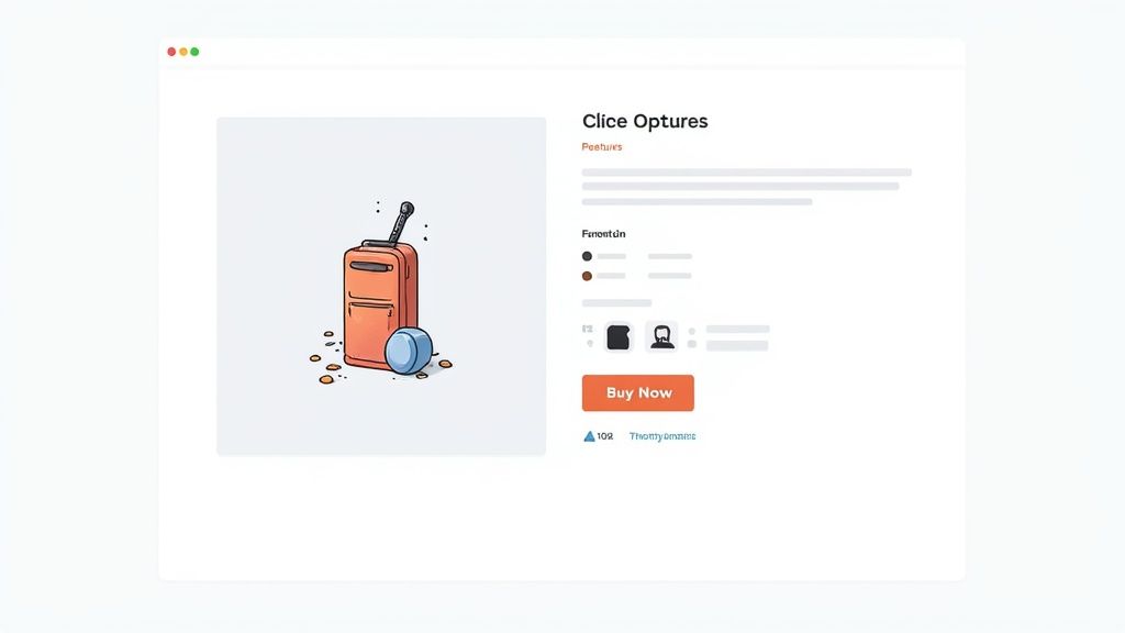
Think of your product page as the final sales pitch. It’s that critical moment where a casual browser decides to become a paying customer, and believe me, every single element on that page matters. This isn't just about listing features; it's about crafting an experience that builds confidence and makes the value of your product absolutely undeniable.
The real goal here is to answer every question and squash every hesitation before it even pops into your shopper's head. When high-quality visuals, a compelling story, and a clear call-to-action work together, clicking "Add to Cart" feels like the most natural thing in the world.
Write Descriptions That Sell Benefits, Not Features
Here’s a classic marketing truth: people don't buy a drill because they want a drill; they buy it because they need a hole. Your product descriptions have to operate on that same principle. Instead of just rattling off specs, you need to translate those features into real-world benefits that solve a problem or make someone's life better.
For example, a backpack’s “water-resistant nylon fabric” isn’t what sells. What sells is the "peace of mind that your laptop stays dry during an unexpected downpour." That small shift in perspective is everything when it comes to connecting with what a customer actually needs.
Here's a simple structure I've seen work wonders:
- A Benefit-Led Summary: Kick things off with a punchy sentence or two that gets right to the core value.
- Scannable Bullet Points: List the top 3-5 key features that directly support that main benefit.
- Detailed Dropdown: Tuck the technical specs and finer details into a collapsible section. This is for the shoppers who really want to dig deep without overwhelming everyone else.
This approach caters to both the skimmers and the researchers, making sure everyone gets what they need.
Use High-Quality Visuals to Build Trust
Let’s face it, online shoppers can't touch or feel your product. Your images have to do all the heavy lifting. Grainy, poorly lit photos scream amateur and create doubt. On the other hand, crisp, professional visuals build instant trust and help customers imagine the product in their own lives.
Shoppers need to see a product from multiple angles to feel confident in their purchase. Since they can't physically inspect it, your gallery should provide a complete 360-degree story, highlighting unique textures, key features, and its scale in a real-world context.
And don't just stop at static photos. Short videos showing the product in action or interactive 3D models can be conversion game-changers. Investing in professional visuals is non-negotiable. If a full studio setup isn't in the budget, exploring product photo editing services can be a fantastic way to bridge the gap and get that conversion-driving quality.
Make Your Call to Action Irresistible
Your "Add to Cart" button needs to be the most obvious, compelling thing on the page. I've seen brands obsess over this, and for good reason—its design, color, and placement matter immensely. Use a color that contrasts with your page's palette so it immediately draws the eye.
The text on the button—the copy—is also a huge factor. "Add to Cart" is the old standby, but don't be afraid to test variations like "Buy Now" or "Get Mine Today" to see what your audience responds to.
Finally, surround that button with little trust-builders. Microcopy like "Free 30-Day Returns" or "Secure Checkout" can be just the thing to remove that last bit of hesitation and effectively increase ecommerce conversion rates.
Design a Frictionless Shopping Experience
A frustrating website is the fastest way to lose a customer. I've seen it happen countless times—every slow-loading page, every confusing menu, and every dead-end search result is a tiny crack in the customer's journey. These small annoyances build up until the shopper decides it's just not worth the effort and leaves.
The real goal here is to make the path from browsing to buying so smooth and intuitive that it feels almost invisible. You're anticipating what your customers need, often before they even realize it themselves. It all starts with clean, simple navigation. Shoppers shouldn't have to decipher a maze of menus and subcategories; they should be able to find exactly what they’re looking for in just a couple of clicks.
Optimize Site Search and Navigation
Your on-site search bar is an absolute goldmine. When someone types something into that box, they're telling you exactly what they want to buy. Don't let them down with irrelevant results. A great search function needs to be smart enough to handle typos, understand synonyms, and even offer predictive suggestions as they type.
But good navigation is more than just a menu. It’s about creating a guided journey. Here are a few elements I always recommend:
- Breadcrumbs: These little navigational trails show users exactly where they are on your site. They let people backtrack easily without mashing the back button and getting lost.
- Advanced Filtering: Let shoppers slice and dice your product catalog by size, color, price, brand—whatever makes sense for what you sell. The more control you give them, the faster they'll find "the one."
- "No Results" Pages: A dead end is a massive missed opportunity. Instead of a blank page, use that space to suggest related searches or showcase your best-selling products. Keep them engaged.
For example, integrating the best AI chatbot for ecommerce can act as a personal shopper, providing instant assistance and guiding customers right to what they need, making the entire journey seamless.
Prioritize Mobile Speed and Usability
Let's be clear: your mobile site isn't just a shrunken-down version of your desktop site anymore. For most stores, it is the primary storefront. And when it comes to mobile, speed is everything. A delay of just one second can send your conversion rate plummeting because mobile shoppers are notoriously impatient.
A seamless mobile experience is critical for capturing sales. While desktop users still convert at a higher rate, mobile is where the majority of browsing and discovery happens. Your design must be thumb-friendly, with large tap targets, simplified forms, and a streamlined checkout process.
The data tells a fascinating story about how we shop. Desktop users convert at 4.8%, which is quite a bit higher than mobile users at 2.9%. But here's the kicker: mobile accounts for a whopping 73% of all e-commerce traffic. You can explore more e-commerce benchmarks and trends over at SpeedCommerce.
That gap between traffic and conversions highlights just how crucial a truly optimized mobile experience is. As mobile commerce continues to dominate, making that journey buttery-smooth isn't just a good idea—it's a direct path to boosting your overall conversion rate.
Simplify Your Checkout and Stop Cart Abandonment
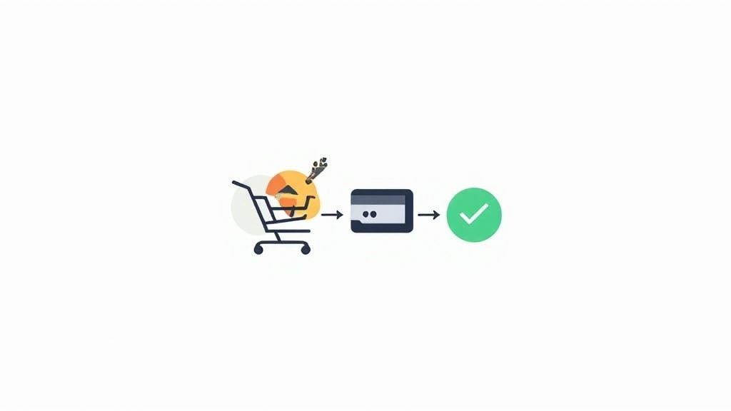
You’ve done the hard work. You guided a shopper from a landing page, they loved your product, and they finally hit "Add to Cart." This is the moment of truth, the final step in the journey… and it’s precisely where most online stores completely fumble the ball.
Any friction in your checkout process sends conversion rates into a nosedive. The single biggest killer? Surprise costs.
When a customer gets to the final screen and suddenly sees an unexpected shipping fee or tax, it feels like a bait-and-switch. This one issue is the top reason for the world's mind-boggling cart abandonment rate, which sits around 70%. Let that sink in: seven out of every ten people who were ready to give you money just… didn't.
Remove Unnecessary Barriers
The second-biggest mistake I see is forcing users to create an account. In an age of instant gratification, that's just a chore. Shoppers don't want to commit to another password and a new marketing list just to make one purchase. This is where a guest checkout option becomes your most powerful tool.
Let them check out as a guest, no strings attached. You can always ask them to create an account after the sale is complete, maybe by highlighting perks like easier order tracking. But never, ever make it a requirement to hand over their money.
Another game-changer is integrating one-click payment options. These completely transform the experience.
- Apple Pay and Google Pay are fantastic for mobile shoppers, using biometrics to make the process secure and ridiculously fast.
- PayPal lets people log in and pay without ever having to dig out their credit card or type in their shipping address.
Offering these express payment methods isn't just about convenience. You're borrowing the trust that shoppers already have in massive platforms like Apple and PayPal. This simple addition can have a huge impact on mobile conversions and your overall sales.
Design a Clear Path to Purchase
Beyond payments, the design of the checkout page itself is critical. Your mission here is to eliminate every possible distraction. Get rid of the main navigation menu, pop-ups, and anything else that might tempt a user to click away from completing their order.
If you have a multi-step checkout, always include a visual progress bar (e.g., Shipping > Payment > Review). This small element manages expectations by showing the user exactly where they are in the process, making it feel way less overwhelming.
Make sure each step is clean, with clearly labeled form fields and smart error messaging that helps users fix mistakes without getting frustrated. Making the checkout feel effortless is the final, essential step to increase ecommerce conversion rates and turn that abandoned cart into a confirmed sale.
In a sea of online stores, shoppers aren't just looking for a product; they're looking for a brand they can trust and connect with. That generic, one-size-fits-all approach? It’s a conversion killer.
If you really want to move the needle, you have to build a foundation of trust. This comes from two places: genuine personalization and undeniable social proof.
It’s the digital version of a friendly, knowledgeable shop assistant combined with a glowing recommendation from a friend. When you nail this combo, shoppers feel confident and understood—and that feeling is what turns a "maybe" into a "yes."
Make it Personal, Make it Relevant
Personalization is so much more than sticking a customer's first name in an email. It’s about creating a smart, tailored shopping experience that actually responds to what they're doing.
Every click, every view, every search—it’s a clue. Using that data to show customers more of what they actually want is a total game-changer.
Think about it: a visitor who has looked at three different pairs of running shoes should see a homepage banner with your latest athletic arrivals, not a random sale on winter coats. That’s where intelligent recommendations come into play.
Here are a few ways to put this into practice:
- "Frequently Bought Together" Bundles: On a product page, show them items that just make sense. If someone is buying a camera, suggesting a compatible lens and a memory card is genuinely helpful, not just a pushy upsell.
- AI-Powered Recommendations: Use a shopper's browsing history and past purchases to power a "Recommended for You" section. It makes them feel like the store was curated just for them.
- A Homepage That Adapts: Change up the content and products on your main page based on who’s looking. Is it a brand new visitor, a loyal returning customer, or someone who left items in their cart? Each one should see something different.
Let Your Customers Do the Selling with Social Proof
Shoppers are naturally skeptical, especially when they’ve never bought from you before. Social proof is your best weapon against that hesitation.
When a potential buyer sees that real people—just like them—absolutely love your products, it validates their decision. It gives them the final nudge of reassurance they need to click "buy."
A study found that displaying user-generated content, like customer photos, can bump up conversions by as much as 10%. Seeing your product out in the real world is infinitely more powerful than a slick, sterile studio shot.
The trick is to place the right kind of social proof at the right moments. High-quality visuals, often polished with professional photo editing services for ecommerce, build that crucial first impression. Then, on the product page itself, customer reviews can provide the final push.
Sprinkle these trust signals throughout the entire journey. Security badges on the checkout page, authentic testimonials on your landing pages—it all adds up. By showing shoppers they’re in good company, you make the choice to purchase feel both safe and smart.
Test and Refine Your Conversion Strategy

Here’s the thing about conversion rates: they’re never really "done." The most successful stores treat conversion optimization not as a one-time project, but as a continuous cycle of data-driven improvement.
Instead of making massive, risky changes based on a gut feeling, you need to adopt a mindset of constant testing and refinement. This is where A/B testing becomes your secret weapon.
In a nutshell, A/B testing (or split testing) is where you create two slightly different versions of a page element—maybe a call-to-action button or a product headline—and show each version to a different group of visitors. You then measure which one performs better. It’s that simple.
This process strips the ego and guesswork out of your decision-making. You're letting your customers tell you exactly what they prefer through their actions. The goal is to get into a sustainable rhythm of hypothesizing, testing, learning, and implementing the winners.
Small Changes, Big Impact
You don't need to overhaul your entire website to see a real lift in sales. In my experience, the most powerful A/B tests often focus on small but critical elements that have an outsized impact on user behavior.
For instance, simply changing the text on a CTA button from "Buy Now" to "Get Your Kit Today" might feel minor, but it could easily result in a surprising jump in clicks. It's all about finding that small bit of friction and smoothing it out.
Not sure where to start? Try testing these high-impact areas:
- Product page headlines: Pit a benefit-focused headline against a feature-focused one.
- CTA button colors: Does a vibrant orange outperform your standard blue? There's only one way to find out.
- Product image order: Try leading with a lifestyle shot instead of a standard product-on-white. Adding a short video can also work wonders. You can learn more about the cost of professional product photography and see how it moves the needle.
- Checkout form fields: What happens if you remove that one "optional" phone number field? It might be the final push someone needs to complete their order.
By isolating and testing just one variable at a time, you can be 100% confident that any change in performance is a direct result of your experiment. This methodical approach is exactly how you build a high-converting powerhouse, one small, proven win at a time.
Frequently Asked Questions
What Is a Good Ecommerce Conversion Rate?
Everyone wants to know the magic number, but the truth is, a "good" conversion rate is a moving target. Generally speaking, most stores fall somewhere between 2% and 4%. But that's just an average—rates can swing wildly depending on your industry, price point, and even the type of traffic you're getting.
If you're in the top 10% of online stores, you're likely seeing rates north of 4.7%. Instead of getting hung up on a universal benchmark, the real goal is to beat your own numbers month over month. The best approach? Find your specific industry's average and use that as a realistic starting point.
How Can I Quickly Improve My Mobile Conversion Rate?
For a quick win on mobile, your mantra should be speed and simplicity. Mobile shoppers are impatient and easily distracted, so you have to make it incredibly easy for them.
Start by decluttering your mobile navigation. Make sure your call-to-action buttons are big, bold, and easy to tap with a thumb. Next, add one-click payment options like Apple Pay or Google Pay. This alone can slash checkout time and give your mobile sales a serious boost.
The key to mobile conversion is removing friction. Every unnecessary form field, slow-loading image, or confusing step is a reason for an impatient mobile shopper to leave.
Finally, get obsessive about your mobile site speed. A delay of even one second can send your conversion rate plummeting, especially for customers who are shopping on the go.
What Is the Biggest Cause of Cart Abandonment?
By far, the number one killer of sales is unexpected costs that pop up at the last second. When a shopper gets all the way to checkout and suddenly sees high shipping fees, taxes, or other random charges, it feels like a bait-and-switch. That feeling instantly erodes trust and sends them running.
Of course, that's not the only reason people leave. Other major culprits include:
- Forcing shoppers to create an account just to buy something.
- A checkout form that feels like filling out a tax return.
- Worries about payment security and whether your site is trustworthy.
The most powerful fix is simple: be completely transparent with all costs right from the start. Showing the full price upfront is one of the most effective ways to build trust and increase ecommerce conversion rates.
Ready to turn your simple product photos into stunning, high-converting images? ProdShot uses AI to create professional-grade visuals in seconds, helping you build trust and boost sales. See how it works at https://prodshot.net.