
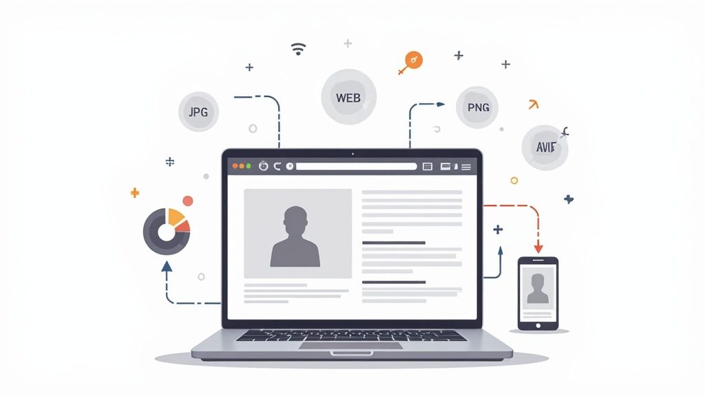
Getting your product images ready for the web isn't just a technical task—it's about striking the perfect balance between file size and visual punch. You need to shrink your images down so they load in a snap, but without turning your beautiful product shots into a blurry mess. Get it right, and you’ll see faster load times, happier customers, better SEO, and a healthier bottom line.
Why Image Optimization is a Straight-Up Business Strategy
It’s easy to think of image optimization as a job for the dev team, a technical box to be ticked. But that mindset misses the bigger picture. In reality, image optimization is a core business strategy that directly fuels revenue, keeps users engaged, and shapes how people see your brand. It’s not about trimming a few kilobytes; it's about building a faster, more profitable online storefront.
Images are almost always the heaviest assets on a webpage. When a potential buyer lands on your site, huge, clunky images can make the whole experience feel sluggish, causing instant frustration. And just like that, they’re gone. This isn't just a minor annoyance—it’s a major leak in your sales funnel.
The Real Cost of a Single Second
Every millisecond matters online. You might be surprised to learn that even a one-second delay in how fast your page loads can cause a significant drop in conversions and send your bounce rate through the roof. When people have to wait for product photos or hero banners to pop up, their patience evaporates.
This is especially true on mobile, where everyone expects things to be instantaneous. A slow-loading product page is often the only thing standing between you and a sale—and a faster competitor is just a click away.
Don't just take my word for it—the link between speed and sales is proven. Walmart found that for every one-second improvement in page load time, they saw up to a 2% increase in conversions. That’s a clear sign that optimizing your images isn't just a technical tweak; it's a direct investment in your company's growth.
The data paints a pretty clear picture of how crucial image speed is for any online business. These numbers aren't just abstract statistics; they represent real customers and real revenue.
Impact of Image Load Times on Business KPIs
| Metric Affected | Potential Impact of a 1-Second Speed Improvement | Real-World Example |
|---|---|---|
| Conversion Rate | A 7% increase in conversions. | AutoAnything saw a 12-13% increase in sales after cutting load times in half. |
| Bounce Rate | An 8.3% increase in bounce rate as page load goes from 1s to 3s. | Google found that a 3-second load time increases bounce probability by 32%. |
| User Engagement | A 16% decrease in customer satisfaction. | Customers are less likely to browse additional pages or products on a slow site. |
| SEO Ranking | Negative impact on Core Web Vitals, especially LCP. | Vodafone improved their LCP by 31% and saw an 8% lift in sales. |
Ultimately, faster images lead to better user experiences, which in turn drives higher engagement, more conversions, and increased revenue. It's a direct line from performance to profit.
Core Web Vitals and Your Place in Google
Google's Core Web Vitals are all about measuring real-world user experience. They look at loading performance, how quickly a user can interact with the page, and whether things jump around as they load. Since images are often the biggest thing on a page, they have a massive impact on your Largest Contentful Paint (LCP) score, a critical Core Web Vital.
A bad LCP score is a red flag for search engines, signaling that your site delivers a poor experience. That can tank your search rankings. By simply optimizing your images, you give these vital metrics a direct boost, telling Google that your site is fast, user-friendly, and deserves a better spot in the search results.
The numbers don't lie. Research shows that images make up roughly 50% of all bytes on an average web page, and a whopping 39% of users will click away if images are too slow to load.
We've seen this play out time and time again. Zitmaxx Wonnen, a furniture retailer, cut its load time down to three seconds and was rewarded with a mind-blowing 50% jump in mobile conversions and a 98.7% lift in mobile revenue. You can dig into more case studies like this over at Nitropack. This isn't just about making things faster—it's about generating a measurable financial return.
Choosing the Right Image Format and Dimensions
Picking the right image format is more than just a technical checkbox; it's a strategic move that has a direct impact on how fast your site loads and how good your products look. The first real step in optimizing images is getting past the textbook definitions and understanding when to use each format. Get this right from the start, and you'll save yourself a world of headaches down the road.
It’s all about balancing file size against quality and features like transparency. An e-commerce store selling jewelry, for example, absolutely needs a format that can handle a transparent background to create those clean, floating product shots. A travel blog, on the other hand, will want something that can handle vibrant, complex photos without bogging down the page.
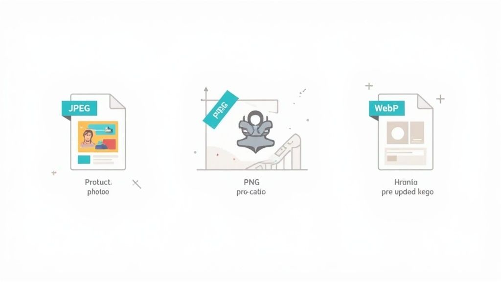
Matching Formats to Your Content
The trick is to match the format to the image's job. Every file type has its own strengths, and using them the right way is the foundation of good image optimization.
-
JPEG (Joint Photographic Experts Group): This is your workhorse for complex photos with tons of colors and smooth gradients. Think hero banners, lifestyle shots, and detailed product photos. It uses "lossy" compression, which cleverly shaves off some data to shrink the file size. You can usually find a sweet spot where the quality dip is completely invisible to the naked eye.
-
PNG (Portable Network Graphics): Reach for a PNG anytime you need transparency. It's the only choice for logos, icons, or any product photo that needs to sit on a colored background without that ugly white box around it. PNGs use "lossless" compression, which means they keep every single pixel of data. The upside is perfect quality; the downside is a much bigger file size.
-
WebP & AVIF (The Modern Powerhouses): These newer formats are where things are headed. They offer far better compression than JPEGs and PNGs, giving you much smaller files at the same visual quality. Plus, they can handle both transparency and animation. With WebP now supported by over 97% of browsers, it's a safe and incredibly powerful choice for just about any image on your site.
For a Shopify store, a great workflow would be using a high-quality JPEG for that big, beautiful homepage banner, but then switching to WebP with a transparent background for the individual product images to keep the page snappy and light.
Why You Must Resize Images Before Uploading
One of the most common—and damaging—mistakes I see is people uploading a massive, high-resolution photo straight from their camera and just letting the website shrink it down with code. When you do this, the user’s browser has to download the entire multi-megabyte file first, only to then do the extra work of resizing it. It's an absolute performance killer.
Think about it: your layout calls for a 500×500 pixel thumbnail. If you upload a 4000×4000 pixel image from your DSLR, you're forcing every visitor to download a file that's huge, just to see a tiny version of it. This chews up bandwidth and makes your page crawl, especially for anyone on a mobile connection.
The rule is simple: Always resize your images to the maximum dimensions they will ever be displayed at before you upload them. If your blog's content area is 800 pixels wide, there is zero benefit to uploading an image that’s 3000 pixels wide.
This one step alone can slash your image file sizes by 80-90% before you even touch compression. There are plenty of tools out there, but if you need something quick and painless, a free online image resizer from ProdShot gets the job done in seconds.
Practical Dimension Guidelines for E-commerce
Figuring out the exact dimensions can feel like a guessing game, but you can start with some tried-and-true standards and tweak them for your specific site design. This keeps your images looking crisp without being needlessly large. If you really want to go deep on making sure your visuals are ready for any device, check out a comprehensive guide to sizing images for websites from Altitude Design.
Here are some solid starting points for most e-commerce sites:
- Full-Width Hero Banners: Aim for around 1920 pixels wide to look sharp on most modern desktops. The height will depend on your design.
- Product Page Main Images: Somewhere between 1000 and 1500 pixels on the longest side is a great target. This gives you enough detail for a quality zoom feature without a monster file size.
- Product Thumbnails: These can be much smaller. Depending on your category page layout, 150 to 300 pixels square is usually plenty.
- Blog Post Images: Simply match the maximum width of your blog's content column. For most themes, this is between 750 and 900 pixels wide.
By carefully selecting your format and resizing to the right dimensions upfront, you build a solid foundation. You're ensuring your images don't just look great, but they also contribute to a fast, smooth experience that keeps people on your site and helps turn browsers into buyers.
Mastering Image Compression Without Losing Quality
Once you've nailed down the right format and dimensions for your images, it's time to tackle compression. This is where the magic really happens for shrinking file sizes, but it’s also where a lot of people get nervous about ruining the quality of their beautiful product shots. The goal is to find that perfect sweet spot: an image that’s as light as a feather, but where the human eye can’t tell the difference.
Getting a handle on the two main types of compression is the key to making smart choices that won't leave your product photos looking pixelated or blurry.
Lossy vs. Lossless: The Two Sides of Compression
I like to think of compression like packing a suitcase. You can either be super meticulous and fold everything perfectly to fit (that’s lossless), or you can leave a few non-essential things behind to make the bag much lighter (that’s lossy).
-
Lossless Compression: This technique shaves off file size by getting rid of unnecessary metadata—basically, behind-the-scenes file info—without touching a single pixel of the actual image. The quality remains 100% identical to the original. This is perfect for things like technical diagrams or graphics with sharp text where every single detail is critical.
-
Lossy Compression: This is a more aggressive method that intelligently removes some visual data that our eyes are unlikely to notice anyway. For almost all product photos and web graphics, you can apply a surprising amount of lossy compression with no visible drop in quality. This is where you’ll see the biggest wins for site speed.
For e-commerce, lossy compression is almost always the right move. I've found you can often slash a file's size by 70% or more before you start to see any real-world degradation. If your images still need a little something extra after compression, you might find our professional product photo editing services can give them that final polish.
Finding the Right Compression Tools
You don't need to be a Photoshop wizard to compress images effectively. There are some fantastic, user-friendly tools out there that make the whole process a breeze. Whether you prefer a quick online tool or a desktop app for batch jobs, there's something for every workflow.
I've tested a ton of them over the years, and a few have become my go-to recommendations.
Compression Tool Comparison
Below is a quick rundown of some of the best tools I've used. Each one shines in slightly different scenarios, so it's worth knowing which one to reach for.
| Tool | Type (Online/Offline/Plugin) | Best For | Key Feature |
|---|---|---|---|
| Squoosh | Online | Fine-tuning compression settings with a live preview. | Its side-by-side comparison view lets you instantly see quality changes. |
| TinyPNG | Online | Quick, no-fuss compression for JPEGs and PNGs. | Extremely simple drag-and-drop interface for batch processing. |
| ImageOptim | Offline (Mac) | Batch optimizing images locally on your computer. | It's free, open-source, and combines multiple compression algorithms. |
These tools are all about giving you control without a steep learning curve. In most cases, it's as simple as uploading your image, playing with a quality slider, and downloading the optimized result.
Automated Optimization with CDNs
For a truly set-it-and-forget-it approach, you can’t beat a Content Delivery Network (CDN). Many modern web hosts and services use CDNs to handle image optimization completely automatically.
Here’s how it works: the CDN smartly detects what kind of device and browser your visitor is using. Then, it serves up the perfect image—often converting it to a next-gen format like WebP on the fly, at just the right size and compression level.
This adaptive approach delivers huge performance gains. We’re talking real-world data showing sites that use this kind of optimization see 30-40% boosts in PageSpeed scores and an incredible 50-60% reduction in visual loading times. Those are the kind of metrics that Google loves to see, which can have a direct, positive impact on your search rankings and user engagement. You can dive deeper into these findings from the Vision Report 2025.
By intelligently compressing your images, you're not just making your site faster. You're creating a smoother, more enjoyable experience for your visitors, which directly translates into higher engagement and better conversion rates. It’s one of the highest-impact changes you can make.
Okay, you've resized, formatted, and compressed your images. They're lean and fast. But don't hit upload just yet. The last piece of the puzzle is making sure search engines and people can actually find and understand them.
An image without the right context is invisible. Search crawlers can't see pictures, and assistive technologies need a description to help users. This is where you connect your slick visuals to your bigger SEO and accessibility goals, turning a simple graphic into a genuine asset that pulls in traffic.
Writing Alt Text That Actually Helps
Everyone says to "use alt text," but that advice is way too simple. Good alt text does two critical jobs at once: it describes the image for visually impaired users who rely on screen readers, and it gives search engines powerful context about what’s on the page.
Dashing off a generic alt="shoes" is a huge missed opportunity. You need to be more descriptive. Think about it: alt="A pair of men's blue suede wingtip dress shoes on a wooden floor" paints a crystal-clear picture for someone who can't see the image. It also naturally weaves in keywords that Google can use to understand and rank your content.
Here's how to get it right:
- Be Specific: What’s really in the picture? If it's a product, call out the color, material, or style. Don't be vague.
- Keep It Punchy: Aim for under 125 characters. Most screen readers will cut off anything longer, so get to the point quickly.
- Keywords are Welcome (But Don't Force It): If your target keyword fits naturally, include it. But never, ever stuff it with keywords. Google is smart enough to spot that, and it will only hurt you.
- Skip the Obvious: You don’t need to start with "An image of…" or "A picture of…" Screen readers already announce that it's an image.
Nail Your File Names Before You Upload
Your SEO work starts before you even open your website's media library. The file name is one of the first clues you give a search engine. A name like IMG_8432.jpg tells Google absolutely nothing.
This is such an easy win. Just rename the file to something that actually describes the image.
My rule of thumb is simple: name the file as if you were describing it to a colleague. That's it. So,
IMG_8432.jpgbecomesblue-suede-shoes.jpg. It’s instantly more meaningful and gives your image SEO a head start.
Always use lowercase letters and stick to hyphens to separate words. Google sees hyphens as word separators, but it often mashes words together when it sees underscores. It's a small detail that makes a big difference.
Give Search Engines the Full Story
Want to go a step further? You can feed search engines even more information to help them categorize and feature your visuals, which is especially powerful for e-commerce.
Two key ways to do this are with image sitemaps and structured data.
- Image Sitemaps: Sometimes, search engines miss images, especially if they're loaded with fancy JavaScript. A dedicated image sitemap is like handing Google a complete catalog of every visual on your site, ensuring nothing gets overlooked.
- Structured Data (Schema Markup): This is your chance to explicitly tell Google, "Hey, this is a product image." By adding schema markup to your product pages, you give your visuals a much better shot at appearing in rich results, like the image carousels at the top of a search page.
These aren't just minor tweaks; they signal to search engines that your images are high-quality, relevant parts of your content. And the data backs this up. Image search now drives a staggering 22.6% of all Google search queries. We've seen websites that get their alt tags and compression right see a 23% boost in organic traffic. This stuff works, proving that optimizing your images goes way beyond just page speed. If you want to dive deeper, you can explore more technical SEO statistics that show just how critical visual content has become.
Diving into Advanced Performance Techniques
Okay, you've nailed the basics. Your images are sized correctly, compressed nicely, and properly tagged. Honestly, that puts you way ahead of the pack. But if you want a truly fast website—the kind that feels instantaneous and gives you a real competitive edge—it's time to go deeper.
This is where we get into the smart stuff: lazy loading, responsive images, and Content Delivery Networks (CDNs). These aren't just about making files smaller; they're about fundamentally changing how and when images are delivered to your visitors. It’s all about sending only what's needed, exactly when it's needed, from the closest possible server.
Unlock a Speed Boost with Lazy Loading
Think about it: why should a visitor's browser waste time and data downloading every single image on a long page if they never scroll down far enough to see them? It doesn’t make sense.
Lazy loading flips the script. It tells the browser to hold off on loading images that are "below the fold" (outside the visible screen area) until the user starts scrolling near them.
For an e-commerce category page packed with products or a detailed blog post, this is a game-changer. The initial page load is lightning-fast because the browser only grabs the handful of images at the top. This gives a massive boost to your Largest Contentful Paint (LCP) score, a metric Google cares a lot about.
The best part? Modern browsers have this built-in. All you need to do is add a simple attribute to your image tag: loading="lazy".

Seriously, that's it. For most websites, adding that one little attribute is one of the highest-impact, lowest-effort optimizations you can make.
Serve the Perfect Image Every Time with Srcset
Using a single, large image for every device is a classic performance killer. That beautiful 1200px wide photo that looks sharp on a desktop is complete overkill for a 400px wide smartphone screen, wasting bandwidth and slowing things down.
Responsive images, using the srcset and sizes attributes, fix this. You give the browser a menu of different-sized image files and tell it how much space the image will fill on various screens. The browser then does the smart work of picking the most efficient option.
Let's look at a real-world example for a product photo:

This code is like giving the browser a set of instructions: "Here are three image sizes. If the screen is small, use the little one. If it's a tablet, maybe the medium one. For desktops, go big." The user on their phone downloads the tiny 480w version, and their page loads way faster.
Once your images are sharp and speedy, it's a good idea to zoom out and look at the bigger picture of mobile performance. This comprehensive guide to mobile website optimization is a great next step to make sure your whole site is dialed in for every device.
Supercharge Delivery with a Content Delivery Network (CDN)
A Content Delivery Network (CDN) is a network of servers spread all over the world. Instead of your images living on one server in, say, Los Angeles, a CDN copies and stores them in data centers globally.
When a customer in London visits your site, the images are served from a nearby server in Europe, not all the way from California.
This simple shift drastically cuts down on latency—the physical time it takes for data to travel. The result is a faster, more reliable experience for every user, no matter where they are.
Modern CDNs are even smarter. Many can automate advanced optimizations on the fly, doing things like:
- Automatically converting images to next-gen formats like WebP or AVIF when a browser supports them.
- Applying the perfect level of compression without you lifting a finger.
- Resizing images dynamically based on URL parameters.
For e-commerce sellers, a powerful Shopify photo editor can often tie into these CDN services, creating a seamless workflow from the moment you upload a photo to its optimized delivery. A good CDN essentially outsources the most technical parts of image optimization, guaranteeing every user gets the fastest version of every image, every time.
You can see how all these pieces—from the filename to your sitemap—fit together.
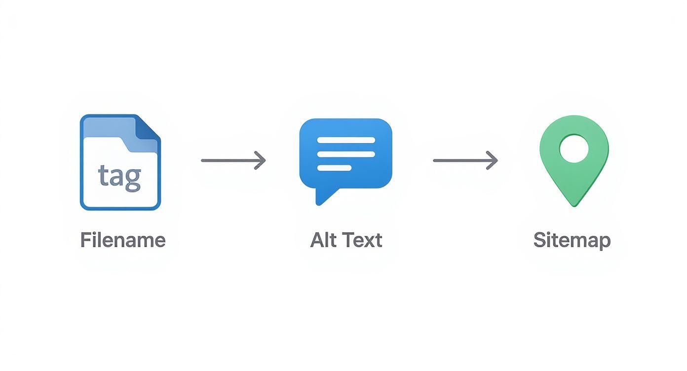
It’s a clear reminder that technical performance and good old-fashioned SEO are two sides of the same coin. By combining these advanced delivery strategies, you move beyond just shrinking files and start building a genuinely high-performance website.
Frequently Asked Questions About Image Optimization
Even with a solid workflow, some specific questions always seem to pop up. Image optimization has its own quirks and nuances, so let's run through a few of the most common hurdles you might run into.
Think of this as your quick-reference guide for getting unstuck and optimizing with confidence.
What Is the Ideal File Size for a Web Image?
There’s no single magic number here. The "right" size really depends on what the image is doing. A huge, full-width hero image is going to have different needs than a tiny product thumbnail.
That said, a good rule of thumb is to aim for under 150 KB for your big, prominent images and try to keep smaller ones (like product photos in a list) under 70 KB.
The real goal isn't about hitting an exact number, though. It's about finding that sweet spot where the file size is as low as possible without anyone noticing a drop in quality.
Your best friend for this is a performance tool. Run your page through Google PageSpeed Insights, and it will literally flag every image that's slowing things down. It takes all the guesswork out of the equation.
This gives you a clear, data-driven hit list so you can focus on fixing the images that are causing the biggest performance problems.
Should I Use WebP for All My Images Now?
For the most part, yes. It's a game-changer.
WebP delivers much better compression and quality than old-school formats like JPEG and PNG, and it's now supported by over 97% of all modern browsers. For almost any website, switching to WebP as your default is a fantastic move that will immediately speed things up.
But what about that small percentage of users on older browsers? For them, you'll want to have a fallback system in place. The good news is that most modern platforms, plugins, and CDNs handle this for you automatically.
It usually works like this:
- The server checks if a visitor's browser can handle WebP.
- If it can, it sends the super-optimized WebP file.
- If not, it just sends a standard JPEG or PNG instead.
This approach gives you the best of both worlds: incredible performance for the vast majority of your audience and a guaranteed good experience for everyone else.
How Do I Optimize Images Already on My Website?
Looking at a huge library of old, unoptimized images can feel overwhelming, but you've got some great options for tackling it. The right method really just depends on your site's platform and how hands-on you want to be.
If you're on WordPress, plugins like Smush or ShortPixel are absolute lifesavers. They can scan your entire media library and bulk-optimize everything you've ever uploaded. It’s pretty much a "set it and forget it" fix.
For non-WordPress sites, the process is a bit more manual but totally doable. You can download your images, run them through an online tool like TinyPNG in batches, and then re-upload the newly optimized versions.
Another powerful, hands-off approach is using a service with an image CDN. The CDN grabs your original image, optimizes it on the fly, and serves the fast, compressed version to the user. You never have to touch the source file on your server. It’s a great way to fix past uploads while ensuring everything you add in the future is optimized, too.
Ready to create stunning, professional product photos without the hassle of manual editing? ProdShot uses AI to instantly transform your simple snapshots into conversion-ready images for Shopify, Amazon, and Etsy. Try it for free and see how easy it is to elevate your brand at https://prodshot.net.