
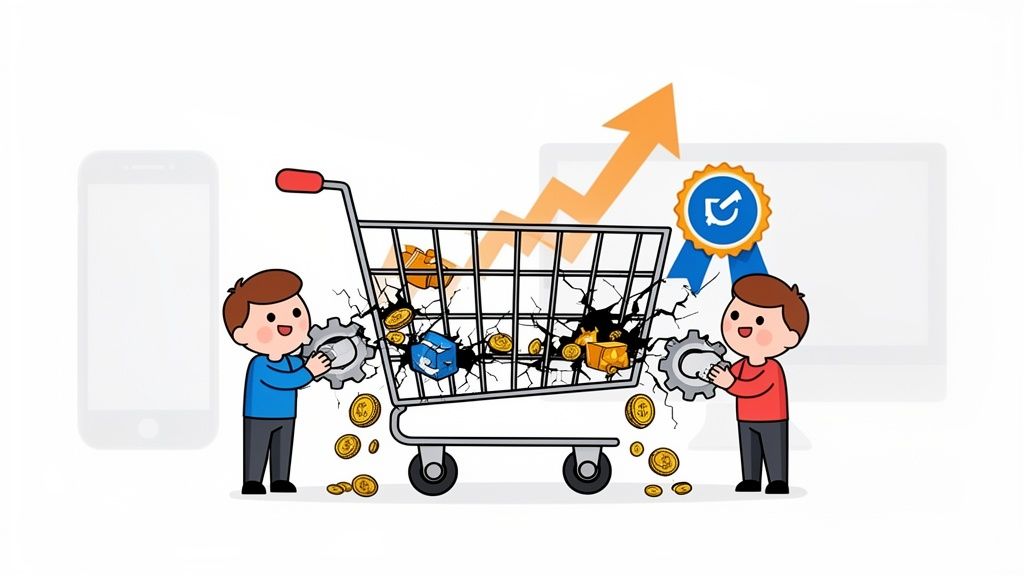
You've been there. A customer loads up their cart, you see the notification, and you get that little buzz of an impending sale. Then… nothing. They vanish without a trace. It’s one of the most frustrating parts of running an online store, but it’s far more than just a minor annoyance. It's a massive, flashing warning sign that something in your sales process is broken.
This isn't just the cost of doing business. It's a fixable leak in your revenue pipeline. To plug it, we have to get past the generic stats and dig into the real psychology of why a shopper who is this close to buying decides to back out.
Each abandoned cart tells a story of hesitation. Often, that story begins long before they even hit the checkout page. Understanding precisely why visitors abandon online forms gives us a huge clue—it’s about friction, uncertainty, and broken trust.
The Real Scale of the Problem
The numbers are genuinely staggering. Right now, the global average for shopping cart abandonment hovers around a massive 70.2%. Think about that for a second. For every ten shoppers who show clear intent by adding your products to their cart, seven of them walk away.
Globally, this adds up to an estimated £198 billion in lost sales. That's not just money left on the table; it's a huge pool of recoverable revenue from customers who were moments away from clicking "buy."

The key takeaway here isn't just about the lost sale itself. It's about a lost opportunity to convert a high-intent customer who was ready to become a part of your brand.
The Psychology of "I'll Do It Later"
So, what’s really going on in a customer's head to trigger this last-minute retreat? It almost always boils down to a few core psychological friction points that every store owner needs to tackle head-on.
Let’s quickly look at the most common culprits.
Top Cart Abandonment Causes at a Glance
This table breaks down the most frequent reasons shoppers get cold feet. Think of it as a quick diagnostic checklist for your own store.
| Reason for Abandonment | Percentage of Shoppers Affected | Quick Fix Suggestion |
|---|---|---|
| Unexpected Extra Costs | 48% | Display shipping and taxes upfront on the product or cart page. |
| Account Creation Required | 24% | Offer a guest checkout option. |
| Complicated Checkout | 21% | Reduce form fields and use a single-page checkout. |
| Can't See Total Cost Upfront | 17% | Add a dynamic cost calculator to the cart. |
| Security Concerns | 17% | Add trust badges (SSL, payment logos) and a clear privacy policy. |
As you can see, the issues aren't random. They're specific, predictable, and—most importantly—fixable.
Three Big Reasons for Digital Hesitation
From the data, three clear themes emerge:
- Financial Anxiety: Nothing kills a conversion faster than sticker shock. When a customer sees one price on the product page and a much higher one at checkout due to surprise shipping fees or taxes, it feels deceptive. Trust is broken instantly.
- Effort and Friction: People are busy. A long, convoluted checkout that demands they create an account or fill out endless forms feels like a chore. If it’s easier to just close the tab, they will.
- A Crisis of Trust: Does your site look trustworthy? A professional design, clear security badges, and high-quality product images are non-negotiable. Anything less can make a customer question the legitimacy of your entire operation.
The moment a customer questions the value, convenience, or security of their purchase, you’ve given them a reason to leave. Your job is to systematically eliminate every shred of doubt.
This is where great visuals play such a vital role. When a customer can see exactly what they’re buying from every angle, in crisp detail, it erases uncertainty. It builds the confidence they need to move forward. If your images are leaving customers with more questions than answers, take a look at our guide on professional Shopify product photography to see how you can fix that.
Ultimately, tackling cart abandonment comes down to a relentless focus on transparency, ease, and trust. Get those three things right, and you’ll see more of those carts cross the finish line.
Finding and Fixing Your Conversion Leaks
Before you can tackle cart abandonment, you have to play detective in your own store. It’s tempting to jump straight to a quick fix like an email reminder sequence, but the best strategies are built on data, not just hunches. The first, most crucial step is to pinpoint exactly where and why shoppers are dropping off.

The great news is you don't need a suite of expensive, complicated software to get started. The clues are probably already waiting for you in tools you use every day, like Google Analytics or your built-in Shopify dashboard. The goal isn’t to get lost in a sea of metrics, but to zero in on a few key data points that tell the real story of your customer’s journey.
Starting Your Investigation
First things first: you need to trace the path a customer takes from a product page all the way to that final purchase confirmation. Inside Google Analytics, the conversion funnel visualization is your best friend. This report will show you, clear as day, which step in your checkout process has the highest exit rate. Is it the shipping page? The payment screen? This is how you find your biggest "leak."
For instance, if you spot a massive 40% drop-off on the page where customers enter their shipping details, that’s a huge red flag. It’s a strong signal that your shipping costs, delivery estimates, or even the form itself are creating serious friction.
A high exit rate on a specific page isn’t just a number; it’s a customer screaming, "This part is too hard!" Your job is to listen and make that step simpler.
Once you’ve identified the trouble spot, it’s time to dig deeper.
Analyzing User Behavior on Key Pages
Knowing where they leave is half the battle; figuring out why is the other. This is where you need to put on your user experience (UX) hat. Go through your own checkout process, but try to see it with fresh eyes—like a first-time customer who doesn't know the ropes.
For each step, ask yourself these critical questions:
- Is every single form field absolutely necessary? A clunky checkout process is behind 21% of abandoned carts. Forcing someone to create an account is a classic conversion killer. Always, always offer a guest checkout option.
- Are all costs completely transparent? Surprise fees are the #1 reason people bail on a purchase. Show taxes and shipping estimates as early as you possibly can, ideally right on the product page or in the cart itself.
- Does the page load fast? A slow or buggy site just feels untrustworthy. Every second matters, especially on mobile where patience is in short supply.
- Is it easy to use on a phone? With mobile abandonment rates soaring past 75%, your checkout has to be built for thumbs. Are the buttons big enough to tap easily? Can you read the text without pinching and zooming?
Running through this checklist helps you move from vague guesses to specific, testable ideas about what needs to be fixed.
Common Friction Points to Investigate
Your analytics will point you in the right direction, but some issues are almost universally problematic. Here’s a quick-hit list of the usual suspects you should investigate right away.
- Forced Account Creation: Nobody wants to commit to a new account just to buy one thing. Let them check out as a guest.
- Limited Payment Options: If you’re not offering popular digital wallets like Apple Pay or Google Pay, you’re adding an unnecessary roadblock for a lot of shoppers.
- Lack of Trust Signals: Are your security badges (like SSL certificates) and accepted payment logos front and center? People need to feel safe.
- Unclear Product Details: Sometimes, that last-minute hesitation is just a flicker of doubt. If a customer isn't 100% certain about what they’re getting, they’ll often abandon the cart to "think it over." This is where crystal-clear visuals make all the difference. Investing in professional product photo editing services can erase that final bit of uncertainty and give them the confidence to click "Buy Now."
This diagnostic approach turns a big, vague problem into a clear plan of attack. Instead of throwing random solutions at the wall and hoping something sticks, you can make targeted improvements that directly address why your customers are leaving—and that leads to a real impact on your revenue.
Keeping Customers Engaged at Checkout
You've done the hard work. A shopper has navigated your site, fallen in love with a product, and added it to their cart. This is the moment of truth, where you have to shift from gentle persuasion to active, helpful engagement. Your one and only job now is to make those final steps so seamless and reassuring that the thought of leaving never even pops into their head.
It’s about getting ahead of the friction. Think of it as being a fantastic retail associate, standing by to answer questions and calm any last-minute jitters before they become deal-breakers.
Eliminate the Ultimate Conversion Killer: Surprise Costs
Let’s cut right to the chase. The single biggest reason people ditch their carts is unexpected costs. It’s not just an annoyance; it feels like a classic bait-and-switch that instantly vaporizes any trust you’ve built. When a shopper sees one price on the product page and a much higher one at checkout, you’ve created a gut-punch of financial anxiety that sends them clicking away.
The only antidote is radical transparency. Displaying every single fee upfront isn't just a "nice-to-have"—it's an absolute must for building the confidence someone needs to hand over their money. It's staggering, but surprise shipping and taxes are the top culprits, driving away anywhere from 47-55% of shoppers. And another 21% leave simply because they couldn't figure out the total cost ahead of time. You can read more about these cart abandonment rate statistics to see just how big the impact is.
Here’s how to put transparency into practice:
- Add a Shipping Calculator to the Cart: Let people pop in their zip code to see the damage before they even start the formal checkout.
- Show the Total Dynamically: Don't make them wait. Display an estimated total, including taxes and shipping, right on the cart page.
- Be Loud About Free Shipping: If you offer it, make sure that banner is everywhere. A dynamic bar showing "You're just $15.00 away from free shipping!" works wonders to nudge the order value up.
If you do one thing, make it this: eliminate sticker shock. The price a customer sees first should be the price they expect to pay. No exceptions.
Build Unshakeable Trust at the Point of Payment
The second a customer has to pull out their credit card, their risk-o-meter goes into the red. This is where you need to go completely overboard with visual cues that scream, "Your information is safe here." These little trust signals are powerful reassurances.
And please, don't bury them in the footer. Put them right where it counts—next to the payment fields and the final purchase button.
- Security Badges: Logos from well-known names like Norton, McAfee, or even just your SSL certificate provide instant peace of mind.
- Payment Logos: Show the logos for Visa, Mastercard, PayPal, and Apple Pay. This not only builds trust but also confirms you take their preferred payment method.
- A Quick Testimonial: A short, punchy quote from a happy customer placed right in the checkout flow can be incredibly effective.
This is also where your product visuals do some heavy lifting. When a customer feels certain about what they're buying—thanks to crisp, professional images (maybe you used a tool like ProdShot)—they arrive at the checkout with way less hesitation. They’ve already built a quiet trust in your brand before they even see a payment form.
Nudge, Don't Shove: Using Smart On-Site Recovery
Sometimes, a shopper just needs a gentle nudge at the perfect moment. This is where exit-intent popups can be your hero, but only if you use them with a delicate touch. A massive, screen-blocking popup feels aggressive and desperate. A small, helpful, well-timed offer, on the other hand, can be the very thing that saves the sale.
The trick is to make your popup feel like a helpful intervention, not a last-ditch plea.
Different on-site tactics work for different situations. Here’s a quick breakdown of your options for stopping a shopper in their tracks.
On-Site Recovery Tactics Comparison
| Tactic | Potential Impact on Conversion | Implementation Difficulty | Best For |
|---|---|---|---|
| Exit-Intent Discount | High | Low | Recapturing price-sensitive shoppers who are about to leave. |
| Free Shipping Offer | Very High | Low | Overcoming hesitation caused by unexpected shipping costs. |
| "Save Your Cart" Prompt | Medium | Medium | Engaging customers who may need more time to decide. |
| Live Chat Invitation | Medium | High | Answering last-minute questions for high-value or complex products. |
Each of these has its place, but the most powerful ones directly address a specific pain point.
For instance, if a user's cursor suddenly darts toward the "close tab" button, you could trigger a small banner at the top of the page: "Wait! Did you know shipping is free on this order?" It’s a simple reminder that tackles a huge point of friction without getting in their way, often turning a near-abandonment into a sale.
Designing a Flawless Mobile Checkout
Let's face it: in modern ecommerce, your store is a mobile store. Most of your customers are browsing, comparing, and buying on a small screen, often while they’re waiting in line for coffee. This makes the mobile checkout the most critical—and fragile—part of your entire sales funnel.
A clunky or slow mobile design isn't just a minor hiccup. It's a guaranteed sale-killer.

The data tells a pretty grim story here. Mobile devices are abandonment central, with a staggering 75.5-84% of carts getting ditched on phones. Compare that to the 69-72% on desktops. That massive gap usually comes down to two culprits: sluggish page loads and a frustrating user interface.
And if you're driving traffic from social media—which is almost entirely mobile—it gets even worse. You could be looking at a brutal 91% abandonment rate. You can discover more insights about these shopping cart abandonment statistics to see the full, painful picture.
Build for Thumbs, Not Cursors
Designing for mobile means you have to think about how people physically use their phones. They’re using their thumbs to tap, scroll, and type. A design that feels great with a precise mouse cursor can quickly become a nightmare on a 6-inch screen.
Your main goal is to make every single interaction feel effortless. This starts with the absolute basics of your checkout page.
- Large, Tap-Friendly Buttons: Every single call-to-action, from "Continue to Payment" to the final "Place Order," needs to be big, clearly labeled, and have enough white space around it to prevent fat-fingering the wrong thing.
- Readable Font Sizes: Don't make people pinch and zoom just to read what they’re filling out. Use clean, mobile-friendly fonts and make sure your input fields are easy to see and select.
- Minimalist Forms: On mobile, less is always more. Be ruthless. Cut your checkout forms down to the absolute essentials. Use autofill for addresses and other info wherever you can to spare your customers from tedious typing.
A great mobile checkout feels invisible. The user just flows from one step to the next without ever having to stop and think, "Wait, what am I supposed to do now?" If they have to struggle, they'll just leave.
Prioritize Speed and Simplicity Above All
Patience is a resource that’s in extremely short supply for mobile shoppers. A slow-loading page is one of the fastest ways to get someone to bail. Every second of delay directly murders your conversion rate, because users lose confidence in a site that feels buggy or broken.
One of the biggest criminals behind a slow mobile site? Unoptimized images. Those gorgeous, high-resolution product photos that look amazing on a desktop can absolutely cripple a mobile connection. You have to find that sweet spot between visual quality and performance.
Thankfully, modern tools make this easy. If you're struggling with huge file sizes, using a simple online image resizer can slash load times without making your products look blurry.
Beyond images, simplifying the entire flow is just as crucial.
One-Click Payments and Guest Checkout are Non-Negotiable
The final steps of checkout should be the absolute fastest. Forcing someone to manually punch in their 16-digit credit card number and billing address is like putting up a giant wall right at the finish line. This is where modern payment solutions become your secret weapon.
Integrating one-click payment options isn't a luxury anymore; it's a baseline expectation for a good mobile experience.
- Offer Digital Wallets: Options like Apple Pay, Google Pay, and Shop Pay let users complete a purchase with a fingerprint or face scan. This sidesteps almost all manual data entry, turning the whole process into a single, secure tap.
- Make Guest Checkout the Default: Forcing a customer to create an account is a massive barrier, especially for first-time buyers. Always, always provide a prominent, easy-to-use guest checkout option. You can always ask them to create an account on the confirmation page—after you’ve secured the sale.
By designing a checkout that’s fast, intuitive, and respects your customer's time, you directly solve the biggest reasons for mobile cart abandonment. And that's how you turn more casual browsers into happy buyers.
Winning Back Sales with Smart Recovery Campaigns
Just because a shopper closes the tab doesn’t mean the sale is lost forever. That abandoned cart is actually one of your most valuable marketing opportunities—it represents a customer who was moments away from buying. With a smart, automated recovery campaign, you can gently nudge them back to complete their purchase.

This isn’t about spamming them with aggressive "BUY NOW!" messages. It’s a delicate dance of helpful reminders and well-timed incentives that feel personal, not pushy. And the data is overwhelmingly on your side: retargeting campaigns can boast open rates exceeding 40%, making them one of the most effective tools you have.
The whole point is to make it incredibly easy for customers to pick up exactly where they left off, using personalized messages that remind them what they were so excited about in the first place.
Crafting the Perfect Three-Part Email Sequence
A single follow-up email is a good start, but a well-structured sequence is the real key to an effective recovery strategy. Sending a series of two or three emails can dramatically boost your chances of winning back that sale. Think of each email as having a specific job to do, where timing is everything.
Email 1: The Gentle Reminder (Sent 1-3 Hours After Abandonment)
The first email should be simple and helpful. Life happens—the customer could have been distracted, lost their internet connection, or just had to step away. Your job is to make it easy for them to come back.
- Subject Line: "Did you forget something?" or "Your cart is waiting for you"
- Tone: Keep it friendly and customer-service-oriented. Assume they just got sidetracked.
- Content: Show them exactly what they left behind with high-quality product images. Include a big, clear call-to-action button that links directly back to their pre-filled cart. Hold off on a discount for now; you’d be surprised how many people convert with just a simple nudge.
Email 2: The Value-Add or Incentive (Sent 24 Hours Later)
If the first email didn’t do the trick, it’s time to sweeten the deal. This message is your chance to address any potential hesitation, whether it's about price or just general uncertainty.
- Subject Line: "A special offer for your items" or "Still thinking it over?"
- Tone: A little more persuasive, but still focused on being helpful.
- Content: This is the perfect time to introduce a small incentive, like 10% off or free shipping. You can also use this space to build confidence by highlighting a few glowing customer reviews or mentioning your no-fuss return policy.
The second email is your chance to tackle the most common objections head-on. A small discount is often the final push a price-sensitive shopper needs to feel confident and hit "complete purchase."
Email 3: The Friendly Last Chance (Sent 48-72 Hours Later)
This is your final, low-pressure follow-up. The goal is to create a gentle sense of urgency without sounding demanding. Let them know their cart will expire soon, but keep the tone light and friendly.
- Subject Line: "Last chance to claim your cart" or "Your items are almost gone"
- Tone: Final, but still helpful.
- Content: Remind them of the items one last time, and be sure to reiterate any offer you made in the previous email. This final touch often converts the shoppers who were just procrastinating.
Leveraging SMS for Instant Engagement
Email is a workhorse, but SMS offers an immediacy that’s hard to beat. With open rates pushing 98%, a quick text can cut through the noise and deliver a time-sensitive message when it matters most.
But because SMS is so personal, your approach has to be spot-on. The key is to be concise, helpful, and respectful of their space.
Best Practices for SMS Cart Recovery
- Get Explicit Consent: This is non-negotiable. Never send marketing texts unless a customer has clearly opted in during checkout.
- Timing is Critical: For best results, send the first SMS within an hour of abandonment. Just be mindful of the time—avoid sending texts late at night or during typical business hours.
- Keep it Short and Sweet: Get straight to the point. Use their name, mention their cart, and include a direct link to complete the purchase.
- Use Sparingly: One or two well-timed SMS reminders are incredibly effective. Any more than that, and you risk feeling intrusive.
A great SMS might look something like this:Hi [Name]! It looks like you left a few things behind at [Your Store]. Your cart is saved and ready when you are: [Direct Cart Link]
This approach is simple, personal, and makes it frictionless for them to finish their order. By combining a thoughtful email sequence with a timely SMS nudge, you build a powerful, automated system that recovers sales you might have otherwise lost for good.
Got Questions About Cart Abandonment? Let's Unpack Them.
Even the most seasoned store owners run into the same handful of questions when tackling cart abandonment. It's totally normal. Let's walk through some of the most common sticking points so you can get your action plan sorted with confidence.
How Do I Actually Calculate My Cart Abandonment Rate?
First things first, you can't fix what you don't measure. Before you can start clawing back lost sales, you have to get a clear picture of the problem. That starts with understanding the core metric: your What Is Cart Abandonment Rate.
The good news? The formula is surprisingly simple.
You're just comparing the number of people who start a checkout to the number of people who finish it.
The Formula: [1 - (Completed Transactions / Carts Created)] x 100 = Cart Abandonment Rate %
So, if 1,000 shopping carts were created this month but only 300 of those shoppers actually completed their purchase, your abandonment rate would be a hefty 70%.
So, What’s a "Good" Cart Abandonment Rate?
This is where things get interesting. While the global average sits at a jaw-dropping 70%, a "good" rate really depends on your industry, product, and price point. Don't chase an impossible 0%—some people are just window shopping, comparing prices, or using the cart as a wishlist. That's just part of the game.
Still, it helps to have a benchmark to know if you're in the right ballpark:
- Average Performance: Hanging out around 70%
- Good Performance: You're doing well if you're between 60-65%
- Excellent Performance: Anything below 60% is top-tier
If you’re seeing numbers consistently creeping above 75%, that’s a red flag. It’s a sign that something in your checkout flow is actively pushing people away and needs to be fixed, pronto.
My biggest piece of advice? Stop obsessing over industry averages. The only number that matters is yours. Focus on bringing your own rate down, month after month. Even a small 5% drop can make a huge difference to your bottom line.
Should I Slap a Discount in Every Recovery Email?
Tread carefully here. It’s tempting to throw a coupon at every abandoned cart, but it's a double-edged sword. Do it too often, and you'll train your customers to abandon carts on purpose, just to snag a deal. It devalues your brand and eats into your margins.
A much smarter approach is to be strategic. Use discounts as your secret weapon, not your opening move.
Your first recovery email should be a simple, friendly reminder. "Did you forget something?" often does the trick. You'd be surprised how many people just got distracted and will come back to buy with that gentle nudge alone. If they still don't bite, then you can follow up 24 hours later with a small incentive like 10% off or free shipping. This layered strategy saves your best offers for the shoppers who truly need a push.
How Quickly Should I Send That First Recovery Email?
When it comes to recovery emails, timing is everything. You need to strike while the iron is hot—while their buying intent is still strong—but without coming across as desperate or creepy.
From what I’ve seen, the sweet spot for that first email is between one and three hours after they leave.
Sending it within that first hour is perfect for catching people who got pulled away by a phone call or a crying baby. Wait any longer than a few hours, and you risk them losing interest entirely, or worse, buying from a competitor. The one-hour mark is a fantastic place to start testing.
Ready to turn uncertain shoppers into confident buyers with stunning visuals? ProdShot uses AI to transform your simple product photos into professional, conversion-ready images in seconds. Stop letting mediocre visuals contribute to cart abandonment and start building the trust that closes sales. Discover how ProdShot can elevate your product gallery today!