

Boosting your ecommerce conversion rates really just comes down to one thing: finding the friction points in your customer's journey and smoothing them out. The goal is to make the path from a casual browse to a completed purchase feel as easy and trustworthy as possible. By figuring out exactly where people are dropping off and zeroing in on those specific stages, you can start turning more of those visitors into actual customers.
Finding the Leaks in Your Sales Funnel
Before you can fix a leak, you’ve got to find it. Improving your conversion rates doesn't start with guesswork or random changes; it starts with a real investigation into your sales funnel. Put on your detective hat. You need to move beyond high-level numbers like total traffic and dig into what users are actually doing on your site to see where they vanish.
So many store owners see a high bounce rate on a product page and jump to the conclusion that the product is the problem. But it’s usually more complicated than that. A high bounce rate could be caused by bad photos, a confusing description, or even traffic from an ad campaign that's targeting the wrong audience. In the same way, a big drop-off at the cart isn't just "cart abandonment"—it's a symptom. The real disease might be unexpected shipping costs or a clunky checkout form.
Pinpointing Critical Drop-Off Points
First, you need to map out your customer's ideal path. It usually looks something like this: landing page -> category page -> product page -> cart -> checkout. Once you have that map, you can use your analytics to see where the biggest chunks of users are disappearing.
- Homepage to Category/Product Page: If people are leaving right away, your navigation might be a mess, or your main message isn't hitting home. They don't know where to go or why they should stay.
- Product Page to Cart: A leak here often points to problems with the product page itself. Are the images compelling? Is the price clear? Is the "Add to Cart" button buried somewhere at the bottom?
- Cart to Checkout: This is a classic problem area. Sticker shock from high shipping costs is a huge conversion killer, as is forcing people to create an account or not offering their preferred payment method.
Using Behavior Analytics to Understand Why
Your analytics tell you what is happening, but tools that track user behavior tell you why. Things like heatmaps and session recordings are goldmines for this kind of insight. Heatmaps show you exactly where people are clicking, moving their mouse, and scrolling, revealing which parts of your page get attention and which are completely ignored.
Session recordings are even better. They’re like watching a movie of a user's entire visit. You can see their mouse movements, where they hesitate, and where they get frustrated and start clicking everywhere.
Honestly, watching just a few session recordings can reveal usability issues you'd never find in your standard analytics reports. It's the closest you'll ever get to sitting next to your customer while they shop on your site.
This kind of qualitative data gives you the context you need to form smart hypotheses. For instance, a heatmap might show that no one is clicking your "shipping policy" link, while session recordings reveal users repeatedly trying to enter a discount code that doesn't work. Those are your leaks.
Globally, the average ecommerce conversion rate hovers between 2% and 4%, but cart abandonment is a beast. An average of 71.3% of shoppers bail before completing a purchase. On mobile, it's even worse at 77.2%. You can dig into other ecommerce benchmarks to see how these issues chip away at sales.
This simple framework is the best way to think about tackling these problems.
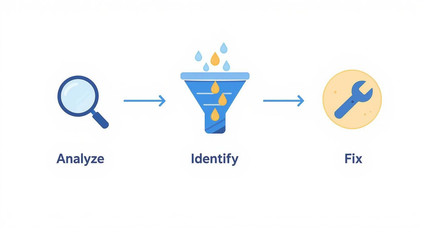
It’s all about being methodical. A systematic analysis leads to an accurate diagnosis, which is the only way to find a fix that actually works.
To give you a head start, here’s a breakdown of the most common drop-off points I see and what usually causes them.
Common Conversion Funnel Leaks and Potential Causes
This table outlines where customers typically abandon their journey and the likely culprits behind each drop-off.
| Funnel Stage | Common Leak Point | Potential Cause |
|---|---|---|
| Discovery | High Bounce Rate on Homepage | Unclear value proposition, slow page load speed, confusing navigation. |
| Consideration | Exit from Category Pages | Poor filtering/sorting options, generic product thumbnails, overwhelming choice. |
| Evaluation | Exit from Product Pages | Low-quality images/video, vague descriptions, missing trust signals (reviews). |
| Purchase | Cart Abandonment | Unexpected shipping costs, forced account creation, lack of payment options. |
| Checkout | Checkout Abandonment | Complicated multi-step forms, security concerns, slow site performance. |
Use this as a starting checklist. By cross-referencing these common issues with your own analytics and session recordings, you can quickly build a prioritized list of what needs fixing first.
Turning Product Pages Into Conversion Engines
Once a potential customer lands on your product page, you've won half the battle. Think of this page as your digital storefront and your best salesperson, all rolled into one. It’s your single best shot to turn a curious browser into a committed buyer. An unoptimized product page is like a silent salesperson—present, but not very persuasive.
The goal here is to transform this page from a simple item listing into a powerful conversion engine. It needs to anticipate questions, build desire, and make clicking "Add to Cart" feel like the most obvious, natural next step in the world.

This transformation really boils down to two things: what your customers see and what they read. Get these right, and you're well on your way to a serious lift in your conversion rates.
Visuals That Sell Before Words Can
In ecommerce, your customers can't touch, hold, or try on your product. That means your photography has to do all the heavy lifting to bridge that sensory gap. Grainy, low-resolution images from a single angle don't just look unprofessional; they plant seeds of doubt and hesitation.
Shoppers need to feel confident in what they’re buying, and high-quality, detailed visuals are the fastest way to build that confidence. Time and time again, research shows that clear, professional photos are one of the most influential factors in a purchase decision.
To make your visuals really work for you, you need a smart mix of image types.
- Studio Shots: These are your clean, white-background images showing the product from every possible angle. They absolutely must be high-resolution, letting people zoom in and inspect every detail, from the stitching on a leather bag to the texture of a ceramic mug.
- Lifestyle Images: You have to show your product in action. A photo of a backpack on a hiker's back or a coffee table book in a beautifully decorated living room provides crucial context. It helps shoppers visualize the product in their own lives, which is how a logical decision starts to feel like an emotional one.
- Scale and Detail Shots: Always include images that give a sense of the product's size—think a wallet next to a smartphone or a necklace being worn by a model. Close-up shots that highlight unique features, materials, or craftsmanship are also essential for hammering home the quality.
Investing in your product imagery is non-negotiable. It's the first thing a user judges, and it often determines whether they even bother to read your product description. Poor visuals can kill a sale before it even has a chance.
To really get the most out of your imagery, think about adding 360-degree views or short product videos. These interactive elements let shoppers "explore" the product in a way that static images can't, which dramatically reduces uncertainty and boosts conversions. For brands looking to elevate their visual game without a massive budget, there are excellent photo editing services for ecommerce that can transform basic photos into professional-grade assets.
Writing Copy That Connects and Converts
Once your stunning visuals have captured a shopper's attention, your product description needs to close the deal. The single biggest mistake I see brands make is simply listing features. A feature is what something is (e.g., "100% organic cotton"), while a benefit is what it does for the customer (e.g., "Keeps you cool and comfortable on hot days with breathable, hypoallergenic fabric").
You have to get inside your customer's head. What problems are they trying to solve? What are their hidden fears or desires related to this product? Your copy should speak directly to those points.
A great product description often follows this simple flow:
- A Compelling Hook: Kick things off with a sentence or two that grabs attention and speaks to the core benefit.
- Benefit-Driven Story: Expand on how the product actually improves the customer's life. Tell a little story or paint a picture for them.
- Scannable Bullet Points: Use bullets to cleanly list key features and tie them directly to their benefits. This is perfect for the skimmers who just want the essential info, and fast.
For instance, instead of just saying "waterproof jacket," you could write: "Never get caught in a downpour again. Our StormGuard jacket keeps you perfectly dry and comfortable, so you can embrace any weather with confidence." See the difference?
Building Instant Credibility with Social Proof
No matter how persuasive your copy is, shoppers will always trust other customers more than they trust you. It's just human nature. This is why social proof, in the form of ratings and reviews, is one of the most powerful tools you have. In fact, just displaying reviews can increase conversions by as much as 270%.
But placement is everything. Don't hide your reviews on a separate tab where no one will see them. Instead, strategically sprinkle them throughout the page.
- Star Rating: Put the average star rating right below the product title. It needs to be one of the first things they see.
- Review Snippets: Pull out the most compelling quotes from your best reviews and place them near the "Add to Cart" button. It’s the final nudge they need.
- Full Review Section: A dedicated section further down the page should let users read all the reviews, see customer photos, and filter by rating.
By combining captivating visuals, benefit-focused copy, and undeniable social proof, you turn a static product listing into a dynamic and persuasive sales experience that actually drives people to click.
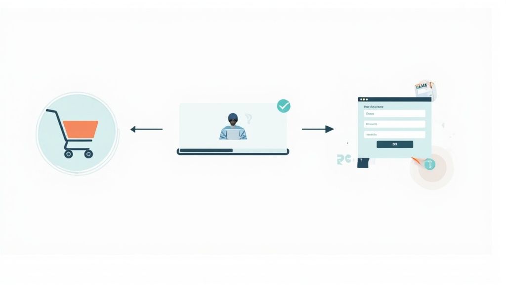
Designing a Frictionless Checkout Experience
You’ve done all the hard work. A shopper found your site, fell in love with a product, and hit that beautiful "Add to Cart" button. This is the final sprint to the finish line, but it’s also where an incredible number of sales just… disappear.
A clunky, confusing, or untrustworthy checkout process is the number one killer of conversions. This is the single most important stage to get right.
Think of your checkout as the last conversation you have with a customer before they commit. If that chat is suddenly full of weird questions, demands for too much info, or surprise costs, they're going to get cold feet and walk. In fact, studies consistently show that extra costs like shipping and taxes are the top reason shoppers bail, accounting for nearly 50% of all abandoned carts.
The psychology is simple: sticker shock breaks trust. A customer has already mentally agreed to the price they saw on the product page. When that number suddenly jumps at the very last second, it feels like a bait-and-switch, even if it’s just for standard shipping. That friction creates doubt at the worst possible moment.
Simplify the Path to Purchase
Your only job here is to remove every single obstacle between the cart and the confirmation page. The more steps, clicks, and fields you make someone fill out, the more chances you give them to second-guess the whole thing.
One of the biggest mistakes stores used to make was forcing people to create an account to buy something. That’s a huge barrier. Offering a guest checkout isn't a "nice-to-have" anymore; it's absolutely essential. We know for a fact that you can win back a huge chunk of the 23% of users who would otherwise leave a site that demands they create a login.
Your checkout flow should feel like an express lane, not a DMV line. Every field you can remove, every click you can eliminate, is a direct investment in your conversion rate.
Beyond offering a guest option, here are some other dead-simple ways to streamline things:
- Cut Down the Form Fields: Be honest—do you really need their phone number? Is the "company name" field critical for a consumer sale? Go through every single input box and be ruthless. If it's not 100% required to fulfill the order, cut it.
- Use Address Autofill: This is a small feature with a big impact. Tools that suggest and complete addresses as someone types reduce typos, save time, and seriously lower frustration. Google Places API is a common choice here.
- Show a Progress Bar: A simple visual indicator showing steps like "Shipping," "Payment," and "Review" does wonders for managing expectations. It lets people know exactly where they are and how close they are to being done, which makes the whole process feel faster.
Build Trust with Payment Flexibility and Transparency
The second a customer has to pull out their credit card, their trust and security alarms are on high alert. This is where you have to over-deliver on reassurance and flexibility.
Offering a variety of payment methods is non-negotiable. Integrating digital wallets like Apple Pay, Google Pay, and PayPal is a game-changer. They allow for one-click payments, letting customers skip the tedious task of typing in card numbers and addresses. The convenience is massive, especially on mobile.
Finally, make your checkout page look secure. It’s all about perception.
- Display Security Badges: Prominently feature logos from trusted names like Norton, McAfee, or your SSL certificate provider. These are quick visual cues that tell the customer their information is safe with you.
- Be Totally Transparent with Costs: Use a dynamic order summary that updates in real-time as the customer adds their shipping info. Nothing should be a surprise when they get to the final "Place Order" button. All taxes and shipping fees must be clearly itemized and explained.
By designing a checkout that is simple, transparent, and flexible, you're respecting the customer's decision to buy from you. You’re making it as easy as humanly possible for them to follow through. This final, frictionless step is often what separates a successful store from one that’s always wondering why its carts are full but its bank account isn’t.
Building Customer Trust That Lasts
In the anonymous world of online shopping, trust is your most valuable currency. A potential customer lands on your site, often for the very first time, and their brain is immediately scanning for reasons to leave. Every single element on your page is either building their confidence or fueling their skepticism. Your job is to make them feel safe, secure, and absolutely certain they're making a good decision.
Without a physical storefront to walk into, shoppers rely on a collection of visual and informational cues—we call them trust signals—to figure out if you're legit. These signals work together to lower a visitor's natural hesitation, assuring them that your business is real, your products are high-quality, and their personal info is protected. Weaving these signals throughout your entire site is a fundamental step toward better conversion rates.
Displaying Essential Trust Badges
The fastest way to build a baseline of trust is by showing symbols customers already recognize and associate with security. Think of these as the digital version of a clean, well-lit store in a safe neighborhood.
- Payment Logos: When you showcase logos like Visa, Mastercard, PayPal, and Apple Pay right on your product pages and during checkout, it immediately signals legitimacy. It tells customers you work with established, secure payment processors they already use.
- SSL Certificates and Security Seals: An SSL certificate (the little padlock and "https" in your URL) is completely non-negotiable for protecting data. But don't stop there. Visibly displaying badges from security providers like Norton or McAfee reinforces that their connection is encrypted and their financial information is safe.
Place these badges strategically where security is top-of-mind for the shopper—primarily in your site footer and all throughout the entire checkout process. This constant, subtle reinforcement helps quiet a user's internal alarm bells.
The Power of a Human-Friendly Return Policy
A clear, fair, and easy-to-find return policy is one of the most powerful trust signals you have. It directly tackles a customer's biggest fear: "What if I don't like it?" Hiding your policy or making it overly complicated just screams that you don't stand behind your products.
A great return policy isn't just a legal document; it's a marketing tool.
Your return policy is a direct reflection of your confidence in your own products. A generous, hassle-free policy removes the risk from the purchase decision, making it much easier for a hesitant shopper to say yes.
Make sure your policy is written in simple language, not legal jargon. Highlight the good stuff like "Free 30-Day Returns" or "No-Questions-Asked Refunds" in prominent spots like your homepage banner, on product pages near the "Add to Cart" button, and of course, in the checkout. That kind of transparency is a massive driver of conversions.
Leveraging Authentic Social Proof
While security badges and policies build your foundation of trust, nothing is more persuasive than the unfiltered voice of another happy customer. Social proof shows that real people have bought from you, loved what they got, and had a positive experience. This is how you move from just being a credible business to being a desirable brand.
- Customer Testimonials: Go beyond simple star ratings. Feature detailed testimonials that include a customer's name and photo (with their permission, of course). These stories provide relatable context and answer the questions that new shoppers might have.
- User-Generated Content (UGC): Actively encourage your customers to share photos of your products out in the real world. A gallery of customer photos on your product pages is incredibly powerful. It provides authentic lifestyle shots and proves your products look just as good in a real home as they do in a studio. The value of professional product photography is immense, and you can explore the https://prodshot.net/cost-of-professional-product-photography to understand how to budget for high-quality visuals that complement authentic UGC.
- Press Mentions and Awards: Has your brand been featured in well-known publications or won industry awards? Showcase those logos. An "as seen in" section borrows credibility from established names, giving your brand an instant boost in authority.
Finally, trust also means being accessible. A truly trustworthy brand makes sure its shopping experience is available to everyone. A frictionless experience extends to all users; you can discover more about how accessibility boosts your website's UX and sales and how it can improve your brand's reputation. By combining these layers of trust—security, transparency, and social validation—you create an environment where new visitors feel confident enough to become loyal customers.
Using Data to Drive Continuous Improvement
Boosting your conversion rate isn't a "set it and forget it" kind of task. It's a constant cycle of testing, learning, and tweaking. The most successful ecommerce stores I've seen treat their websites like a living, breathing experiment, not a finished project. This data-driven approach pulls all the guesswork out of the equation, letting you make small, smart changes that add up to big wins over time.
You don’t need to be a data wizard to pull this off. The whole game is about focusing on a few crucial numbers and getting into a simple testing rhythm. When you consistently measure what's working and what's falling flat, you start building a culture of optimization that pays off again and again.
Understanding Your Key Performance Metrics
Before you can improve anything, you have to know what you're measuring. While tools like Google Analytics 4 (GA4) can feel like you're drinking from a firehose of data, only a few metrics really tell the story of how well you're converting visitors into customers.
Here's a look at a typical GA4 dashboard, which gives you a high-level view of user engagement.
This snapshot is a decent start, but the real gold is found when you dig into specific reports to see exactly how people move through your site.
I recommend keeping your eye on these core areas:
- User Engagement Rate: This is a simple percentage of visitors who actually interacted with your site in a meaningful way. If this number is low, it's a red flag that your landing page content isn't grabbing attention or, worse, you're attracting the wrong kind of traffic.
- Conversion Rate by Traffic Source: This one is absolutely critical. It tells you which of your marketing channels—like Organic Search, Paid Social, or Email—are sending people who actually buy something. This is how you figure out where to double down on your ad spend.
- Funnel Exploration Reports: Inside GA4, you can build custom funnels that visually map out where people are dropping off. Are they bailing after viewing a product? Or right after adding to the cart? This report is basically a treasure map showing you where your biggest leaks are.
Getting Started with A/B Testing
Once your data points to a problem—let's say you have a massive drop-off rate on your product pages—it's time to test a fix. This is exactly what A/B testing (or split testing) was made for. It's a straightforward method: show two different versions of a page to two different groups of visitors and see which one performs better.
I can't stress this enough: A/B testing is the single best way to validate your ideas with real user behavior instead of just guessing. I’ve seen tiny changes, like tweaking the color of a button or the text on a call-to-action, lead to a double-digit lift in conversions.
Your product pages are the perfect place to start. If you’re already using a tool like ProdShot to generate your visuals, you can hop right into your ProdShot asset dashboard and test different image styles with just a few clicks.
So, what should you test first?
- Headlines: Pit a benefit-driven headline against one that's all about the features.
- Call-to-Action (CTA) Buttons: Play around with the button color (green vs. orange is a classic), its size, and even the text ("Buy Now" vs. "Add to Bag").
- Product Images: Try a clean, studio shot as your main image and test it against a lifestyle photo showing the product in action.
- Social Proof Placement: What happens if you move your best customer testimonials higher up the page, right next to the CTA?
For a deeper dive into building a structured plan, this practical CRO guide is a fantastic resource. The golden rule is to change only one thing at a time. That way, you know exactly what caused the shift in performance. Track your results, lock in the winning version, and then move on to the next test. This iterative process is the engine that will continuously drive your conversions higher.
Common Questions About Ecommerce Conversions
When you're trying to get more sales, a lot of questions pop up. It's totally normal. Let's tackle some of the most common things store owners ask about getting their conversion rates up, with some clear, no-nonsense answers to help you move forward.
What Is a Good Ecommerce Conversion Rate?
You'll hear people throw around 2% to 4% as a "good" number, but honestly, that figure can be pretty misleading. A good conversion rate depends entirely on what you sell, how much it costs, and where your traffic is coming from.
Someone selling luxury watches will naturally have a lower conversion rate because it's a huge purchase decision. On the other hand, a shop selling quirky, low-cost stickers could easily see a much higher percentage.
The best thing you can do is stop comparing yourself to a vague industry average and start benchmarking against your own past performance. If you were at 1.5% last month and you've hit 1.8% this month, you're winning. That's the real sign of progress.
Forget about chasing a universal "good" number. Your most important metric is your own growth. A consistently improving conversion rate, even if it’s a small jump, means your business is getting healthier.
Where Should I Start for Quick Wins?
If you're looking for changes that will make a difference right now, focus your energy on two things: trust signals and checkout friction. Little tweaks here almost always give you the best bang for your buck.
- Slap on some Trust Badges: Get those security seals (like Norton or McAfee) and payment logos (Visa, PayPal, etc.) right near your "Add to Cart" and checkout buttons. It’s an instant confidence boost.
- Make Checkout a Breeze: Always, always offer a guest checkout option. Forcing someone to create an account is a surefire way to lose them—a reported 23% of shoppers will bail for this reason alone.
- Be Upfront About Shipping: Nobody likes a surprise fee at the very end. Unexpected shipping costs are the #1 reason people abandon their carts. Show them the cost early in the process.
These small adjustments tackle the biggest points of hesitation for new customers, giving them the reassurance they need to click "buy" without having second thoughts.
How Does Mobile Performance Affect Conversions?
Let's be clear: mobile performance isn't just a piece of the puzzle anymore. It is the puzzle.
With over 60% of all ecommerce traffic now coming from phones, a slow or clunky mobile site is a conversion death sentence.
Think about your own experience. Patience on a smartphone is paper-thin. A page that takes more than three seconds to load will bleed potential customers. And if someone runs into broken links or buttons that are impossible to tap, that frustration instantly shatters any trust you've built. They won't just leave; they'll run straight to your competitors.
Making sure your mobile experience is fast and flawless isn't just a good idea—it's a basic requirement for staying in business.
Ready to create stunning product visuals that stop the scroll and drive sales? With ProdShot, you can turn simple smartphone photos into professional, high-converting images in seconds. Try ProdShot for free and see the difference AI can make.