

Before you can boost your ecommerce conversion rate, you need to accept a simple truth: there's no magic number for a "good" rate. The real goal is to systematically improve your store's performance. This means getting into the weeds of your user behavior, smoothing out the rough spots in their shopping journey, and making decisions based on cold, hard data—not just hopeful guesses.
What Really Drives Ecommerce Conversion Rates
Before you touch a single button or rewrite one product description, you have to know where you stand. Your conversion rate is simply the percentage of visitors who do what you want them to do (usually, make a purchase) out of everyone who stops by.
The math is easy:
(Number of Sales / Total Site Visitors) x 100 = Conversion Rate %
But that number on its own is just a starting point. The real work—and the real opportunity—lies in understanding the story behind that percentage. What's considered "good" is all about context.
Why You Should Look Beyond Vague Industry Averages
I see so many store owners get hung up on generic industry benchmarks. While they can give you a rough idea of the playing field, relying on them too heavily can be misleading.
For example, the global average ecommerce conversion rate often hovers between 2% and 4%. But if you dig deeper, you'll see that a fashion and jewelry store might average closer to 1.9%, while a shop selling home appliances could hit 3.6%. You can explore more about these industry-specific benchmarks to see just how much performance varies.
So, why the big difference? It boils down to a few key factors:
- Product Price & Complexity: A store selling $2,000 custom furniture will almost always have a lower conversion rate than one selling $20 t-shirts. The customer needs more time and information to make a decision.
- Traffic Source: Someone clicking from a targeted email campaign is already warm and much more likely to buy than a person who randomly stumbles upon your site from a broad social media ad.
- Brand Maturity: A well-known brand with a legion of loyal fans is going to convert far better than a new store that’s still trying to earn its first shred of trust.
My advice? Stop chasing a mythical "perfect" rate. Instead, focus on making small, steady gains on your own numbers. A 0.5% increase for your store is a huge win and far more valuable than trying to match an industry titan.
To help you get a sense of where you might fit, here’s a look at some typical conversion and cart abandonment rates across different sectors.
Ecommerce Conversion Rates Across Industries
Use this table to see how your store stacks up against average conversion and cart abandonment rates in different ecommerce sectors.
| Industry | Average Conversion Rate | Average Cart Abandonment Rate |
|---|---|---|
| Fashion & Apparel | 1.9% | 74.1% |
| Health & Beauty | 2.9% | 77.9% |
| Home & Garden | 2.5% | 75.3% |
| Electronics & Appliances | 3.6% | 68.3% |
| Food & Drink | 4.6% | 61.1% |
These numbers highlight how much "normal" can vary. A high cart abandonment rate in fashion is expected, while the food and drink industry sees much more decisive purchasing. Context is everything.
How to Find Your True Performance Baseline
Okay, time to get practical. The first step is to calculate your current conversion rate accurately. Jump into your ecommerce platform's analytics—whether that's Shopify, BigCommerce, or another—or use Google Analytics 4. Make sure you look at a decent chunk of time, like the last 30 to 90 days, to smooth out any random spikes or dips.
Once you have that main number, the real fun begins. You need to slice and dice your data to find the hidden stories. This is where you’ll uncover the most glaring friction points. Start by asking questions like:
- How does our conversion rate on mobile compare to desktop?
- Do new visitors convert as well as returning customers? (Spoiler: they usually don't).
- Which marketing channels (organic search, paid ads, social media) are actually bringing in the people who buy?
This kind of analysis transforms a vague problem into a clear mission. You go from "our conversion rate is 2%" to a much more actionable insight: "Our mobile conversion rate is only 0.8% for new visitors from Instagram ads, and that's where we need to focus our energy."
That specific, data-backed conclusion is the only real foundation for building a strategy that will actually increase your ecommerce conversion rate.
2. Design Product Pages That Actually Sell
Think of your product page as your final sales pitch. It’s the digital equivalent of a customer picking an item off a shelf, feeling its weight, and deciding if it’s worth their money. This is your last, best chance to convince them to click "Add to Cart."
To get that click, your product pages have to do more than just list features. They need to build confidence, answer questions a shopper might not even know they have, and make the purchase feel like the most obvious, satisfying next step.
Craft Product Descriptions That Connect
Let's be honest: nobody wants to read a dry, technical description that sounds like it came from an engineering manual. Your product descriptions should tell a story. They need to solve a customer's problem.
It’s all about cognitive fluency—how easily the brain processes information. The easier your copy is to understand, the more a shopper will like your product. It’s a simple but powerful psychological trick.
So instead of just listing dimensions, explain what they mean for the customer. Don't just say a backpack has a "20-liter capacity." Instead, try: "Its 20-liter capacity comfortably fits your 15-inch laptop, a change of clothes, and a water bottle—everything you need for a day on the go." See the difference?
Here’s how to make your descriptions scannable and compelling:
- Lead with the payoff. Start with a punchy sentence or two that nails the main benefit for the customer.
- Use bullet points. Break down the top 3-5 key features. This is gold for scanners who just want the facts.
- Tell a mini-story. Paint a picture of how the product will fit into—and improve—the customer's life.
A great product description doesn’t just sell an item; it sells an experience or a solution. Focus on the transformation the customer will feel after they buy.
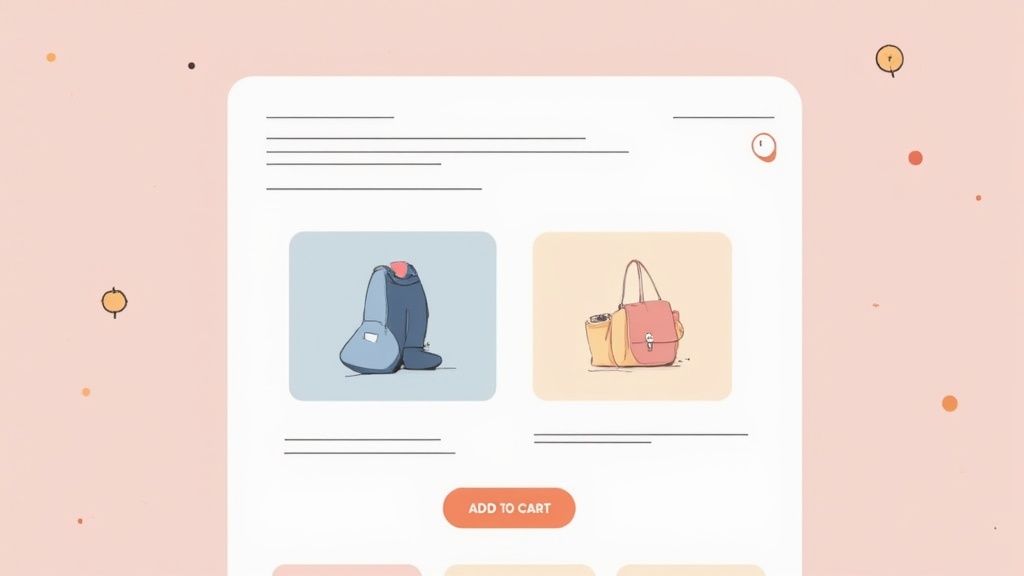
Use Visuals That Do the Heavy Lifting
In ecommerce, your pictures are the product. Shoppers can't touch it, feel it, or try it on, so your visuals have to do all the work. High-resolution, professional-looking images aren't a luxury; they're the price of admission for building trust.
Your visuals need to bridge what I call the "context gap." A shopper has to understand the product's size, scale, texture, and quality without ever holding it. Clear, well-lit photos from every angle are the absolute minimum.
But to really drive conversions, you need to go deeper:
- In-Context Shots: Show your product where it belongs. A hiking boot on a muddy trail is infinitely more persuasive than one floating on a stark white background.
- 360-Degree Views: Let shoppers spin the product. This gives them a feeling of control and a complete picture, cutting down on uncertainty.
- Detail Close-Ups: Get right in there. Highlight the quality stitching on a leather bag or the unique grain of a wooden table. Show off your craftsmanship.
- Product Videos: A short video showing the product in action can answer a dozen questions in under 30 seconds. This is one of the biggest conversion boosters I've seen.
I know what you're thinking—that sounds expensive. But great visuals are an investment, not an expense. The good news is you no longer need a massive studio budget. Today, specialized services offer professional Shopify product photography that can make your products look incredible and build the confidence needed to make a sale.
Display Social Proof That Seals the Deal
The moment a shopper gets interested, their brain immediately starts looking for reasons not to buy. It's a self-preservation instinct. This is where social proof becomes your secret weapon against doubt. Seeing that other people have already bought—and loved—your product is incredibly reassuring.
But just having a few reviews tucked away isn't enough. You have to show them off strategically to make a real impact.
Types of Social Proof to Weave In
| Social Proof Type | Why It Works | How to Implement It |
|---|---|---|
| Star Ratings & Reviews | Gives a quick, scannable gut check on quality and trust. People's eyes are drawn to them. | Place star ratings right under the product title. Let users filter reviews by rating or common topics. |
| User-Generated Content | Shows real people using and enjoying your product, which feels far more authentic than slick marketing shots. | Add a "Shop Our Instagram" gallery to your product pages featuring tagged customer photos. |
| Expert Endorsements | Borrows credibility from a trusted source, whether it's a person or a well-known publication. | Display "As Seen In" logos from media outlets or pull quotes from industry experts. |
| Real-Time Activity | Taps into the fear of missing out (FOMO) by creating a sense of buzz and popularity. | Use subtle pop-ups like, "Sarah from Austin just bought this 5 minutes ago." |
When you weave these elements together, you stop just selling a product and start building a compelling case for it. You’re showing visitors that their purchase is a safe, smart, and popular choice—making it a whole lot easier for them to hit that "Add to Cart" button.
Create A Shopping Experience People Love
A clunky, confusing website is the fastest way to kill a sale. I’ve seen it happen countless times. Your real job is to build a user experience (UX) so smooth and intuitive that customers glide from browsing to buying without a single hiccup. It's all about eliminating friction.
The entire journey should feel natural, almost effortless. When you design a great shopping experience, you're respecting your customer's time and guiding them toward what they need, often before they even have to think hard about it.
Make Navigation Dead Simple
Have you ever landed on a website and felt completely lost trying to find something? It's incredibly frustrating. Your site's navigation needs to be so clear that a brand-new visitor can find any major product category in three clicks or less. It’s a classic guideline for a reason—it works.
Think of your main menu like the brightly lit, well-organized aisles in a store. Piling on too many options just leads to analysis paralysis.
- Stick to the Essentials: Aim for 5-7 main categories in your navigation bar. Anymore, and you risk overwhelming people.
- Use Obvious Language: Get straight to the point. Call your "T-Shirts" category "T-Shirts," not something clever like "Torso Covers." Clarity will always outperform creativity in navigation.
- Implement Breadcrumbs: These little navigational trails (e.g., Home > Apparel > T-Shirts) are a lifesaver. They show users exactly where they are and give them an easy way back, which helps reduce confusion and keeps them from bouncing.
A shopper’s brain is wired to conserve energy. When you make them work hard to find something, you’re creating cognitive load. Simplify their path, and you make it easier for them to decide to buy.
This principle of clarity extends to your visual presentation, too. Crisp, professional images that load quickly are fundamental. Sometimes, getting this right requires a professional eye, and using photo editing services for ecommerce can make a massive difference in how polished and trustworthy your entire site feels.
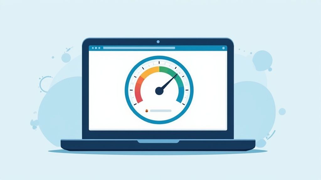
Obsess Over Site Speed
In ecommerce, every single second counts. Seriously. A tiny one-second delay in your page load time can slash conversions by 7%. If your store does $100,000 a day, that's a staggering $2.5 million in lost sales over a year. Speed isn't just a technical metric; it's a critical part of the customer experience.
Shoppers today have zero patience for a lagging website. They expect instant gratification, and if your page sputters, they won't wait around. They'll just leave.
Here’s how to get faster:
- Compress Your Images: This is the big one. Huge, unoptimized images are the #1 killer of site speed. Use tools to shrink file sizes without turning your product shots into pixelated messes.
- Invest in Fast Hosting: Your web host matters more than you think. That cheap hosting plan might save you a few bucks a month, but it will cost you a fortune in lost sales.
- Do an App Audit: Every app or plugin you install can slow your site down. Be ruthless. Regularly review everything you have installed and get rid of anything you aren't actively using.
Build For Mobile First, Not Mobile Friendly
Being "mobile-friendly" is table stakes now. The real winners design for a mobile-first experience. This isn't just about having a site that shrinks to fit a phone; it's about building your store from the ground up to be flawless on a small screen.
While desktop users often convert at a higher rate—likely because it’s easier to see details and fill out forms—the vast majority of your traffic is probably coming from mobile devices. If that initial mobile experience is clumsy, you lose them before they ever get to a desktop. You can explore the conversion data by device to see just how important this is.
Turn Your Search Bar into a Sales Tool
When a shopper uses your site's search bar, they're handing you a golden opportunity. They are literally telling you exactly what they want to buy. These visitors have incredibly high purchase intent, and a smart search function can convert them at a much higher rate than casual browsers.
A simple search box just won't cut it. Your search needs to be intelligent.
- Offer Autocomplete: As someone starts typing, suggest popular products and search terms. This not only speeds up the process but can also introduce them to items they didn't even know you carried.
- Handle Typos Gracefully: A search that returns "no results" for a simple typo is a dead end. Your search should be smart enough to offer "Did you mean…?" suggestions.
- Provide Smart Filtering: Once the results pop up, let users drill down. Give them filters for price, size, color, ratings, and whatever else makes sense for your products.
A powerful search function acts like your best salesperson, available 24/7 to guide your most motivated customers straight to the checkout.
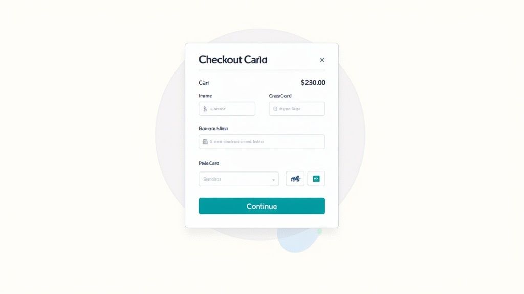
Fix Your Leaky Checkout Funnel
Think of your checkout as the final, most critical step in a long race. After all the effort you've put into attracting a customer, a clunky or confusing checkout process is like tripping just before the finish line. This is where most sales are lost, making it the biggest leak in your funnel.
The good news? It's also one of the most fixable areas of your site. The mission is simple: make it as easy and fast as possible for people to give you their money.
Guest Checkout Is Your Best Friend
If there's one mistake I see sink conversions over and over, it's forcing people to create an account. Think about it from their perspective—they're ready to buy, but you're suddenly putting a roadblock in front of them. In fact, a staggering 24% of shoppers say they'll ditch a purchase if forced to register first.
Always, always offer a guest checkout option. Make it the most prominent button on the page. It’s an easy win that respects your customer's time and privacy. You can always ask them to create an account on the order confirmation page after the sale is locked in.
I tell my clients this all the time: Don't put hurdles between an excited customer and the "Complete Purchase" button. Guest checkout isn't just a feature; it's an express lane to higher revenue.
Streamline Your Forms
Every single field in your checkout form is a small task you're asking the customer to complete. Each one adds a tiny bit of friction. Too many, and they'll just give up. It’s time to be ruthless.
- Only Ask for What You Need: Do you really need their phone number to ship a t-shirt? Is the billing address truly necessary if it’s the same as the shipping one? Cut every single field that isn't absolutely essential for processing and shipping the order.
- Embrace Autofill and Address Lookups: Modern checkout forms should be smart. Leverage browser autofill and tools that automatically populate the city and state from a zip code. This simple tech reduces typos and makes the whole process feel smoother.
- Clearly Mark Optional Fields: If you can't bring yourself to delete a field, at least mark it clearly as "(optional)." This signals to the user that they can safely skip it and move forward.
Building trust during checkout is just as important as on your product pages. The same way reviews reassure a potential buyer, a clean and trustworthy checkout process keeps them confident.
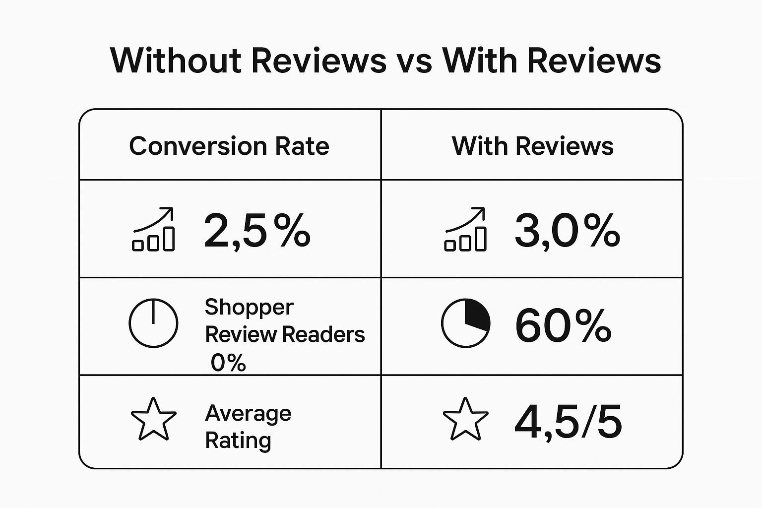
As you can see, trust signals have a direct and measurable impact on performance. This principle holds true right up to the final click.
Eliminate Sticker Shock
The number one reason people abandon carts isn't a long form—it's unexpected costs. Nothing kills the buying mood faster than getting to the final payment screen and seeing the total jump because of surprise shipping fees and taxes. It feels dishonest and instantly erodes trust.
Be upfront about all costs. A shipping calculator in the cart is a great start. Even better, show estimated shipping fees right on the product page. Or, you could build shipping costs into your product prices to offer "free" shipping, a proven psychological trigger that encourages purchases.
Common Checkout Problems and How to Fix Them
I've seen hundreds of checkout flows, and the same friction points appear time and again. Here's a quick rundown of the most common issues that cause customers to bail and, more importantly, how to fix them.
| Friction Point | Impact on Conversion | Actionable Solution |
|---|---|---|
| Forced Account Creation | High negative impact; a top reason for abandonment. | Offer a prominent guest checkout option. Prompt for account creation post-purchase. |
| Surprise Shipping & Fees | Massive drop-off; feels like a bait-and-switch. | Display all costs (taxes, shipping) upfront in the cart or on product pages. |
| Long, Complex Forms | Increases user fatigue and abandonment rates. | Remove all non-essential fields. Use autofill and address lookup tools. |
| Limited Payment Options | Can seem untrustworthy or inconvenient. | Integrate digital wallets (PayPal, Apple Pay) and offer multiple credit card options. |
| Not Mobile-Friendly | Creates frustration for a huge segment of shoppers. | Ensure your entire checkout is responsive with large, tappable buttons and fields. |
By proactively addressing these common pitfalls, you can create a much smoother path to purchase for your customers, turning more browsers into buyers.
Offer Modern and Trusted Payment Options
Finally, make sure you're offering the payment methods people actually use and trust. Just having a single credit card processor can feel outdated and even a little suspicious. To get this right, you should visualize common payment methods to understand what your customers expect.
Integrating digital wallets is no longer optional—it's essential. Services like PayPal, Apple Pay, and Google Pay enable one-click payments that are a godsend on mobile. They don't just speed things up; their familiar logos act as powerful trust signals, assuring shoppers their financial data is in safe hands.
Build The Trust That Earns The Sale
In ecommerce, trust isn't just a nice-to-have feature; it's the very currency that convinces someone to click "buy." If a shopper feels even a sliver of doubt about your site's legitimacy or security, they'll be gone in a heartbeat. Building that unwavering confidence in your brand is how you turn a hesitant visitor into a loyal customer.
It all starts with the basics. Every single ecommerce store today needs an SSL certificate. That little padlock icon in the browser's address bar is non-negotiable. It encrypts customer data, sending a clear signal that their personal and financial details are safe. Without it, you're not just hurting trust—you're practically screaming that your site is insecure.
Showcase Your Security and Guarantees
Once the technical security is handled, you have to make sure people see it. Don't just assume shoppers will notice the padlock. You need to be obvious about it.
Place security badges from providers like Norton, McAfee, or even your payment gateway (think Shopify Secure or PayPal) where they count most: in your site's footer and, most importantly, right on the checkout page. These logos are mental shortcuts. They borrow credibility from names your customers already trust, soothing those last-minute jitters that kill so many sales.
Beyond security tech, your store policies are some of the most powerful trust signals you have. A clear, straightforward return policy is one of the best tools for boosting conversions. Shoppers need to know they won't get stuck with a product that isn't right for them.
Make your return policy incredibly easy to find and even easier to understand. Ditch the legal jargon. Frame it positively with something like a "30-Day Happiness Guarantee" instead of a cold "Returns and Exchanges Policy." This small change transforms a dry document into a customer-centric promise.
Turn Customers into Your Best Marketers
The most authentic form of trust doesn't come from you—it comes from other customers. This is social proof in action. When a potential buyer sees that other people have bought from you and loved the experience, it validates their own decision and makes the purchase feel like a safe, smart choice.
Here’s how to put social proof to work:
- Authentic Customer Reviews: Don't hide your reviews on a separate page. Integrate them directly onto your product pages with star ratings, detailed testimonials, and—the real gold—customer-submitted photos and videos. Seeing your product in a real person's home is incredibly persuasive. In fact, understanding the cost of professional product photography really highlights the immense value that authentic, user-generated content brings to the table for free.
- Media Mentions: Has your brand been featured in a magazine or a popular blog? Show it off! A simple "As Seen In" section with logos from familiar media outlets gives your credibility an instant lift.
- User-Generated Content (UGC): Come up with a branded hashtag and encourage customers to share photos with their new products on social media. Curate the best ones and feature them in a gallery on your site. UGC is the ultimate endorsement because it's genuine, relatable, and speaks louder than any marketing copy you could write.
Tell a Story That Connects
Finally, remember that people buy from people. Your "About Us" page is one of the most underrated tools for forging a real connection. Don't just give a boring timeline of your company's history. Tell a story.
Who are the people behind the brand? What problem are you passionate about solving for your customers? A compelling brand story gives your business a face and a soul, transforming it from just another online store into a brand people want to support. While improving your website is key, building a strong reputation is just as important for earning trust. Learning how to build brand awareness lays the foundation for this.
It's this blend of technical security, social validation, and human connection that creates an environment where shoppers feel completely safe and confident. These trust signals work together to lower purchase anxiety, which is one of the biggest conversion killers out there.
Common Questions About Ecommerce Conversion
Even with a solid game plan, you're bound to run into some specific questions when you're trying to push your conversion rate higher. Let's tackle the most common ones I hear from store owners. My goal is to give you direct, no-nonsense answers so you can focus on what actually moves the needle.
What Is a Good Ecommerce Conversion Rate?
This is easily one of the most misunderstood metrics out there. Everyone wants a magic number, and you'll often hear that the industry average is somewhere between 2% and 4%. But honestly, obsessing over a universal benchmark is a huge mistake.
Think about it. A luxury furniture store selling $5,000 sofas could be incredibly profitable with a 1% conversion rate because their average order value is so high. On the flip side, a shop selling $15 phone cases needs a much higher rate to even stay in business. Context is everything.
Instead of chasing someone else's numbers, the real goal should be to consistently improve your own baseline.
- Keep an eye on your progress weekly and monthly. Are you seeing an upward trend? That's what matters.
- Dig into your data. How do different traffic sources (like organic search vs. social media) or devices perform?
- Use industry stats as a rough guide, not a strict rule. A fashion store averaging 1.9% can be just as successful as an electronics store at 3.6%.
The real win isn't hitting some arbitrary percentage. It's achieving consistent, data-backed improvement for your unique business. A steady climb from 1.5% to 2.0% over a few months? That's a massive success.
How Does Mobile Design Affect Conversions?
Let’s be clear: mobile design isn’t just a factor in conversions anymore—it’s the entire foundation of modern ecommerce. While desktop conversion rates often look better on paper, the vast majority of your traffic is probably showing up on a smartphone. Ignoring their experience is like locking the front door on more than half of your potential customers.
A clunky mobile experience is an instant deal-breaker. If your pages are slow, the buttons are too tiny to tap, and people have to pinch and zoom just to read your text, they’re gone. They'll just bounce right over to your competitor's site.
Having a "responsive" design that just shrinks your desktop site is the absolute bare minimum. To really win on mobile, you have to design for the thumb.
- Make your checkout flawless on a small screen. This means as little typing as possible and big, obvious buttons.
- Integrate one-click payment options. Digital wallets like Apple Pay and Google Pay are non-negotiable for reducing friction.
- Keep navigation simple and tap-friendly. Your menu should be clean and dead simple to use without needing the precision of a mouse.
If you haven't built a powerful mobile-first experience, you are actively turning away sales every single day. It's that simple.
What Is the Top Reason for Cart Abandonment?
Sticker shock at checkout. Hands down, this is the number one conversion killer.
Picture this: a customer finds a product they love, mentally agrees to the price, and heads to checkout, only to be hit with a final total bloated by unexpected shipping fees, taxes, or other random charges. It feels like a bait-and-switch, and it instantly breaks their trust.
This single issue is responsible for more abandoned carts than just about any other point of friction. The solution? Radical transparency.
- Show shipping estimates right on the product pages. Don’t make them wait until the final step to find out the cost.
- Include a shipping calculator in the cart view. Let people see the all-in price before they commit to entering their personal info.
- Think about offering "free" shipping. You can always build the shipping cost into your product price, which is a psychologically powerful way to frame the offer.
Being upfront about the total cost is how you preserve the trust you worked so hard to build. Don't let a surprise fee be the reason you lose a customer you were seconds away from winning.
How Often Should I Run A/B Tests?
The short answer? You should always have a test running. A/B testing is the engine of conversion optimization. It’s how you turn your hunches into data-proven improvements. Without it, you're just guessing.
But this doesn't mean you should be testing random things just for the sake of it. Your testing needs to be strategic.
- Prioritize based on potential impact. Start where small changes can deliver the biggest results. This almost always means your highest-traffic pages: the homepage, key category pages, product pages, and the checkout flow.
- Test one major element at a time. Focus on a single, significant variable. That could be the main headline, the call-to-action button's color and text, or the hero product image. If you test too many things at once, you'll never know what actually worked.
- Let your tests run long enough. You have to collect enough data to be confident in the result (this is called "statistical significance"). Calling a test too early can lead you to make the wrong decision based on a fluke.
This disciplined approach ensures your efforts to increase your ecommerce conversion rate are guided by what your customers actually do, not just what you think they'll do.
Ready to stop worrying about photography and start getting images that sell? ProdShot uses AI to turn your simple phone photos into high-quality, conversion-ready product shots in seconds. Try ProdShot for free today and see the difference it makes.
Article created using Outrank