
The secret to a thumb-stopping product photo on Instagram? It's often not the product itself, but the background you place it against. A great instagram posts background is the unsung hero that stops the scroll, cuts through the visual clutter, and instantly tells your audience you’re a professional brand.
Why Your Instagram Background Matters More Than Ever

I always tell clients to think of their Instagram feed as their digital storefront. Every post is a new window display, and the background is the set dressing. A cluttered, poorly lit, or off-brand background is like trying to sell a luxury watch from the trunk of a car—it completely undermines the product's value and confuses your potential customer.
Your product is the star of the show. The background is simply the supporting actor that makes it shine.
This isn’t just about making things look nice; it’s about survival in a ridiculously crowded marketplace. Standing out on Instagram is tougher than ever. In fact, one analysis of over 15 million posts found that overall reach plummeted by a staggering 31% in a single year. Simply posting more often is a losing game when your visibility is dropping that fast. You can dive into the numbers yourself by exploring the full Instagram statistics on Metricool.com.
While video formats are growing, the data shows that high-quality static images still command strong engagement, making them a cornerstone of any solid Instagram strategy.
| Post Type | Median Engagement Rate | Key Takeaway |
|---|---|---|
| Image Post | 0.87% | Still a highly effective format, especially for product-focused content. |
| Carousel Post | 1.22% | Highest engagement, but requires multiple high-quality images. |
| Video Post | 0.71% | Lower median engagement, but can be powerful for storytelling. |
| Reel | 0.99% | Strong for reach and discovery, but less direct for product examination. |
This data for 2026 underscores that a well-crafted single image remains a powerful tool. Your background choice is a huge part of getting that image right.
With organic reach in a nosedive, every single impression is precious. A clean, on-brand instagram posts background is your best shot at making that first glance count.
The Problem with Bad Backgrounds
A weak background doesn't just fail to convert; it actively repels customers. It introduces visual friction, making your product harder to see and appreciate. I see the same mistakes pop up all the time:
- Busy or Distracting Scenes: A messy desk, clashing patterns, or random objects in the frame are stealing the spotlight from the one thing you're trying to sell.
- Poor Lighting and Shadows: Harsh, uneven light can make your product look cheap and hide the very details a customer needs to see.
- Off-Brand Aesthetics: Using backgrounds that clash with your brand’s color palette or overall vibe creates a feed that feels disjointed and untrustworthy.
The Solution Is Simpler Than You Think
Here's the good news: you don't need a fancy photo studio or a five-figure camera rig to get this right. Modern tools have completely leveled the playing field, making it possible for anyone to create flawless, professional-looking product shots.
By combining a few simple photo techniques with the power of AI, you can turn a basic picture from your phone into a polished, conversion-ready asset in just a few minutes. This guide will walk you through exactly how to pick the right style and use tools like ProdShot to create the perfect instagram posts background for your products.
Finding The Right Background Style For Your Brand
Picking the right Instagram posts background is way more than just choosing something that looks pretty. It's a huge piece of your brand's visual identity on the platform. The goal is to find a style that feels true to your product and, more importantly, connects with the people you want to reach.
We can really boil down the most effective background styles into three main buckets: solid color, textured, and lifestyle. The best brands I see are often using a mix of all three to keep their feed looking fresh but still totally cohesive. Let's break down how you can choose the right one for your products.
Solid Color Backgrounds For A Bold Statement
There’s a reason solid colors are the workhorse of product photography. They’re clean, they’re direct, and they strip away all the noise, forcing your customer's eye right where you want it: on your product. A plain white background is the classic e-commerce choice for a reason—it feels professional, minimalist, and high-end. It’s a safe bet that just plain works.
But don't stop at white. Pulling a color straight from your brand's palette is one of the smartest moves you can make for brand recognition. Just think of a brand like Glossier and its signature soft pink; you know it the second you see it. Weaving a consistent color story through your Instagram posts background is how you build a powerful, scroll-stopping grid.
Textured Backgrounds To Add Depth And Context
Sometimes a solid color can feel a little too plain. This is where a textured background comes in, adding a bit of personality and context without being distracting. The secret here is to be subtle. You want the texture to whisper, not shout, supporting your product's story instead of stealing the show.
To get your ideas flowing, think about these kinds of pairings:
- For earthy, natural products: Try wood grain, slate, or even fine sand. A handmade ceramic mug just looks right sitting on a rustic wooden tabletop.
- For luxury or cosmetic items: Marble, silk, or a soft linen can inject a dose of elegance. Picture a fancy serum bottle resting on a cool, white marble slab.
- For bold, modern products: Don't be afraid of concrete, brushed metal, or a simple paper texture. They can give off an edgy, contemporary vibe that really makes a product pop.
I often recommend clients create a "mood board" before shooting. Gather images of textures and colors that align with your brand. This simple step helps you visualize how different elements work together before you commit, saving you from costly and time-consuming reshoots.
Lifestyle Backgrounds For Relatability
Lifestyle shots are all about putting your product into a real-world context, helping customers see it in their own lives. This isn't about getting a technically perfect photo; it's about creating an authentic, aspirational vibe. A great lifestyle photo doesn't just sell an item; it sells an experience.
For example, instead of shooting a blanket on a white background, show it draped over a comfy armchair next to a steaming mug and a good book. All of a sudden, you're not selling a blanket anymore. You're selling comfort, relaxation, and that perfect Sunday morning feeling. The background tells a story the product can't tell on its own.
The aim is to build a scene that feels genuine. Try to avoid those overly staged setups that scream "stock photo." Your customer should be able to picture themselves in the image, which makes the product feel that much more desirable. A good lifestyle background can turn a logical purchase decision into an emotional one.
How To Create Flawless Backgrounds With AI
Think you need an expensive photo studio and a team of editors to get those flawless, on-brand product shots for your Instagram? Think again. It’s surprisingly simple to go from a quick snap in a messy room to a professional studio shot with the right tools.
All you really need is your smartphone, a window with decent light, and a smart AI tool to do the heavy lifting. I’ll walk you through how to turn a basic product photo into a polished, high-quality image for your feed in just a few minutes, not hours of tedious editing.
Start With A Good Source Photo
The old saying "garbage in, garbage out" is especially true for product photography. While AI is a miracle worker, starting with a clean, well-lit image gives you the best possible final result. You don't need a professional setup; just find a spot with good natural light.
- Find Indirect Light: Place your product near a window where it gets bright, indirect sunlight. Direct sun creates harsh shadows that are a pain to fix later. An overcast day is your best friend here.
- Use a Simple Backdrop: If you can, put your item against a plain surface. A white poster board, a clean wall, or even a simple bedsheet will do the trick. This makes it incredibly easy for the AI to perfectly isolate your product.
- Focus and Shoot: Tap your phone's screen right on the product to make sure it's in sharp focus, then take the picture. Grab a few shots from slightly different angles to have options.
That’s it. This simple starting point gives the AI a clear, well-lit image to work its magic on.
Remove And Replace Your Background Instantly
This is where the real transformation happens. Forget spending hours manually tracing your product in complicated editing software. A tool like ProdShot does it for you in seconds. The AI is trained to recognize your product and cleanly remove everything else.
You just upload your picture, and the AI automatically detects and removes that cluttered background. What you’re left with is a perfect, clean cutout of your product, ready for a new backdrop. For those looking to dive deeper into AI image generation, understanding concepts like Stable Diffusion's img2img feature can open up even more creative doors.
This single step is the biggest time-saver for any e-commerce brand. I've seen clients go from spending 30-45 minutes per image in Photoshop to just 30 seconds with an AI tool. That time adds up fast when you have dozens of products to shoot.
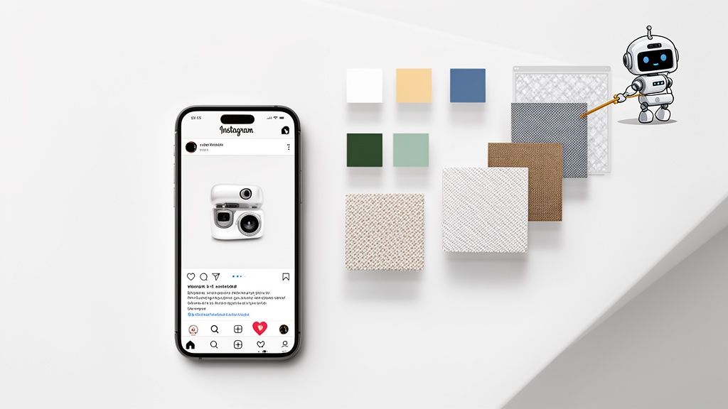
Once your background is gone, it's time to choose a replacement. The typical creative process moves from simple solids to more detailed lifestyle scenes.

This visual guide shows the path many brands take: they start with clean solids, add some texture for depth, and eventually build entire lifestyle scenes to tell a story.
Select The Perfect AI-Generated Background
Now for the fun part. With your product isolated, you can place it against any Instagram posts background you can dream up. AI gives you some powerful options.
- Solid Colors: Go for a crisp, clean white background for that classic e-commerce look, or plug in a specific hex code to perfectly match your brand’s color palette.
- Textured Surfaces: Instantly add context and style by placing your product on photorealistic textures like marble, wood, or concrete. It adds a premium feel without being distracting.
- Custom Scenes: This is where AI really shines. You can generate a completely custom background with a simple text prompt. For example, you could type "a modern kitchen counter with soft morning light," and the AI will create that exact scene around your product.
Our own AI product photo generator is built to make this incredibly easy. You can experiment with different styles until you find the perfect look for your feed. In just a few clicks, you can generate dozens of high-quality variations, giving you a massive library of content to schedule for your Instagram.
Getting Your Image Ready for Instagram Stardom
Nailing the perfect Instagram posts background is a huge win, but that's just getting you to the starting line. Now comes the real work: making sure that gorgeous new image actually stops the scroll and gets the engagement it deserves.
A few small adjustments to your dimensions, composition, and even the post format can be the difference between an image that gets buried in the feed and one that your audience can't ignore.
First up, let's talk size and shape. Instagram's automatic cropping can be brutal, and it has a nasty habit of butchering an image you've spent ages perfecting. To keep total control and make your product the hero, you have to play by its rules.
- Square (1:1 Aspect Ratio): The old reliable. Stick to 1080 x 1080 pixels. It's a classic for a reason—it’s safe, clean, and always looks good in the grid.
- Portrait (4:5 Aspect Ratio): This is my go-to, and for good reason. At 1080 x 1350 pixels, it eats up more vertical screen space. As someone scrolls, your post is bigger, bolder, and harder to miss.
- Landscape (1.91:1 Aspect Ratio): I almost always steer clients away from this one for product shots. At 1080 x 566 pixels, it’s the smallest option and makes your product look tiny and less important.
If you upload a photo with the wrong dimensions, Instagram will either compress it or crop it for you, and both will tank your image quality. If you need a foolproof way to get the size right every time, a good image resizing tool here is a lifesaver.
Nail Your Composition
Now that you have your background, where you actually place your product is the next big decision. This is where a classic design principle, the rule of thirds, is your best friend.
Think of your image as a tic-tac-toe grid, divided into nine equal squares. The most visually interesting spots to place your product are along those lines or where they cross.
Putting a product smack-dab in the center can feel a bit boring and static. By nudging it just a little off-center to one of these "power points," you create a more dynamic feel that looks way more professional and naturally guides your customer's eye right to it.
Unleash the Power of Carousels
Why settle for one amazing photo when you can show off a whole series? Carousel posts, which let people swipe through multiple images, are an absolute goldmine for engagement. This format is perfect for showing a product from every angle, zooming in on key features, or even showing it in different real-world scenarios.
The data backs this up completely. A 2026 analysis showed that Instagram's algorithm rewarded engaging visuals, with carousels leading the pack with a median engagement rate of 6.90%. That blows single images (4.44%) and even Reels (3.31%) out of the water.
It proves that a killer set of static images can still be king. In fact, one top-tier image can pull in 109% more engagement per reach than a Reel. You can discover more insights about 2026 social media engagement on Buffer.com.
A pro tip: Use a consistent Instagram posts background across all slides in a carousel. It unifies the entire post and makes the swiping experience feel seamless and polished. It’s a small detail that makes your brand look incredibly buttoned-up.
Going Pro: Advanced Tips For A Cohesive Feed

Moving beyond one-off posts to build a stunning, cohesive grid is what really separates amateur sellers from professional brands. It's all about creating an unforgettable presence where every single post feels like it belongs.
Consistency is your most powerful tool here. Think of it as creating a visual uniform for your products. This is where having templates for recurring content—like sales, new arrivals, or customer features—becomes an absolute lifesaver. Using a consistent layout and font helps your feed look organized and instantly recognizable.
The fight for attention is only getting tougher. Instagram is projected to hit 3 billion monthly users by 2026, and 44% of them are already using the platform to shop. You have to stand out. Hootsuite’s blog on Instagram statistics shows that 60% of top brands use a consistent filter or aesthetic, which is a powerful lesson in branding.
Develop A Secondary Background Palette
I see this all the time: brands stick so rigidly to one or two main colors that their feed starts to feel flat and monotonous. The fix is to develop a secondary background palette. These are complementary colors that harmonize with your primary brand colors without being a direct match.
Let's say your main brand colors are a bold navy blue and gold. Your secondary background palette could include shades like:
- Soft beige
- Light grey
- Dusty rose
- Cream
These colors give your navy and gold branding a beautiful, neutral stage to pop from. It introduces variety while making every instagram posts background feel intentional and connected. This simple move adds a layer of depth and sophistication to your entire grid.
By defining a clear primary and secondary color palette, you create a visual system that makes content creation faster and your feed instantly more professional. It’s a simple strategy with a huge impact.
Use AI For Uniform Lighting And Shadows
One of the sneakiest challenges in creating a cohesive feed is keeping your lighting and shadows consistent across different photos. Maybe one product shot has soft, diffused light, while the next has sharp, defined shadows. It's a subtle detail, but those little inconsistencies can make your grid feel disjointed.
This is another area where AI tools are a total game-changer. When you generate a new background for your product, good AI doesn't just cut and paste. It intelligently adjusts the lighting and adds realistic shadows that match the new scene.
By applying a similar lighting style across all your AI-edited images, you can achieve a level of visual harmony that used to require an expensive studio setup. It's a crucial step that many sellers miss. Our professional product photo editing services can help automate this, ensuring every single image looks like it belongs in the same family.
Frequently Asked Questions About Instagram Backgrounds
Even with a solid plan, you're bound to hit a few snags when dialing in your visual strategy. Getting your instagram posts background just right is a mix of technical skill and creative gut feeling. Here are some quick answers to the questions I hear most often from brands.
What Is The Best Background Color For Product Photos?
For pure e-commerce platforms like Amazon or Shopify, a clean white or light gray background is the undisputed king for a reason. It makes your product the undeniable hero of the shot, which is exactly what you want. There are zero distractions, giving the image a professional, trustworthy feel.
But your Instagram feed is a different beast. This is where using a consistent color from your own brand palette really pays off. It helps you build a memorable, cohesive grid that people start to recognize instantly. The goal is always to make your product pop, not force it to compete with a chaotic background.
Can I Take Good Product Photos For Instagram With My Phone?
You absolutely can. In fact, the camera in your pocket right now is probably more than powerful enough to capture incredible, high-resolution images.
The real game-changer isn't the camera, though—it's the lighting and the background.
Here's a simple, winning formula: shoot your product near a window to get that soft, indirect natural light. Then, use an AI photo editor to completely remove your actual surroundings and drop in a perfect, studio-quality background. This little workflow makes phone-shot photos look like they came from an expensive professional shoot.
How Do I Make My Instagram Feed Look Cohesive?
Cohesion boils down to one thing: consistency. The simplest way to get that unified grid look is to lock in a specific background strategy and stick with it.
- Pick a tight color palette: Stick to a few core colors for your backgrounds, like a crisp white, a warm beige, and one of your signature brand colors.
- Stick to one texture family: If you're using textures, don't mix and match randomly. Stick to a similar style, like various types of wood, or different marble patterns.
Using an AI tool to generate these backgrounds is a huge help here, as it ensures every single photo has the same polished lighting and overall vibe. That's what really ties your entire grid together. And if you want to take it a step further, mastering the smaller details, like how to change background color on your Instagram Story, can give your whole presence a more professional edge.
Are Digital Backgrounds Better Than Real Ones?
Honestly, for most e-commerce brands, digital backgrounds are way more practical and efficient. Building physical sets is expensive, takes up a ton of space, and is incredibly time-consuming. I've been there, and it can be a nightmare.
AI-generated digital backgrounds give you limitless creative freedom without the headache. They guarantee a clean, professional result every single time and can literally save you countless hours of setup and editing. They let you pump out a high volume of quality content fast—and that’s how you win on social media today.
Ready to stop wasting time and start creating stunning, on-brand product photos in seconds? ProdShot uses AI to instantly remove messy backgrounds and replace them with perfect studio-quality scenes. Try ProdShot for free and see how easy it is to elevate your brand's visuals.