
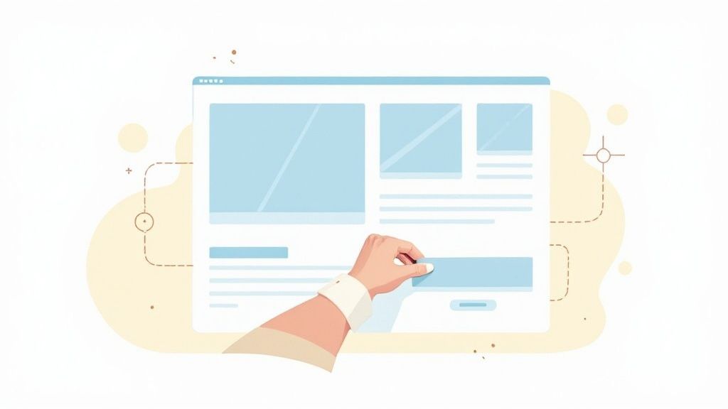
Visual hierarchy is the invisible hand that guides your eye across a screen, telling you exactly what to look at first without a single word. It’s the secret sauce designers use to create a clear, intuitive path for a user's attention.
Think about a newspaper. What’s the first thing you notice? The massive, bold headline. That’s visual hierarchy in action, grabbing you before you even think about reading the smaller article text.
Unlocking the Power of Visual Hierarchy
In a world overflowing with information, getting visual hierarchy right isn't just a nice-to-have design skill; it's a fundamental part of clear communication. It’s the art of arranging everything a person sees to signal its order of importance, turning what could be a jumbled mess into a smooth, intuitive experience. For a deeper dive into the concept, this guide on What Is Visual Hierarchy In Design is a great starting point.
This whole process works because it taps directly into how our brains are wired to see the world. We can't help but notice things that stand out. Designers lean into this natural tendency using a few core principles:
- Size and Scale: Bigger things feel more important. Simple as that.
- Color and Contrast: A splash of bright, contrasting color is an instant attention magnet.
- Strategic Placement: We tend to place the most critical information where people’s eyes naturally fall first.
Here's a quick look at how these foundational principles work together.
Core Principles of Visual Hierarchy at a Glance
This table breaks down the essential building blocks that designers use to direct a viewer's focus and create a clear, understandable visual journey.
| Principle | What It Controls | Primary Impact |
|---|---|---|
| Size & Scale | The physical dimensions of an element. | Larger elements appear more important and draw the eye first. |
| Color & Contrast | The hue, saturation, and brightness of elements. | High-contrast or vibrant colors stand out and create focal points. |
| Typography | The font, weight (bold, regular), and size of text. | Creates a clear reading order for headlines, subheadings, and body text. |
| Placement | The position of an element on the page (top, center, etc.). | Elements placed in prominent areas are perceived as more significant. |
| Proximity | The grouping of related elements close together. | Helps the brain organize information and understand relationships. |
| White Space | The empty space surrounding elements. | Reduces clutter, improves readability, and emphasizes key content. |
By mastering these elements, you can transform a confusing layout into one that feels effortless and guides the user exactly where you want them to go.
The reason this is all so incredibly effective boils down to biology. Groundbreaking research shows that our brains process images about 60,000 times faster than plain text. This means a well-structured visual layout gets its main message across almost instantly, long before a visitor has time to read a single sentence.
When you also consider that people remember 80% of what they see, a strong visual hierarchy isn't just about looking good—it's about making sure your most important message sticks.
The Building Blocks of Effective Design
Visual hierarchy isn't some abstract design theory; it's a set of practical tools you can use to guide a viewer's eye. By understanding these core principles, you can take a jumbled design and turn it into something that communicates its message clearly and instantly. These are the levers you pull to direct attention right where you want it.
The most obvious tool in the box is size and scale. Our brains are just wired to notice bigger things first and automatically assume they're more important. A huge, bold headline doesn't just feel more significant than the tiny body text—our eyes are physically pulled to it. This is exactly why a main call-to-action button is almost always bigger than secondary links. It's visually shouting, "Click me first!"
This infographic breaks down how elements like size, color, and contrast all work together to create a clear pecking order.
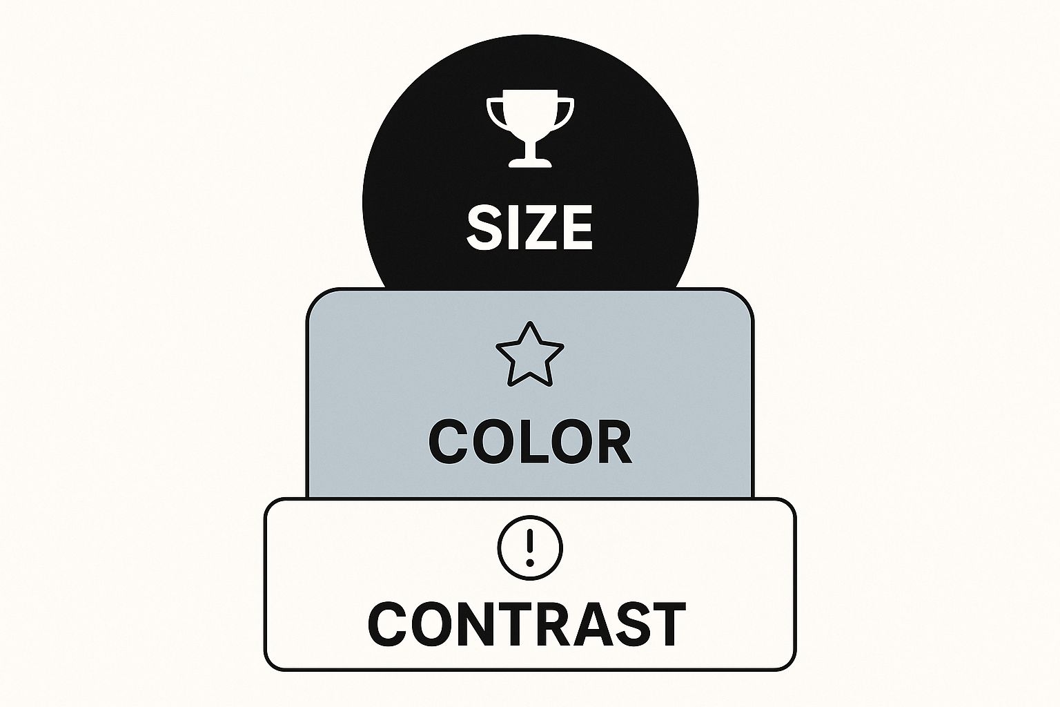
As you can see, the biggest shape grabs your attention immediately. Then, the high-contrast color creates a second focal point, guiding your eye in a very deliberate sequence.
Creating Focus and Clarity
Another incredibly powerful tool is color and contrast. A splash of a bright, contrasting color is like shining a spotlight on one part of your design. Think about a bright red "SALE" tag on a product image or a vibrant button sitting on a muted background. The human eye can't help but be drawn to these differences, making them perfect for highlighting your most critical information.
In the same way, typography carves out a clear reading path for your audience. Knowing how to use different text styles is key; for example, mastering bold and italic fonts can dramatically improve how you direct a reader's focus. A good typographic hierarchy usually has three simple levels:
- Primary: Big, bold headlines that deliver the main message.
- Secondary: Medium-sized subheadings that break up and organize the content.
- Tertiary: Smaller, standard-weight text for all the details.
And finally, never, ever underestimate the power of white space. Those empty areas around your content aren't wasted real estate—they're actively working for you. By giving your key elements room to breathe, white space cuts through the clutter, making your most important messages pop with way more impact and clarity.
How Visual Hierarchy Drives E-commerce Sales
In the lightning-fast world of online shopping, visual hierarchy isn't just a stuffy design term—it's one of your most powerful sales tools. A well-designed product page works like a silent salesperson, guiding a customer’s eye from one key piece of information to the next. It creates a smooth, intuitive path that leads right to the checkout.
Think about the last time you landed on a great product page. What did you see first? Probably a big, beautiful product photo. Your eyes then likely flicked to the bold, clear price, and finally settled on a brightly colored "Add to Cart" button. This is no accident. It’s a carefully choreographed experience designed to make shopping easy and build confidence.
From First Glance to Final Click
The journey from browsing to buying needs to feel effortless. If a customer has to hunt for the price or can't find the checkout button, they’re going to get frustrated and click away. A strong visual hierarchy gets rid of that confusion, making the most important steps impossible to miss.
This isn't just a digital phenomenon. In the physical world, research on packaging shows that 94% of first impressions are based on design. A whopping 64% of shoppers will try a new product just because the packaging caught their eye. Those same visual cues that influence us in a supermarket aisle are just as powerful on a digital storefront.
By setting a clear order of importance—product first, price second, action last—you stop making users think and start guiding them toward a sale.
The Financial Impact of Smart Design
At the end of the day, the goal is to make the buying process feel completely natural. A page with a clear visual flow doesn't just look more professional; it actively turns more of your visitors into paying customers.
Here’s how to break it down:
- Primary Focus: The hero image is the star of the show. High-quality visuals are non-negotiable, and understanding the basics of professional Shopify product photography can make a massive difference.
- Secondary Information: The product title, price, and key benefits should be easy to scan. Use different font sizes and bold text to make them pop against the longer descriptions.
- Call to Action (CTA): Your "Add to Cart" or "Buy Now" button needs to be the most dominant, eye-catching element on the page. Use a contrasting color and give it plenty of space to breathe.
Using AI to Perfect Your Visuals
Getting visual hierarchy right by hand can feel like an art form. It often involves endless fiddling, a sharp eye for design, and a ton of patience. But what if you could skip all that trial and error? For e-commerce brands, AI is stepping in to instantly create high-impact product shots, taking the guesswork out of what makes a visual work.
Modern AI tools can look at a product image and automatically apply all those important hierarchy principles to make it pop. They intelligently pick the perfect background to make your product the star, position it just right to convey value, and make sure its best features are front and center.
Take a look at this example from ProdShot. It shows just how quickly AI can spin up multiple, high-quality backgrounds that are built to convert.
The system instantly creates a clear focal point. It places the product right where it needs to be, setting it against backgrounds that have great contrast without being distracting. The result? Your product grabs a shopper's attention immediately.
Automation That Scales
This kind of technology lets brands churn out studio-quality visuals at a scale that used to require a whole design team. Forget spending hours in complicated photo editing software; you can now generate dozens of optimized images in just a few minutes. This is a game-changer for keeping a professional, consistent look across all your product listings.
By handing over these critical design decisions to AI, you're ensuring every single product photo is structured to sell. You can see just how simple it’s become by exploring how an AI product photo generator works.
The real benefit here is straightforward: AI-driven optimization gives every product its best shot at capturing a customer's eye. It takes all the principles of visual hierarchy and applies them to create images that don't just look pretty—they're strategically built to guide the eye and drive sales. This lets you focus on growing your business while the AI handles the visual perfection.
Putting Design Principles into Practice
Knowing the theory behind visual hierarchy is one thing. Actually using it to make a page sell better? That's where the real magic happens.
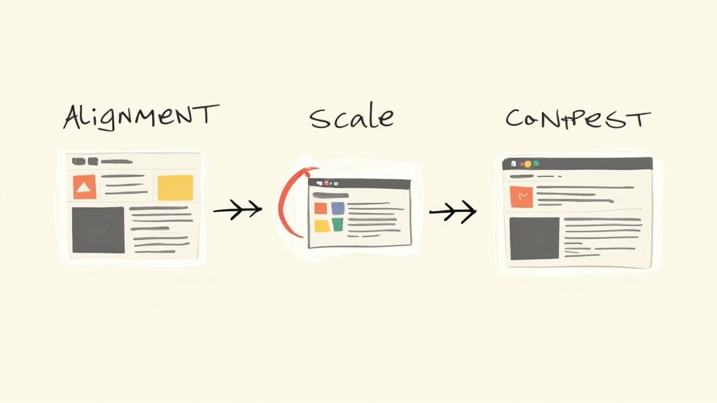
Let's walk through a quick redesign of a standard e-commerce page. You'll see how these principles can take a confusing layout and transform it into a smooth, conversion-focused experience.
Picture a typical "before" version of a product page. It's probably a bit of a mess. The product photo is just okay, the "Add to Cart" button blends in with everything else, and the product description is a giant, intimidating block of text. There’s no clear path for your eyes, forcing you to hunt for the information you need.
From Cluttered to Clear
This kind of layout creates friction. When every single element is screaming for attention, nothing actually gets it, and frustrated shoppers are far more likely to just give up and leave.
Now, let’s apply our principles to create an "after" version.
First up, we need a strong focal point. We’ll make the product image much, much larger. It’s not just about size, though; we need a high-quality photo that’s been edited to really pop against the background. Using an effective Shopify photo editor is a great way to handle this, making sure your main visual grabs attention the instant the page loads.
Next, we attack that wall of text. The product title gets bumped up to a large, bold headline. We’ll pull the most important features out and list them with bullet points so they’re easy to scan. Right away, this creates a typographic hierarchy that guides the customer from the main idea down to the finer details.
Finally, that all-important call-to-action (CTA) gets a serious upgrade. The "Add to Cart" button gets a bright, contrasting color—one that isn't used anywhere else on the page. We also give it plenty of breathing room, surrounding it with white space to make it impossible to miss.
By making these simple, strategic tweaks, we've created a clear visual journey for the customer: product first, key details second, and a compelling call-to-action last. This isn't just about making things look pretty; it’s a data-backed strategy.
A well-designed visual hierarchy can cut down the time it takes for a user to complete a task by up to 25%, which has a direct impact on bounce rates and, ultimately, sales. It’s a powerful reminder that a clear visual path is a massive competitive advantage. If you want to dive deeper, you can explore the research on design efficiency.
Frequently Asked Questions About Visual Hierarchy
Even after you get the hang of the basic concepts, trying to apply visual hierarchy in a real project can bring up a few tricky questions. Let's tackle some of the most common ones with clear, straightforward answers to help you put this theory into practice.
What Is the Most Important Principle of Visual Hierarchy?
If you had to pick just one, size and scale probably have the biggest and most immediate impact. It's just human nature—our brains are wired to notice bigger things first and assume they're more important.
Want your headline or "Buy Now" button to be the first thing people see? Making it bigger is the most direct route to creating that all-important focal point.
But the truly great designs don't just rely on one trick. They blend multiple principles together. A large button (scale) that also has a bold, high-contrast color is far more powerful than one that's just big. Real mastery is about understanding how these elements work together to create a clear path for the viewer's eye.
Can You Have Too Many Focal Points?
Oh, absolutely. It’s one of the most common mistakes you'll see. When everything on a page is shouting for attention, nothing actually gets heard. This just creates visual chaos and a confusing experience for your customer, often leading to what’s called "choice paralysis."
A successful design needs one clear primary focal point. This is then supported by a handful of secondary and tertiary elements. Your goal is to guide the user's attention, not unleash a free-for-all where every element is fighting for the top spot.
If you look at your design and it feels cluttered or overwhelming, just step back and ask: "What's the #1 thing I want someone to do here?" Make that your undeniable hero element, and then dial everything else back a notch.
How Does Visual Hierarchy Affect Accessibility?
A strong visual hierarchy isn't just a design choice; it's a huge part of making your site accessible to everyone. When you get it right, you help all users—including those with visual impairments or cognitive disabilities—navigate and understand your content with ease.
Here’s how it all connects:
- Typographic Hierarchy: Using proper H1, H2, and H3 tags does more than just look neat. It creates a logical map that screen readers follow to announce content. This allows a visually impaired user to scan a page for key information, just like a sighted user would.
- Color and Contrast: This is a big one. Ensuring there's high contrast between your text and its background is a basic accessibility requirement. It helps people with low vision or color blindness read your content. Never rely on color alone to communicate something important—that's a classic accessibility mistake.
At the end of the day, organizing your information in a logical, clear way creates a better, more intuitive experience for every single user.
Ready to create stunning, conversion-optimized product photos without the hassle? ProdShot uses AI to instantly apply visual hierarchy principles, making your products the star of every shot. Transform your simple smartphone pictures into professional-grade visuals in seconds. Try it for free at ProdShot today!