
You’ve got a product worth selling, an iPhone in your hand, and a listing that still looks flatter than the competition. That’s a common spot for small sellers. The product isn’t the problem. The presentation is.
A photo collage iphone workflow can fix more than most sellers expect. Not because collages are decorative, but because they let you answer several buyer questions in one image. What does it look like from the front? How big is it? What does the detail look like up close? How does it fit into real use?
That matters when you’re selling on crowded platforms where buyers scroll fast and hesitate faster. A single product image often leaves too much work to the shopper. A good collage reduces that friction.
Why a Simple iPhone Collage Can Boost Your Sales
A seller with a handmade leather wallet usually starts the same way. One clean front shot goes on Etsy. Then a back shot. Then maybe an interior shot. Each image is fine on its own, but together they don’t always tell a clear story.
A collage solves that. One frame can combine the hero image, the card slots, the stitching detail, and a hand-held shot for scale. The buyer gets the pitch instantly.
That’s why collages work especially well for lean businesses. They compress information without needing a studio shoot. And when you already know that high-quality media is essential for digital advertising, the next step is using your existing photos more strategically, not just taking more of them.
What a buyer wants to see
Most shoppers don’t need artistic variety. They need clarity. A useful product collage usually answers these questions:
- What am I buying
- What makes it different
- How big is it
- What does it look like in real use
- Can I trust this listing
A collage can handle all five if the images are chosen well.
Practical rule: Don’t think of a collage as a scrapbook. Think of it as a compressed sales page.
Since iOS 13, iPhone users have been able to build photo grids natively through the Shortcuts app, which made quick collage creation available without a third-party app, according to this walkthrough on YouTube: https://www.youtube.com/watch?v=KgqGNd0T3h8. For a small seller, that’s enough to build a strong first draft of a product visual using tools already on the phone.
Where the budget question shows up
Most small shops don’t start with polished photography systems. They start with daylight, a kitchen table, and trial and error. That’s fine. The better question is where DIY stops being efficient.
If you’re weighing that trade-off, it helps to understand the actual cost of professional product photography before you outsource too early. In many stores, a smart iPhone collage is the bridge between basic snapshots and a fully professional image workflow.
Your First Product Collage Using Native iPhone Tools
A seller usually hits this point fast. The photos are already on the phone, the listing needs to go live today, and downloading another design app is one more task that delays the upload. On iPhone, the fastest native option is Photo Grid in the Shortcuts app, and for a first product collage, that speed is useful.

Start with four photos that each answer a buyer question. If the product is a ceramic mug, use one clean front view, one side shot showing the handle, one close-up of the glaze or rim, and one photo that shows scale on a desk or in a hand. That mix gives the collage selling value instead of just filling boxes.
How to build it inside Shortcuts
Open Shortcuts, go to the Gallery tab, search for Photo Grid, and add it to My Shortcuts. Then tap it and choose the images you want to combine.
The shortcut builds the grid automatically. In the referenced tutorial, the creator shows typical processing in a few seconds and presents it as faster than Google Photos on iOS for basic collage creation, with reliable results on standard JPEG and HEIC files in common sizes for everyday use: https://www.youtube.com/watch?v=VUeefgW9USA
For small catalogs, that matters. Quick output makes it easier to test a new image on a product page, replace a weak visual, and keep listing work moving instead of turning one collage into a 20-minute editing job.
Choose photos that work together
Shortcuts can combine images. It cannot decide which image should carry the sale.
Use a simple selection rule before you build the collage:
- Start with one anchor image. Use the clearest full-product shot.
- Add one proof image. Show a material detail, hardware, stitching, port, or packaging element.
- Include one context image. Show the item in use, worn, held, or placed in a realistic setting.
- Finish with one reassurance image. Add scale, included accessories, or another angle that removes hesitation.
This structure works well for e-commerce because each frame has a job. Generic iPhone collage tutorials usually focus on layout and style. Sellers need a collage that reduces uncertainty and helps the shopper decide faster.
If the set mixes portrait and horizontally oriented shots, crop them in the Photos app before running the shortcut. The native grid is fast, but it is rigid. Mismatched orientations often create awkward spacing or aggressive crops, and both make the collage feel less polished than the actual product.
If the collage feels crowded, the photo selection is usually the problem.
Keep the first version clean
Plain usually wins on product pages. Decorative backgrounds, stickers, and extra text tend to make a collage look homemade, especially on smaller mobile screens where buyers are scanning quickly.
A few limits are worth watching:
| Situation | What usually happens | Better move |
|---|---|---|
| Mixed bright and dark photos | The collage looks inconsistent | Adjust exposure in Photos first |
| Too many close-ups | The product is harder to understand fast | Keep one full-item shot |
| Busy backgrounds | The page looks cluttered | Retake against a plain background |
| Too many images | The collage gets harder to scan | Use fewer frames with clearer roles |
The native iPhone route is strong for first drafts, quick listing updates, and budget-conscious testing. Its weakness is control. It will not fix poor lighting, weak framing, or a confusing set of source images. Once a store needs tighter branding, cleaner backgrounds, or platform-specific image variations at scale, native tools start to show their limits.
Composing Collages That Sell Products
Most collage tutorials stop at “pick a layout.” That’s where they stop being useful for sellers.
Current iPhone collage advice leans heavily toward personal memories and aesthetics, but it doesn’t give sellers a framework for showing angles, dimensions, and usage context. That gap matters because product collages need to build buyer confidence, not just look tidy, as noted here: https://copytrans.studio/support/make-photo-collage-iphone/

Use a hero shot and supporting proof
A sales-focused collage should have hierarchy. One image leads. The others support.
Think of the layout like this:
| Role in collage | What it should show | Why it matters |
|---|---|---|
| Hero image | Best overall view | Gives instant recognition |
| Detail image | Texture or feature | Proves quality |
| Angle image | Side, back, inside | Reduces uncertainty |
| Context image | Real use or scale | Helps buyer imagine ownership |
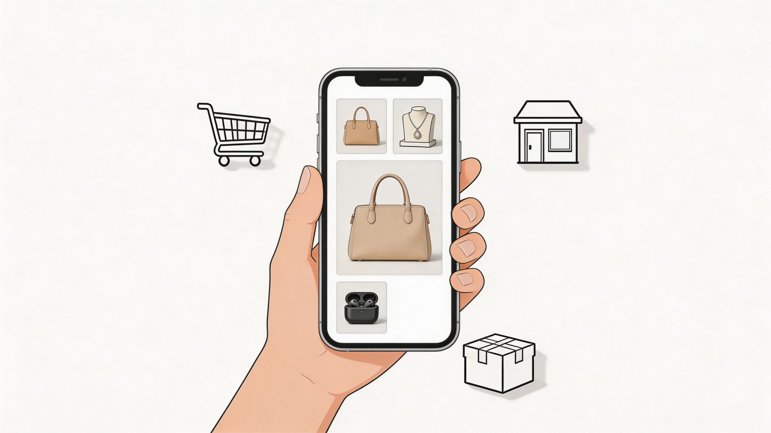
A handbag collage is a good example. The hero shot shows the full bag. A second frame shows the interior compartments. A third reveals strap hardware. A fourth shows the bag worn on shoulder for scale.
That arrangement sells better than four similar front-facing shots.
Match the collage to the product type
Different categories need different visual stories.
For jewelry, close-up detail carries more weight. Buyers care about finish, clasp quality, stone setting, and scale on skin.
For gadgets, function is the story. Show the front, side ports, included accessories, and one in-use view on a desk or in hand.
For home goods, context pulls harder. A candle, mug, or throw pillow usually benefits from one clean standalone image and one scene that makes the item feel at home.
A collage should remove questions in the order a buyer asks them.
Build visual flow instead of random boxes
Even in a rigid grid, you can guide the eye. Place the strongest image first. Group similar tones together. Avoid putting two close-up detail shots next to each other if they compete for attention.
A few composition rules work reliably:
- Start broad, then narrow. Let the buyer see the whole item before the micro detail.
- Keep backgrounds consistent. If one frame is white and another is on a dark wood table, the collage can feel patched together.
- Use scale with intent. A hand, coin, notebook, or model can help if it clarifies size.
- Don’t duplicate information. Front view plus slight front-angle often wastes space.
Here’s the mistake I see most often: sellers build collages from the photos they happen to have, not the photos the buyer needs. Once you shift that mindset, the photo collage iphone process becomes less about layout and more about sales clarity.
Optimizing Your Collage for Major E-commerce Platforms
A strong collage can still underperform if it’s exported badly. The same image won’t behave the same way on Shopify, Amazon, Etsy, and Instagram Shopping.
That matters because visual variety helps on scrolling platforms. A source tied to native iPhone collages projects that by 2025, multi-image collage formats on Instagram could boost engagement by an estimated 25 to 40 percent, with viewers retaining attention up to 3x longer than on single images: https://www.youtube.com/watch?v=KgqGNd0T3h8

What changes by platform
Amazon treats product imagery differently from a direct-to-consumer Shopify store. Etsy often rewards personality and craft context. Instagram Shopping cares about mobile-first framing.
A collage needs to respect those environments. Otherwise, text gets cut off, details shrink, or the image feels cramped on mobile.
E-commerce Platform Image Size Cheat Sheet (2026)
| Platform | Recommended Dimensions (px) | Optimal Aspect Ratio | Notes |
|---|---|---|---|
| Amazon | 1000px on longest side minimum, 1200px for zoom | 1:1, 5:1, or 16:9 | Main product image must stay clean and easy to read |
| Shopify | 2048 x 2048 ideal for square | 1:1 often works best | Accepted formats include JPEG, PNG, GIF |
| Etsy | 2700 pixels on the shortest side | 4:3 preferred | Supports up to 10 images per listing |
| Instagram Shopping | 1080 x 1080 or 1080 x 1350, Stories 1080 x 1920 | 1:1, 4:5, 9:16 | Mobile framing matters more than desktop neatness |
Practical platform choices
For Amazon, be careful with collages in the main image slot. The cleaner approach is usually a single hero image first, then collage-style support images later in the gallery if the platform rules and category norms allow it.
For Shopify, you have more freedom. Collages can then work hard on collection pages, product detail sections, and supporting lifestyle content. If your store needs cleaner post-processing for listing visuals, this Shopify photo editor is one route to tighten presentation after the collage is built.
For Etsy, collages work especially well when they clarify handmade details. Buyers often want proof of craftsmanship, material texture, and sizing. A four-panel image can do that quickly.
For Instagram Shopping, choose portrait-friendly versions when possible. A collage built for a square storefront can feel small in a feed where vertical framing wins more visual space.
Export checklist before upload
Use this before sending the file to any marketplace:
- Check legibility. Zoom out on your phone. If details disappear, buyers won’t catch them either.
- Trim dead space. Thick borders waste valuable screen area.
- Keep file format sensible. JPEG is usually fine for standard listing use. PNG helps when transparency matters.
- Name the file descriptively. Use product-centered filenames instead of camera roll defaults.
Platform optimization isn’t glamorous, but it’s where a good image often becomes a useful one.
A collage should fit the storefront it’s entering. If you design without that in mind, you’ll keep remaking the same asset for every channel.
Adding Brand Identity to Your iPhone Collages
A decent collage can help one listing. A branded collage system helps the whole store.
That’s the shift many small sellers miss. They learn how to make one image look better, but not how to make ten products look like they belong to the same business. Consistency builds recognition. It also makes a store feel more reliable.
Keep the branding light
You don’t need a full design suite on day one. The iPhone’s built-in Markup tool is enough for subtle additions like a small logo, a clean text label, or a simple background color block.
The goal isn’t decoration. It’s repeatability.
Try keeping these elements consistent across your collages:
- Background treatment. Use the same light or neutral backdrop family across products.
- Logo placement. If you add it, keep it small and put it in one predictable corner.
- Text style. Choose one font approach and stick to it.
- Color behavior. Don’t make every listing a different mood board.
Popular App Store collage apps offer 50+ grid layouts and carousel formats, which shows how much demand there is for visual variety, and their in-app purchase model also suggests sellers will pay for features that go beyond native tools when those features help produce more conversion-focused visuals: https://apps.apple.com/us/app/photo-collage-maker-scrl/id6756541774
That’s useful context. More layout options can help. But too much variety can also fracture your brand if every product uses a different visual language.
Brand trust often comes from restraint
The most effective store visuals are often boring in the best way. They’re clear, repeatable, and recognizable.
A simple framework works:
- Use one collage structure for most products.
- Reserve special layouts for bundles, gift sets, or launch campaigns.
- Apply edits in the same order every time. Crop first, adjust brightness second, brand last.
Small visual habits create the feeling of a real brand long before a customer reads your About page.
Don’t ignore accessibility basics
Accessibility sounds technical, but part of it is just cleaner communication. When you upload your collage to your store, use filenames that describe the product and angle. If your platform supports alt text, describe what’s visible in plain language.
Good examples are straightforward:
- ceramic-mug-blue-four-view-collage.jpg
- gold-hoop-earrings-detail-and-scale.jpg
That helps organization internally, and it makes the store easier to manage as your catalog grows.
A polished collage doesn’t need heavy branding. It needs a recognizable pattern. Buyers notice that even when they can’t explain why they trust the store more.
When to Graduate to AI-Powered Product Photos
The native iPhone method is good. For many early-stage sellers, it’s good enough.
Then the cracks show up. Backgrounds don’t match. Lighting changes between shots. You spend too much time fixing photos before you even start the collage. And when the catalog grows, manual cleanup becomes the significant bottleneck.

The point where DIY slows you down
There are a few signs you’ve outgrown a purely manual photo collage iphone workflow:
- Your products need clean cutouts. Jewelry, cosmetics, and small accessories often look weak against messy real-world backgrounds.
- You sell across several channels. Reformatting every image by hand gets old fast.
- Your brand needs more consistency. One-off fixes don’t scale.
- You’re launching often. Speed starts to matter as much as image quality.
At this point, AI tools start making practical sense. Not because they’re trendy, but because they remove repetitive production work.
What AI changes in the workflow
AI collage and editing tools can handle parts that are tedious on a phone. Background removal is the clearest example.
According to iDownloadBlog’s write-up on Photoroom, AI-enhanced collage tools can remove backgrounds with 99% accuracy on clean product shots and process 6 images in 8 seconds, which shows why sellers use them to get studio-style results without manual clipping: https://www.idownloadblog.com/2025/03/05/how-to-create-photo-collage-iphone/
That doesn’t mean AI solves everything. It still performs best when the original photo is decent. Reflections, clutter, and poor separation between product and background can still create weak edges. But for many sellers, it cuts out the least valuable part of the job.
AI is also changing how products are presented
The next shift isn’t just cleaner collages. It’s more flexible product presentation. For apparel and accessories, sellers are increasingly exploring workflows that place products into modeled scenes without booking a full shoot. Tools in the product to model AI category are part of that broader move toward faster merchandising.
That’s especially useful once your storefront needs more than simple grid images.
The native route helps you prove the product. AI helps you standardize the presentation.
If you’re still testing demand, stick with the iPhone tools and get listings live. If you’re replacing backgrounds repeatedly, correcting lighting every week, or trying to make a growing catalog look coherent, it’s time to move up to an AI product photo generator.
If you’re ready to turn quick phone shots into cleaner, marketplace-ready product images, ProdShot is built for that next step. It helps sellers move beyond basic DIY collages with AI-powered background removal, lighting cleanup, and polished outputs for Shopify, Amazon, Etsy, eBay, and more.